New Dawn
Oct 23, 2020 10:08:26 #

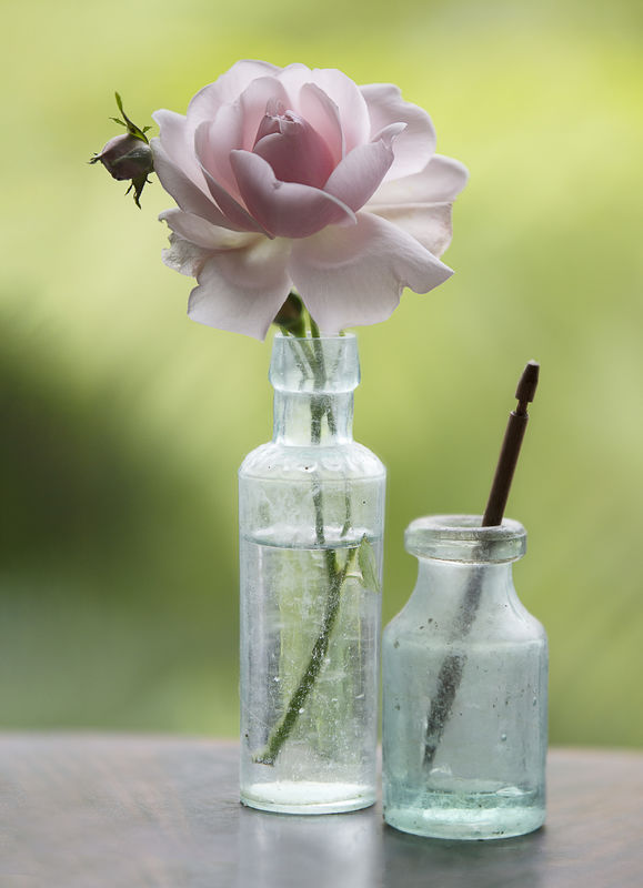
Over in Post Processing Digital Images I'm known for my dark composites - so I've posted this here in order not to taint my reputation! This is a New Dawn rose mildly processed in Photoshop. Your critique is welcome. The colour is slightly better in download.
Oct 23, 2020 10:15:28 #

Not to sure about the 2nd bottle but I think the rose is pretty much perfect. Delicate pinks look almost blown out but double download reveals details up to the petal edge. A mason jar will be recognised by those on the other side, and the scratchy details give it some depth.
Oct 23, 2020 10:26:36 #
Beautiful image. Excellent rendering both of the rose and the frosted glass - colour, DOF, composition, focus all spot on in my opinion. Excellent work. Please stay well and keep on posting.
Oct 23, 2020 10:28:38 #

The colors of the posted version are 'off' due to not using the sRGB colorspace when creating the JPEG for posting. I didn't go back and review your prior work, but you've received feedback before about dark compositions, you'll likely receive more from this post.
Why the ISO-400 and 1/400sec for a static image? Why all the grain in the image from an EOS 5DIII? It would seem this could have been ISO-100 and exposure parameters (slower shutter and / or fill flash) creating a brighter image before any processing. PS can also clean up this grain if not stopped in the camera with brighter exposure settings.
For subtle pleasing colors, this is great! But, for dark shading of the middle of a rose in perfect rose bloom, I think you missed an opportunity to use a flash to 'open' the interior of the flower. The focus on the top of the bottle seems sharper than the center of the bloom. It seems everything on the same plane as the 'Mason' bottle are in sharp focus, but f/2.8 was too narrow to include the center of the flower. A wider aperture and / or an AF point on the bloom would be a change to consider.
Oct 23, 2020 10:52:59 #
John N wrote:
Not to sure about the 2nd bottle but I think the rose is pretty much perfect. Delicate pinks look almost blown out but double download reveals details up to the petal edge. A mason jar will be recognised by those on the other side, and the scratchy details give it some depth.
Thanks for commenting John. Not sure whether you mean the second bottle shouldn’t be there or I’ve not done a good job on it? It’s there ‘cos I like it but I’d agree the focus doesn’t quite match - that’s lazy processing!
Oct 23, 2020 10:53:56 #
Ourspolair wrote:
Beautiful image. Excellent rendering both of the rose and the frosted glass - colour, DOF, composition, focus all spot on in my opinion. Excellent work. Please stay well and keep on posting.
Glad you like it, thanks for your comments.
Oct 23, 2020 11:09:10 #

Here is how I experience it. The rose is exquisite! I love the pastel colors and the shading of the bloom! There is good separation from the background and the edge of the petal is sharp. Maybe a tad too sharp on the lower right. I like the arrangement of the two bottles.
The colors and composition have a calming effect. But I experience a little distraction from the shadow
I think I understand why there is a dark shadow on the left, without it there would be a “hole”. But my eye keeps wandering to it, it draws my eye away from the rose. It feels a little unbalanced. I wonder if a bit of a crop on the left side would eliminate that.
Overall a very nice job, that is a beautiful rose! Thank you for sharing!
Oct 23, 2020 11:34:39 #
CHG_CANON wrote:
The colors of the posted version are 'off' due to ... (show quote)
I’ve given up trying to get the colour right for UHH!
The iso400 was a choice - and I was happy to have the shutter speed. Didn’t think about reducing either of them! Flash is not for me - I don’t own one but I could easily have worked with lower iso and should have thought about it. I chose several images to merge - then chose additional areas selectively (to add-in, beyond the Ps offering). Perhaps I should have chosen more, or more carefully.
I do have a 50mm lens with wider aperture but don’t like it at all - it seems virtually unusable for my type of photography and I’ve seen others complain about it. I should add the rose is not my usual type of photography, it’s delicate appearance simply appealed, as did the background.
Thanks for you considered critique, it’s very helpful and encouraging. Maybe I’ll have a second crack at it.
Oct 23, 2020 11:42:27 #
REF: colorspace
If you shoot in RAW, colorspace as set in the camera is immaterial. The digital editor defines the colorspace. In an Adobe world, you should select ProPhotoRGB for RAW images, making all edits and intermediary file conversions within ProPhotoRGB. As the final step of creating the JPEG for sharing, update the colorspace into the target file to sRGB.
In an Adobe subscription environment, colorspace management becomes significant easier. Import original RAW images into LR where the ProPhotoRGB colorspace is the default and cannot be un-selected. Assure your external editors are defined as colorspace ProPhotoRGB along with your preferred file format. Use / create an LR export to manage and automate the creation of output JPEGs, including the sRGB colorspace setting into the resulting export file.
Additional ideas about resizing digital images and an example screen capture of an LR export are provided in this post:
Recommended resizing parameters for digital images
Oct 23, 2020 11:44:57 #
JD750 wrote:
Here is how I experience it. The rose is exquisite... (show quote)
You’re welcome, glad you like it JD. The left hand side was extended a little to balance the composition, which has the effect of extending the shadow area. Otherwise the background is as taken - it’s a tree fern through a window. I could ease the shadow, rather than remove it, which might help things a bit. Thanks for your comments, I’ll give the shadow some thought.
Oct 23, 2020 12:18:47 #

I like everything about the composition except the element sticking out of the smaller bottle. I don't know what it is or its relationship to the rest.
I like everything about the processing except the yellow-green is a little too intense for the soft pink IMO. Ironically, the yellow-green in the thumbnail works better (IMO) than the real color
Fun to see you exploring your gentler side, Dave!
I like everything about the processing except the yellow-green is a little too intense for the soft pink IMO. Ironically, the yellow-green in the thumbnail works better (IMO) than the real color
Fun to see you exploring your gentler side, Dave!
Oct 23, 2020 12:19:38 #
CHG_CANON wrote:
REF: colorspace br br If you shoot in RAW, colors... (show quote)
Thanks for this guidance, I’ll spend some time absorbing it over the weekend. I do subscribe to CC and usually choose ‘Edit in Ps’ from Lightroom, although recent updates have wrecked this - I’m told I can go back to an earlier version of ACR to correct it. In the case of the rose I simply chose them from my external drive while in the merge process.
Oct 23, 2020 12:22:06 #
Linda From Maine wrote:
I like everything about the composition except the element sticking out of the smaller bottle. I don't know what it is or its relationship to the rest.
I like everything about the processing except the yellow-green is a little too intense for the soft pink IMO. Ironically, the yellow-green in the thumbnail works better (IMO) than the real color
Fun to see you exploring your gentler side, Dave!
I like everything about the processing except the yellow-green is a little too intense for the soft pink IMO. Ironically, the yellow-green in the thumbnail works better (IMO) than the real color
Fun to see you exploring your gentler side, Dave!
It won’t last Linda!
Oct 23, 2020 12:50:14 #
Oct 23, 2020 14:09:02 #
Linda From Maine wrote:
😊 😊
.
.
TOL tells me it’s a ‘dibber’ - makes holes for plant cuttings. Live and learn!
If you want to reply, then register here. Registration is free and your account is created instantly, so you can post right away.