I'll try this again.
Oct 22, 2020 13:04:33 #

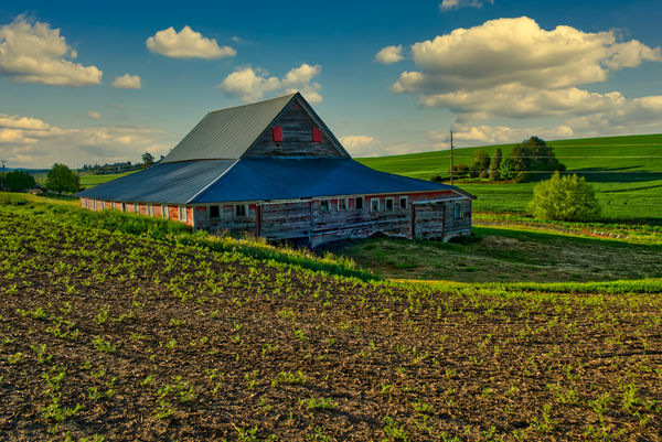
My previous post of this image appeared as though it was badly processed in nuclear waste. I hope this looks better. If I recall, it was taken early one morning in the spring just outside of Pullman, though it could also be Colfax.
Oct 22, 2020 13:22:48 #

Photobum wrote:
My previous post of this image appeared as though it was badly processed in nuclear waste. I hope this looks better. If I recall, it was taken early one morning in the spring just outside of Pullman, though it could also be Colfax.
Great shot! Appears to be pleasantly processed, if that is is a term. Luv the reds on the barn. Thanx for sharing.
Oct 22, 2020 14:45:35 #
Still a bit "hot" on the greens, but more than an acceptable image. Please stay well and keep up the good work.
Oct 22, 2020 14:45:55 #

You were clearly displeased with the earlier post, so the questions are:
Are you pleased with this version or less displeased?
Are the results for your enjoyment or others?
Does this image reflect how your mind recalls the scene?
I find the picture overall pleasing and well processed. That being said please allow me to make some observations that reflect my tastes and are only offered for thought.
First, it appears somewhat over saturated for my taste. Since it was taken early in the morning this may represent the colors you saw.
Second, I looked a different crop that I like better. I covered the lower portion beginning with the grass on the right and the left removing the building. I felt making it a panorama put the barn more on the rule of thirds.
Some will tell you to use editing software to remove the pole and wires, I am somewhat of a journalistic person so they don't bother me.
Take this for what little it's worth keeping what has value and trash the rest.
Bill
Oct 22, 2020 17:02:09 #
Oct 23, 2020 00:53:47 #

I'm pretty flexible when it comes to vivid. I think a shot should be what you want to make of it, but I like it when things either look like they really were, as you thought they were, or as you wanted them to be. I've even seen machine rendered 'paintings' and 'drawings' I really like. I also agree with leaving in the wires... their absence always makes me think they were removed anyway. One vote for, "I really like it"!
Oct 23, 2020 01:01:36 #
Oct 23, 2020 08:56:51 #

Actually, I liked the other shot better. This one looks a bit washed out but is probably due to the angle of the light..
Oct 23, 2020 10:28:32 #
Oct 23, 2020 18:31:27 #
Oct 23, 2020 20:05:29 #

If you want to reply, then register here. Registration is free and your account is created instantly, so you can post right away.