Did I overcook?
Oct 21, 2020 14:36:20 #
FreddB
Loc: PA - Delaware County
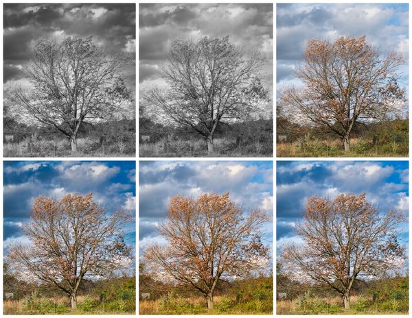
During a timeout at my grandson's soccer match, I was attracted to, or distracted by, this lonesome tree.
Then, while processing (Luminar 4), I couldn't stop and made 6 versions. IYHO (versus IMHO), which, if any,
would be the Goldilocks nominee? Feel free to bang up the original if you care to.
Then, while processing (Luminar 4), I couldn't stop and made 6 versions. IYHO (versus IMHO), which, if any,
would be the Goldilocks nominee? Feel free to bang up the original if you care to.

Oct 21, 2020 14:48:06 #

Oct 21, 2020 15:40:16 #

I commend your desire to avoid overcooking. The original photo isn't weak so it doesn't need much editing. Of your edits I would choose #3. My advice would be don't overdo sharpening or cropping. IMO the saturation is very slightly overdone except for the orange leaves on the tree, but that's the sort of thing we do to taste.
For my edit I gave it just a little contrast and some minor tweaking to the light levels (toning down highlights was the main one). I did some tweaking to the individual colours, except for orange which I boosted. As I said, the original wasn't weak so it didn't need much of anything.
If I had more time to give it I would clone out the fence posts. As it is I cloned out some minor distractions.
.
Oct 21, 2020 16:10:22 #

Hi Fredd, "LFM" here 😊
Images that have many small details and similar tones don't seem as successful in b&w in my opinion. That's a generalization, of course, but for me it applies to your results here.
In one of the "replacement skies" topics in main forum, someone pointed out that often the result competes for attention with the subject. I think that is happening with your more saturated, dramatic skies in your color results here.
You have a strong, interesting subject in your lone tree with its last few leaves hanging on. I like R.G.'s version for the softer, less noticeable clouds (it appears to be leaning 1 degree to the left, easy fix). I do love that you "couldn't stop," and made several versions! IMO editing for mood and story is a creative and fulfilling hobby.
Thanks for posting!
Oct 21, 2020 17:02:09 #
FreddB
Loc: PA - Delaware County
UTMike wrote:
I like your result. As LFM says, It is your photo.
Thanks for noticing, Mike.
Oct 21, 2020 17:13:53 #
FreddB
Loc: PA - Delaware County
R.G. wrote:
By #3, I assume (sorry, sometimes I just can't control the impulse) you mean upper right. That was my first shot - it just took off from there. Don't know how I missed the building. Thanks for your interest.I commend your desire to avoid overcooking. The o... (show quote)
Oct 21, 2020 17:28:35 #
FreddB
Loc: PA - Delaware County
Hi, Linda!
Appreciate your interest. I'm not a big fan of b&w, unless it's an old movie - The Third Man, Bogart movies. Thought I'd give it a shot; those dark clouds did get a tad much though. Hard to resist "lone" trees and old buildings, especially barns.
Anyway, thanks much for your comments.
Stay safe.
Appreciate your interest. I'm not a big fan of b&w, unless it's an old movie - The Third Man, Bogart movies. Thought I'd give it a shot; those dark clouds did get a tad much though. Hard to resist "lone" trees and old buildings, especially barns.
Anyway, thanks much for your comments.
Stay safe.
Oct 21, 2020 22:31:15 #
I had a close look at the leaves and they look like very natural colours, so I would leave them be. The shed on the left and the sign on the fence post would not be a great loss. For the B&W, the first (i.e. top left) appeals to me - so for once I seem to be in disagreement with LFM. Interesting how we all see things slightly differently. I guess that if all the Hogs were cogniscent of the fact, there would be fewer interminable 20-page topics!
Stay well and thanks for letting us view your recent pp rabbit-hole! I think we all go there sometimes. I have a daughter who is an illustrator - if there weren't deadlines, she would still be working on her first concepts 25 - years in!
Stay well and thanks for letting us view your recent pp rabbit-hole! I think we all go there sometimes. I have a daughter who is an illustrator - if there weren't deadlines, she would still be working on her first concepts 25 - years in!
Oct 22, 2020 09:28:19 #
FreddB
Loc: PA - Delaware County
Ourspolair wrote:
I had a close look at the leaves and they look lik... (show quote)
Thanks much for your interest, time and comments.
I usually try to avoid the rabbit hole, but the occasional tree or barn somehow grabs your hand and pulls you in.
I'm glad I'm not the only one who likes the b&w version; always did like dark skies and thunder storms.
Still don't know how I missed the shed.
Thanks again, and stay safe!
Oct 22, 2020 10:30:48 #

Oct 22, 2020 11:26:48 #
FreddB
Loc: PA - Delaware County
nanaval wrote:
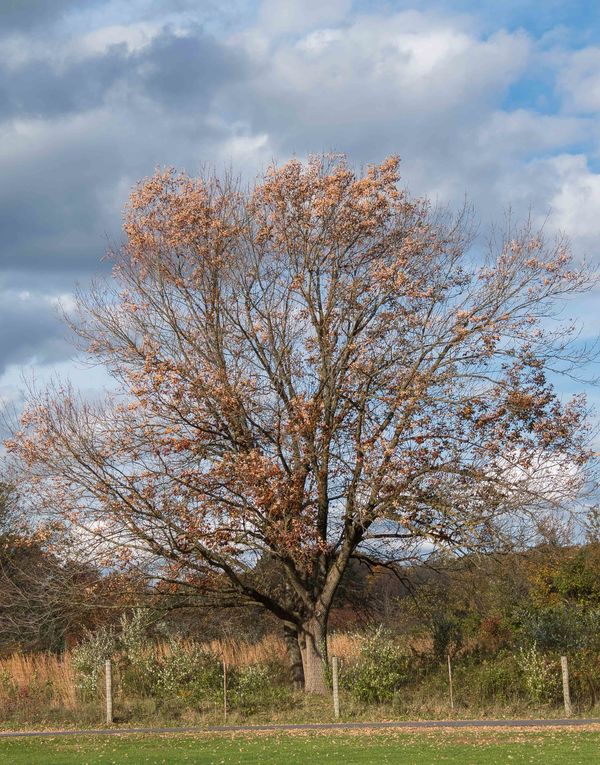
I like the middle one in the bottom row..
Thanks, nanaval
I think that's my favorite, too. That was stage 2, and then I got a little
carried away. I might go back and zap the shed - it seems to bother/
distract the others.
Oct 22, 2020 13:39:03 #
lnl
Loc: SWFL
I agree with nana all. I like the middle one, bottom row best. I think I’m drawn to color though.
Oct 22, 2020 17:22:38 #
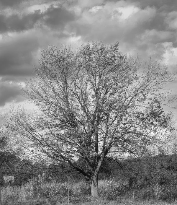
Ok, I'm going against the group again. I like the first B&W. A lonely tree standing against the approaching storm. I would really like to see it as a stand alone shot with download.
I like the first B&W. A lonely tree standing against the approaching storm. I would really like to see it as a stand alone shot with download.Oct 23, 2020 11:19:01 #
FreddB
Loc: PA - Delaware County
Curmudgeon wrote:
Ok, I'm going against the group again. I like the first B&W. A lonely tree standing against the approaching storm. I would really like to see it as a stand alone shot with download.
I like the first B&W. A lonely tree standing against the approaching storm. I would really like to see it as a stand alone shot with download.Here ya go!
Oct 23, 2020 12:09:44 #
FreddB wrote:
Here ya go!
Thank you, even more so now, I stand by my decision.
If you want to reply, then register here. Registration is free and your account is created instantly, so you can post right away.