Which One?
Oct 9, 2020 15:48:10 #
kenievans
Loc: Dallas
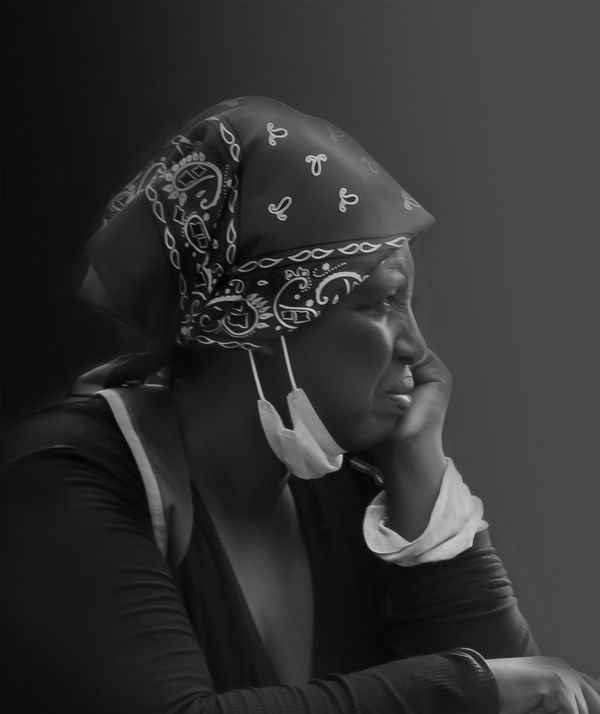
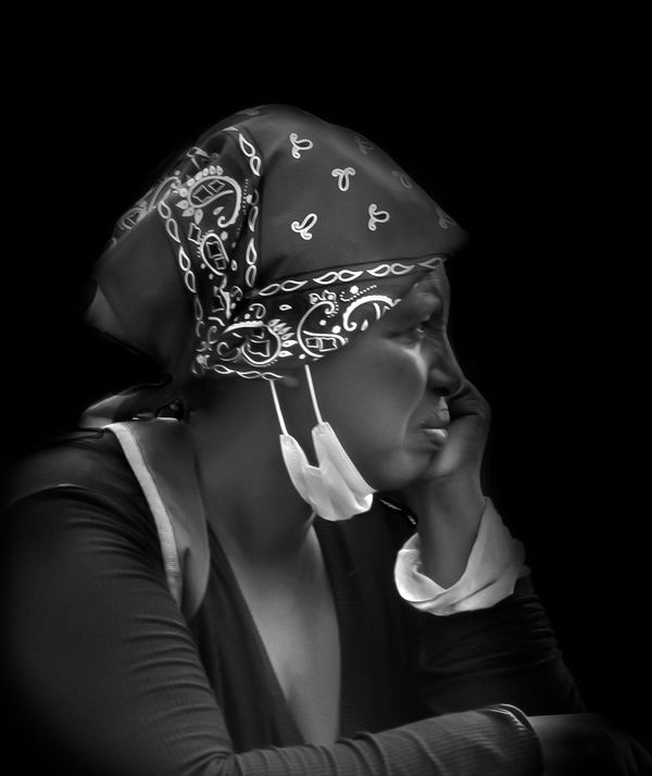
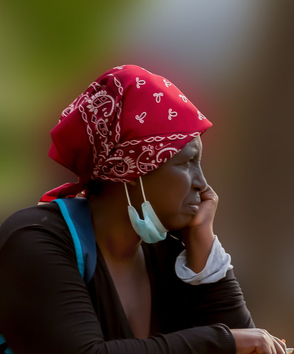
Which of these backgrounds looks better in this photo? I took a photo of this woman sitting in a park late one afternoon. She was looking in the direction of the sun. The original background was very distracting. I replaced it in one with a solid black background and with a gradient background that matched the direction of the light in the other. I included the original color photo for comparison.
Oct 9, 2020 15:55:56 #
Keni, I prefer the first one. The contrast is a bit too much in the second and the third one is just distracting. Though, a lot more could be done to increase the drama in the first or second one.
--Bob
--Bob
kenievans wrote:
Which of these backgrounds looks better in this photo? I took a photo of this woman sitting in a park late one afternoon. She was looking in the direction of the sun. The original background was very distracting. I replaced it in one with a solid black background and with a gradient background that matched the direction of the light in the other. I included the original color photo for comparison.
Oct 9, 2020 16:07:58 #
kenievans
Loc: Dallas
rmalarz wrote:
Keni, I prefer the first one. The contrast is a bit too much in the second and the third one is just distracting. Though, a lot more could be done to increase the drama in the first or second one.
--Bob
--Bob
Thank you I agree about the distraction in the original. What would you suggest for the first one? I want to enter this into my monthly club competition and if I can improve it that would be great.
Oct 9, 2020 16:54:16 #
Oct 9, 2020 21:05:05 #
Oct 9, 2020 22:17:54 #
Oct 9, 2020 22:19:45 #
kenievans
Loc: Dallas
mcmama wrote:
Number 1 just blends better to my eye.
Thanks. I agree but I still feel like it needs work. Just not sure which direction.
Oct 10, 2020 06:17:01 #
kenievans wrote:
Which of these backgrounds looks better in this photo? I took a photo of this woman sitting in a park late one afternoon. She was looking in the direction of the sun. The original background was very distracting. I replaced it in one with a solid black background and with a gradient background that matched the direction of the light in the other. I included the original color photo for comparison.
I really like this image Keni (although it's a little blurry?) - the colours are an attractive part of the whole, so I simply selected subject (and could have refined that slightly, but didn't), inverted the selection and added a Gaussian blur to taste. If it were mine I'd reduce the highlight in the background, but its OK. What do you think of this option?
Oct 10, 2020 08:06:22 #
Oct 10, 2020 08:06:33 #
Oct 10, 2020 09:04:49 #
kenievans wrote:
Which of these backgrounds looks better in this photo? I took a photo of this woman sitting in a park late one afternoon. She was looking in the direction of the sun. The original background was very distracting. I replaced it in one with a solid black background and with a gradient background that matched the direction of the light in the other. I included the original color photo for comparison.
I like #2. I like the bit of contrast
. I like a crispy looking B&W😎
Oct 10, 2020 10:41:44 #
kenievans wrote:
Which of these backgrounds looks better in this photo? .
I like #2. I also like the amount of contrast in #2.
Oct 10, 2020 16:20:20 #
Oct 11, 2020 13:24:12 #
kenievans
Loc: Dallas
magnetoman wrote:
I really like this image Keni (although it's a little blurry?) - the colours are an attractive part of the whole, so I simply selected subject (and could have refined that slightly, but didn't), inverted the selection and added a Gaussian blur to taste. If it were mine I'd reduce the highlight in the background, but its OK. What do you think of this option?
I like your version very much. It shows what captured my attention about her in the first place. I thought she was beautiful with a great skin color and such high cheekbones. Its a little blurry from camera shake. I didn't want to be obvious about my picture taking so I didn't use a tripod. I had gotten hollered at earlier in the day because a group of homeless folks thought I was trying to take their picture. I was actually just trying to shoot a specific angle of a building.
Oct 11, 2020 14:23:25 #
kenievans wrote:
I like your version very much. It shows what captured my attention about her in the first place. I thought she was beautiful with a great skin color and such high cheekbones. Its a little blurry from camera shake. I didn't want to be obvious about my picture taking so I didn't use a tripod. I had gotten hollered at earlier in the day because a group of homeless folks thought I was trying to take their picture. I was actually just trying to shoot a specific angle of a building.
Yes, ‘street’ can be problematical! For the record, of your b&w versions, I prefer the slightly more contrasty version. I would certainly have tried to get this shot.
If you want to reply, then register here. Registration is free and your account is created instantly, so you can post right away.
