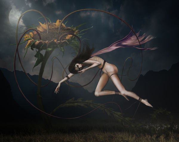
Entrapment - A Mix of Photos and Paint
Sep 30, 2020 06:47:48 #

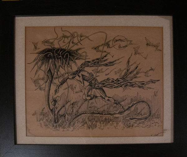
This isn't an original idea, its based on a pen and ink drawing that purchased a while back. Your critique is welcomed.
Oct 1, 2020 08:05:51 #

The results of your composites are always spot on. Can you post the image that led you to come up with your excellent composite.
Oct 1, 2020 09:34:32 #

NJFrank wrote:
The results of your composites are always spot on. Can you post the image that led you to come up with your excellent composite?
I fully agree regarding the composite. What would I play with? The sunflower is the dominating beast capturing the young maiden so I would kick up the yellow a bit to show strength ... but that is a may, maybe, perhaps comment.
This is one of those photos that you put in a projector, project on a canvas, then lay on the oils or acrylics and sell as a painting for buku money.
------------------------
I have verbally used buku but did not know how to spell it and did not know the origin: "Used by Vietnamese, picked up by the Veterans of the Vietnam War. Means "a lot of" or "many." derived from the French word "beaucoup" meaning 'much.'' Urban dictionary
Oct 1, 2020 11:07:01 #
The background and mood is great. So is the flower. Not crazy about the figure.
Oct 1, 2020 12:28:08 #
Oct 1, 2020 12:45:29 #
Wonderful. I agree with Fotoartist about mood, background and the flower but without the figure the image has no reason for existing.
Oct 1, 2020 15:49:36 #
NJFrank wrote:
The results of your composites are always spot on. Can you post the image that led you to come up with your excellent composite.
Hi Frank, thanks for your interest and kind remarks. Here's what went on...it started as an 'I wonder if I can' trial composite, having studied the pen and ink drawing for some time. The sunflower needed to be a better shot without doubt, I just didn't have one. Elle is a real pro, one of the best I've worked with, it was just a shame she had too many clothes on! The background is just a lovely place in our Lake District. There is also a foreground grass image and a shot of the cyclamen, plus a few filters. The rest (most of the figure, feelers, the bottom leaf thing) are all painted selections. In all just on 100 layers in 12 groups, not including the component parts of the figure as I flattened and dumped the junk to save file space. I'd like to have another go at it some time - maybe if I get a good sunflower shot next year.
The Inspiration
(Download)
Elle in 'Broken Doll' pose
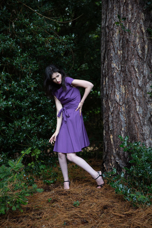
(Download)
A very second rate sunflower shot!
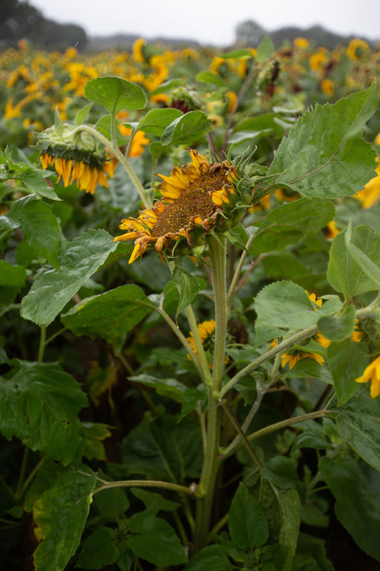
(Download)
Late evening on a pass in Cumbria
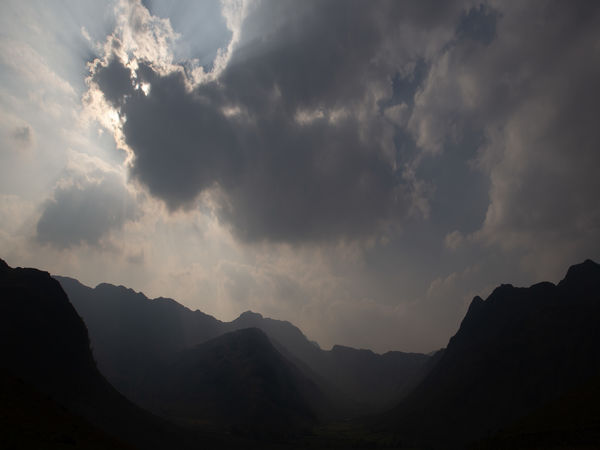
(Download)
Oct 1, 2020 15:52:39 #
dpullum wrote:
I fully agree regarding the composite. What would... (show quote)
I can only say 'merci buku' Don! I agree, the sunflower needs a kick in the pants - see my response to Frank.
Oct 1, 2020 15:53:51 #
Fotoartist wrote:
The background and mood is great. So is the flower. Not crazy about the figure.
Yes, I get that - my wife feels the same - I told her, at seventy-six I'm working from memory!
Oct 1, 2020 15:54:27 #
sippyjug104 wrote:
I like it. Very thought provoking.
Thanks sippy, glad you like it.
Oct 1, 2020 15:55:49 #
Curmudgeon wrote:
Wonderful. I agree with Fotoartist about mood, background and the flower but without the figure the image has no reason for existing.
Thanks Curmudgeon - I think Fotoartist is referring to the quality of the figure, not the fact it's there. Can't disagree with that.
Oct 1, 2020 16:26:31 #
Inspiration can come from anywhere. In this case the pen and ink was your
Inspiration. I applaud you for your very fine effort. It seems the sunflower is the bone of contention for some. That is what the internet is for. To find an appropriate flower. Well at least for me, that is what I would fall back on, if I had none in my arsenal. A 100 layers in 12 groups to get this final image is something to be proud of.
I don’t think if I possessed that pen and ink I would have been inspired by it. So my hat is off to you.
Keep producing, I am seldom disappointed with your work.
Oct 1, 2020 16:48:02 #
couch coyote
Loc: northern Illinois
A very good effort, the components work especially well together!
If you have 100 layers, you've put massive amounts of time and effort into this. Kudos to you!! I want to make a couple suggestions, but please don't think I'm discounting all you have achieved.
Regarding the figure, look again at little sections of the inspiration artwork. First, the fingers. If they are distorted and snaky, the thumbs need to be distorted similarly. Second, the left arm. Notice how, in the drawing, there's a curve to the bicep, a curve where the forearm intersects the elbow area, and wedge-shaped shadows on the back of the arm. Your arm needs more curves. For the hip/rear area, perhaps look at some Old Masters drawings of nudes. A figure so emaciated that her ribs show would have a flatter rear, and maybe a hollow in the hip joint.
Again - I mean to be helpful, not critical. :)
Oct 1, 2020 17:19:57 #
NJFrank wrote:
Inspiration can come from anywhere. In this case t... (show quote)
Thanks again Frank - I am lumbered with a ‘thing’ about using my own images. I just don’t enjoy using others, but I do understand what you’re saying, it would move things on for sure.
Oct 1, 2020 17:22:27 #
couch coyote wrote:
A very good effort, the components work especially... (show quote)
Your critique is welcome and I thank you for it - I shall take it on board. This is what this section is for, helping each other.
If you want to reply, then register here. Registration is free and your account is created instantly, so you can post right away.