First Portrait Opportunity
Sep 27, 2012 22:00:42 #

I would really appreciate unvarnished comments on this set. It is my first "serious" session. Please cover the works: composition, focus, color (color blind I am!!!), etc. I am looking for BOTH strengths and weaknesses. Thank you all! Arthur.
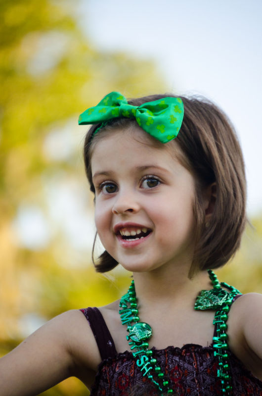
#1
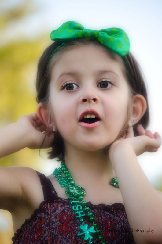
#2
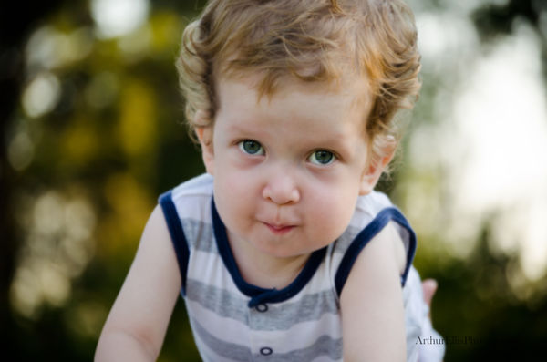
#3
Sep 27, 2012 23:24:23 #

These are very nice. Your use of a shallow DOF is excellent. Exposure is right on .
With number two, you might be a little bit TOO low as you are shooting up her nose. The good thing is you were down on her level, but just a hair too low.
Cropping is good. I see SO many here that are cropped way too tight and the head needs to have some support - so getting the shoulders in is very good.
In #3, there is what is likely an adult thumb sticking up on his back - clone that out. His expression is wonderful. Cropping off the top of his head is fine with me. The trick is to lop off enough to make it look intentional instead of just clipping a little - THAT looks like sloppy framing.
It appears these were taken outside in open shade and this is an issue with all images taken in that environment - the lighting is very flat. That means there are no shadows and consequently no dimension to the faces. These do not look like formal poses, so addressing that is not practical, but if you DO position people outside for images, get a piece of black foam core or mat board and have someone hold it OVER the head. This will block the toplight and then the light that hits the subject will come from the side - a more flattering light.
Sep 27, 2012 23:25:05 #

Hi Arthur: First time, good job. It looks like you captured the spirit of the children, which is good. I do like that you blurred the background. A few observations, don't crop at the joints and avoid cropped the top of the baby's head. Always make sure the eyes are sharp. Things to use a reflector and fill flash, which you may or may not have used. Maybe if you wanted to use props, ball is fun for a young child. I do like the necklace on the little girl, shows her personality. By the way, my favorite pic is the first one. I like to use a telephoto lens, flash and reflector with a shallow depth of field for my photos of people. Keep practicing, you are off to a good start. Cheryl
Sep 27, 2012 23:47:20 #
O.k., here goes: The kids are cute. All kids are cute. The photos are all soft and not very sharp. I am speaking mainly of the 2nd one. In the first one her necklace is nice and crisp. I wish you made these downloadable so I could see her eyes better. I find the 1st photo interesting because I think you got away with one there. What I mean is the background white is on the verge of being blown out yet her dress and shadows are dark. All sorts of things could have gone wrong but did not. However, if you were to reduce the shadows a bit, this would lighten her dress also which would be good. Notice how her right arm is perfectly centered at the lower left corner? This is a good thing and adds to the balance. You also have her cropped pretty good left to right. You are tighter at the back of her head and you allowed for some lead room in the direction she is facing. I like that. You could crop a lot closer to the top of her head. This will get rid of a lot of the distracting white in the background. If you had a reflector on the ground facing up, you could get rid of a lot of the shadows under her armpits and her neck. Other than that, it is a very nice photo.
I do like the softness of the 2nd photo. The lighting is very good but that white in the background almost kills it. You got lucky there. Her right arm going out of the photo and coming back in is a little funky but if you widened the photo out to show the whole arm, I think would mess things up. It is a good thing that you kept the crop tight.
The 3rd photo is cropped like a snap shot. Both sides need to be tighter. Again the white in the background is a killer. I also see a thumb sticking out of his back. Easy to get rid of. You could also have softened the bags under his eyes. From here it does look like you focused on his eyes. This is what you need to do and you did it. With a young one like this, it is hard to get the perfect pose but you did good.
But I saved the best for last. Your DOF is almost dead on and the distance of the subject to the background is excellent. The blur is perfect. Did you notice that I did not use the word, "Bokah"? I hate that word. It is so misused. I also think all of the poses are very good because they are natural and not contrived.
If CaptainC sees this, he will give you a more defined critique because he is a pro and this is how he makes his living. I am just an amateur who knows what to look for.
I am curious; what lens did you use? It seems to lack that certain "punch".
Sep 27, 2012 23:50:50 #

acellis wrote:
I would really appreciate unvarnished comments on this set. It is my first "serious" session. Please cover the works: composition, focus, color (color blind I am!!!), etc. I am looking for BOTH strengths and weaknesses. Thank you all! Arthur.
Not being much of a portrait photographer means I can offer no advice, and I see you have already received advice from the Captain.
My novice eyes think these are very good photos and the subjects are adorable. 8-)
Sep 28, 2012 09:43:16 #
I see the captain mentioned the "thumb" before I could. I was going to ask if he had a tail?
Nice job for outdoor open shade photos. I like your composition as well. Keep up the good work.
Nice job for outdoor open shade photos. I like your composition as well. Keep up the good work.
Sep 28, 2012 20:19:00 #
Thank you all for your thoughtful comments. I looked at #3 i can't tell you how many times and missed the thumb!! Details: Nikon d5100, 55-200 lense @ approximately 165 mm, f=4.8 iso = 400 & s=200, matrix metering, wb=shade.
Sep 29, 2012 03:27:16 #
acellis wrote:
I would really appreciate unvarnished comments on this set. It is my first "serious" session. Please cover the works: composition, focus, color (color blind I am!!!), etc. I am looking for BOTH strengths and weaknesses. Thank you all! Arthur.
beautiful kids
If you want to reply, then register here. Registration is free and your account is created instantly, so you can post right away.