Pleasing to the eye --comparison
Sep 15, 2020 07:26:41 #

Sep 15, 2020 07:28:30 #
Sep 15, 2020 07:31:51 #
Sep 15, 2020 07:38:48 #
Sep 15, 2020 07:45:50 #
Sep 15, 2020 07:54:34 #

Sep 15, 2020 08:00:15 #

Sep 15, 2020 08:01:33 #
Sep 15, 2020 08:03:23 #

Sep 15, 2020 08:07:29 #
Sep 15, 2020 08:14:02 #
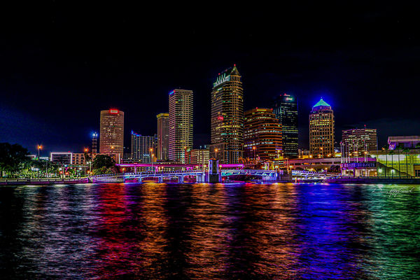
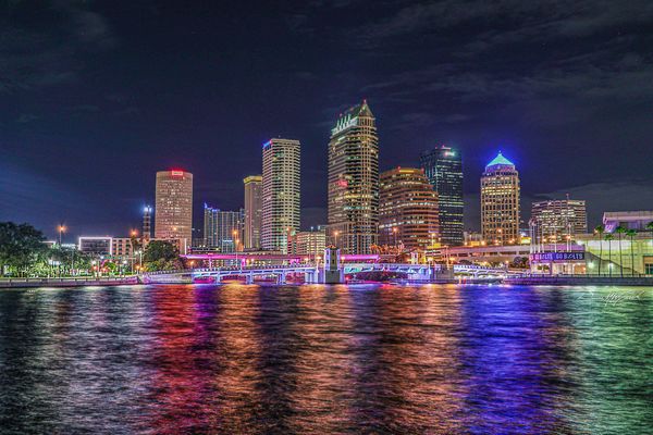
1, better contrast and better color. The emphasis on the pattern of buildings and reflections is what draws the eye.
Sep 15, 2020 09:56:51 #
I think #1. The sky in #2 is a distraction. Personally I would reduce the saturation a bit and reduce the red channel to adjust for the apparent building colours.
Sep 15, 2020 09:58:43 #


Sep 15, 2020 11:44:04 #

#2. The first one is a little too dark so you lose some of the detail. Also note that the eye is drawn to brighter areas so the brighter photo will draw the eye to it. Nice photo!!
JUST MY OPINION!!!
Dodie
JUST MY OPINION!!!
Dodie
Sep 15, 2020 11:49:22 #
leftj
Loc: Texas
luvmypets wrote:
#2. The first one is a little too dark so you lose some of the detail. Also note that the eye is drawn to brighter areas so the brighter photo will draw the eye to it. Nice photo!!
JUST MY OPINION!!!
Dodie
JUST MY OPINION!!!
Dodie
#1 is too HDR.
If you want to reply, then register here. Registration is free and your account is created instantly, so you can post right away.