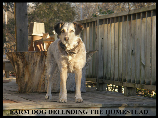
FARM DOG IMAGES COMPARED
Aug 22, 2020 10:01:43 #
Shooter41
Loc: Wichita, KS
After taking a shot of a farm dog more than willing to protect her family's homestead when a stranger approached, I worked on it in Photoshop and can't decide which version is best. Would several of you take a look at the two versions and help me decide which is best? Thank you for your expertise and suggestions.
Shooter41 I darkened her nose where it was washed out and lightened the cat in the background. Better?
Shooter41 I darkened her nose where it was washed out and lightened the cat in the background. Better?


Aug 22, 2020 10:04:09 #
Aug 22, 2020 10:04:10 #
Aug 22, 2020 10:05:54 #

Somewhere between the two, but closer to the first, the brighter version. The top seems to need a bit more black, or lower exposure, and / or more contrast. The second overshoots all these possible minor adjustments. Is the face overexposed, maybe some details can be recovered by lowering specifically the highlights?
Aug 22, 2020 10:06:04 #
Shooter41
Loc: Wichita, KS
I agree. I thought that darkening it would make it more dramatic, but instead it got rid of the interesting porch all around her. Thanks for the tip.
Aug 22, 2020 10:06:29 #

Either picture wold be great if you removed the white post coming out of it's head. My personal preference is #1 due to the greater amount of light.
Aug 22, 2020 10:07:00 #
Aug 22, 2020 10:09:19 #
Shooter41
Loc: Wichita, KS
I will try again starting with the original lighter version to get back some detail and then just slightly darker rather than "pedal to the metal." Thank you for your excellent suggestion.
Aug 22, 2020 10:11:56 #
Shooter41
Loc: Wichita, KS
Wow! Somehow I didn't even notice the post coming out of her head. I'll work on it in Photoshop CS4, which is my old version I purchased outright years ago, to see if I can remove the post. Thanks for sharing your expertise. Shooter 41
Aug 22, 2020 10:18:49 #
Shooter41
Loc: Wichita, KS
Does the farm dog look better now with the post removed from her head, using the lighter version to gain back some over exposure on the left side of her nose?
Aug 22, 2020 10:19:57 #
Aug 22, 2020 10:21:13 #
IDguy
Loc: Idaho
Shooter41 wrote:
After taking a shot of a farm dog more than willing to protect her family's homestead when a stranger approached, I worked on it in Photoshop and can't decide which version is best. Would several of you take a look at the two versions and help me decide which is best? Thank you for your expertise and suggestions.
Shooter41
Shooter41
2nd much better. Lighting emphasizes subject.
Aug 22, 2020 10:22:15 #
IDguy
Loc: Idaho
Shooter41 wrote:
I agree. I thought that darkening it would make it more dramatic, but instead it got rid of the interesting porch all around her. Thanks for the tip.
Do you want people looking at the porch?
Aug 22, 2020 10:23:14 #
IDguy
Loc: Idaho
Shooter41 wrote:
Wow! Somehow I didn't even notice the post coming out of her head. I'll work on it in Photoshop CS4, which is my old version I purchased outright years ago, to see if I can remove the post. Thanks for sharing your expertise. Shooter 41
Easy to clone out.
Aug 22, 2020 10:25:20 #
Shooter41
Loc: Wichita, KS
"Lucy's" nose was getting snow white and with auto exposure on, the left side of her nose was completely washed out. I tried burning it in with Photoshop but it just isn't there no matter what I do. (If my camera had been set with a lower ISO, I probably would have been able to keep it from washing out.) Any suggestions other than shooting in "manual" next time? Thanks!
If you want to reply, then register here. Registration is free and your account is created instantly, so you can post right away.