Too much for B/W?
Aug 18, 2020 15:11:41 #

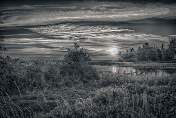
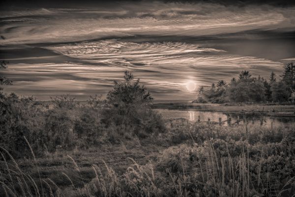
Still learning the best composition/subject matter for a decent B/W photo. Is there too much going on in the landscape for B/W? Is it preferable to keep it purely B/W as in number 1 or add a bit of yellow as in number 2?
Thanks for any tips!
Thanks for any tips!
Aug 18, 2020 15:15:38 #

Not really. However, the image is a bit flat. A lot could be done to the first one to render a knock out black and white photograph.
--Bob
--Bob
Golden Rule wrote:
Still learning the best composition/subject matter for a decent B/W photo. Is there too much going on in the landscape for B/W? Is it preferable to keep it purely B/W as in number 1 or add a bit of yellow as in number 2?
Thanks for any tips!
Thanks for any tips!
Aug 18, 2020 15:22:15 #

The answers to both your questions are going to be very subjective. But to Bob's point, I also feel there is much that can be done both with tonal contrast and selective dodge/burn in your composition to help separate elements and direct our eye through the frame.
I personally like tint and toning to many monochrome images, but more in the selenium or blue areas (there's another I can't recall this second) rather than sepia, pink or yellow. And I personally like a less busy composition than you've provided. The main drawback for me here is the amount of "stuff" that's all pretty much the same physical size and tone.
UHH user Graham Smith is a master of tonal range and light/shadows. Download this pic and study the foreground grass: https://www.uglyhedgehog.com/t-650178-1.html
.
Aug 18, 2020 16:19:13 #

Linda From Maine wrote:
The answers to both your questions are going to be... (show quote)
I think that the tint you have in mind is platinum Linda. I steer well clear of sepia

Aug 18, 2020 17:00:14 #
Graham Smith wrote:
Platinum, yes. Thanks Graham!I think that the tint you have in mind is platinum Linda. I steer well clear of sepia
.
Aug 18, 2020 19:20:34 #
rmalarz wrote:
Not really. However, the image is a bit flat. A lot could be done to the first one to render a knock out black and white photograph.
--Bob
--Bob
Do you have advice to start me out on trying to get some depth in this image? Thanks!
Aug 18, 2020 19:26:38 #
Linda From Maine wrote:
The answers to both your questions are going to be... (show quote)
Thanks for the example to study. Yes, it does need some kind of direction for the eye to follow out to North Bay in Grays Harbor.
Aug 19, 2020 02:12:54 #

Golden Rule wrote:
Still learning the best composition/subject matter for a decent B/W photo. Is there too much going on in the landscape for B/W? Is it preferable to keep it purely B/W as in number 1 or add a bit of yellow as in number 2?
Thanks for any tips!
Thanks for any tips!
Quite a lot of the frame consists of foreground but I find there's not much of interest there. You can't add extra content but you could increase the visual interest by increasing the contrast a bit in that area, in particular the part between the viewer and the bright part of the sky. The tall wispy grass looks good but there's also a relatively large area of the foreground that just looks like empty space, and it needs something like more contrast to justify its inclusion in the composition. If you want to add to the sense of depth you could limit the extra contrast to a broad channel that leads from the immediate foreground to the bright part of the sky with the sun in it. Extra vignetting (especially on the left) would also help with the sense of depth.
Aug 19, 2020 08:09:17 #

Go with what rmalarz tells you, I'm a great fan of his B&W. For myself I find it very confusing as there is little depth to the contrast. Forget the yellow tint, it does nothing for it in my opinion.
Aug 19, 2020 08:58:33 #

It has been already discussed but I will mention it once again. Tinting a b&w photograph is very subjective. In my case I like to add a little bit of warmth to my images.
Now lets talk about your first image. Indeed the image is pretty flat. Contrast is something that enhances ANY b&w image. Something that many photographers here tend to ignore is how useful dodging and burning-in could make for a better monochrome image. Those were and continues to be useful tools in the digital era as they were in the darkroom. I think that the words "black and white" say it all, the bright and the dark areas need emphasis.
Now lets talk about your first image. Indeed the image is pretty flat. Contrast is something that enhances ANY b&w image. Something that many photographers here tend to ignore is how useful dodging and burning-in could make for a better monochrome image. Those were and continues to be useful tools in the digital era as they were in the darkroom. I think that the words "black and white" say it all, the bright and the dark areas need emphasis.
Aug 19, 2020 09:19:16 #
Golden Rule wrote:
Do you have advice to start me out on trying to get some depth in this image? Thanks!
I'll jump in here, if I may. Without knowing what software you used to convert to B/W I will suggest a simple starting point. In either PS or Lr use the Convert to Black and White, not Convert to Grey Scale, the use the Colour Mix sliders to lighten or darken certain hues. Experimentation works wonders but be subtle. Also, in LR the Clarity slider is great but use sparingly. Adjusting the clarity will bring out cloud detail in flat grey skies.
Your next best friend is probably dodging and burning to introduce localised contrast.
Graham
Aug 19, 2020 10:33:49 #
As mentioned, tints are subjective. They can be either warm or cool, but a third possibility is to use split toning to give it a mixture of warm and cool, which not only adds contrast but also gives a more balanced result.
Aug 19, 2020 18:06:57 #
Forgive me for not getting back sooner. I opened up LR Classic this morning and no catalogue?! I have my computer guy coming over Friday to get my photos back from wherever the latest backup is located. Thank you all for your advice and tips on what I can try after I get the photos back. I'm not too worried because they are on my PC plus a backup plus Carbonite. I can't wait to try some of the PP you have suggested. Thanks!
Aug 19, 2020 21:13:24 #

If you want to reply, then register here. Registration is free and your account is created instantly, so you can post right away.