Black & white abandoned school
Aug 12, 2020 08:06:49 #

Aug 12, 2020 08:25:12 #
Aug 12, 2020 08:56:20 #
StevenG
Loc: Long Island, NY
Photobum wrote:
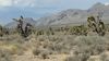
Several of those who commented on the colored photo of this abandoned school requested to see it in black & white. This rendition required a bit of dodging & burning to separate some of the grey tones and the clouds look much more threatening. Anyway, I think it looks pleasing as a b&w - sort of. Hope you do too. Ken
Very nicely done!
Aug 12, 2020 09:00:21 #

Aug 12, 2020 09:25:34 #

Aug 12, 2020 09:41:57 #

traderjohn wrote:
I don't remember your colored version. This is very nice. When you make your adjustments do you use a a Wacom tablet??
No, I don't use a Wacom. Just a simple mouse. I have a Wacom but haven't found the knack of using it.
Aug 12, 2020 10:02:07 #
Aug 12, 2020 10:11:05 #

Aug 12, 2020 10:18:22 #

Photobum wrote:
Several of those who commented on the colored photo of this abandoned school requested to see it in black & white. This rendition required a bit of dodging & burning to separate some of the grey tones and the clouds look much more threatening. Anyway, I think it looks pleasing as a b&w - sort of. Hope you do too. Ken
Really nice!
Aug 12, 2020 11:05:26 #

Aug 12, 2020 11:32:35 #
Aug 12, 2020 12:04:48 #

Photobum wrote:
Several of those who commented on the colored photo of this abandoned school requested to see it in black & white. This rendition required a bit of dodging & burning to separate some of the grey tones and the clouds look much more threatening. Anyway, I think it looks pleasing as a b&w - sort of. Hope you do too. Ken
absolutely a WINNER in my book sir........wonderful work Ken.

Aug 12, 2020 12:35:40 #
Extremely well-done image. The “dodging and burning” adds quite a bit. I almost never say whether I think someone else’s work should be “this or that.” My opinion is just that, MY opinion. All of yours may be different.
What I think would finish or complete this fine photo is some wider perspective, showing it’s alone, moody character. Now, I am aware there could be tourist traps next door that would render this photo useless, but if not, some slight bit more of background might further strengthen this.
I hesitated to say anything, but liked it so much I just hadda make a suggestion.
Aug 12, 2020 12:53:51 #

Rather nice work, Photobum.
--Bob
--Bob
Photobum wrote:
Several of those who commented on the colored photo of this abandoned school requested to see it in black & white. This rendition required a bit of dodging & burning to separate some of the grey tones and the clouds look much more threatening. Anyway, I think it looks pleasing as a b&w - sort of. Hope you do too. Ken
Aug 12, 2020 12:55:00 #

If you want to reply, then register here. Registration is free and your account is created instantly, so you can post right away.