Edited flowers
Aug 6, 2020 12:48:00 #

When reviewing shots to decide on flower posts of my wife's garden, I edited some shots beyond my normal parameters. I am posting these shots with a request for your comments about them and any suggestions that you may have on post-processing.
Thanks for looking and, as always, downloads give the best view.
Thanks for looking and, as always, downloads give the best view.
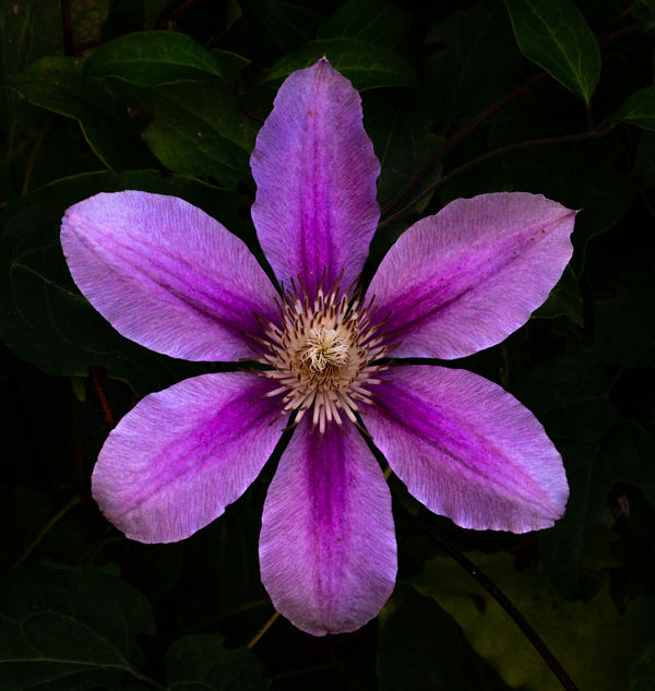
1
(Download)
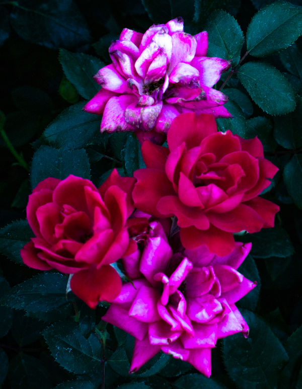
2
(Download)
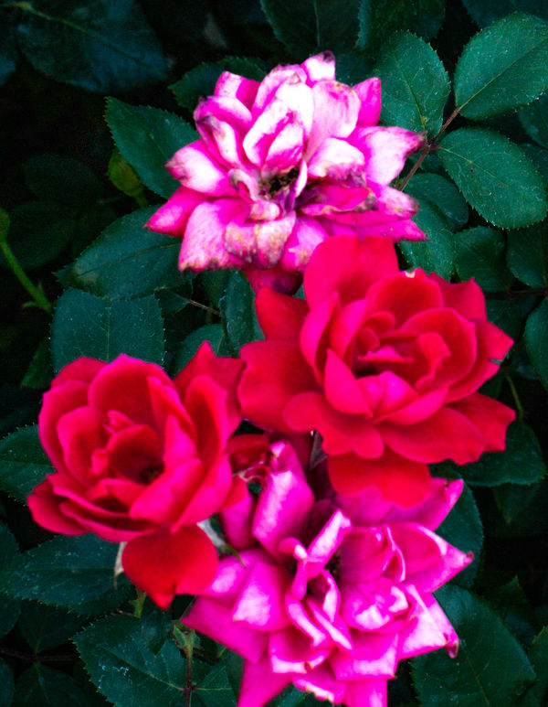
3
(Download)
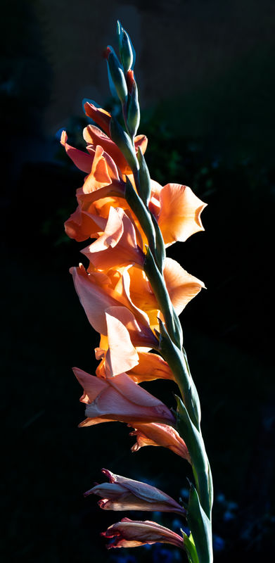
4
(Download)
5
(Download)
6
(Download)
7
(Download)
8 e
(Download)
9
(Download)
10
(Download)
Aug 6, 2020 12:52:48 #

Aug 6, 2020 12:56:27 #

I didn't see the originals, so I guess I like these better. 
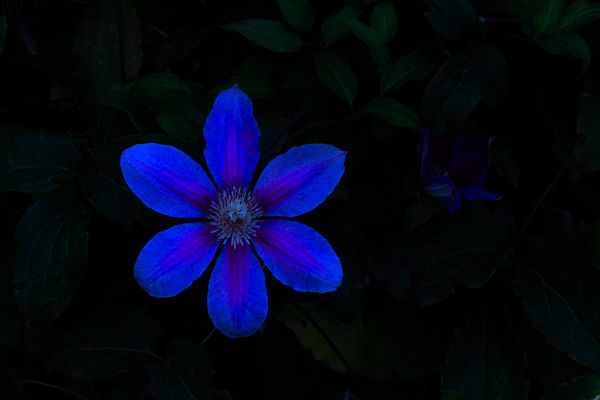
For the first, my favorite, the 'whisper' of the background is great. Maybe make the background still a bit darker, particularly the brightness of the leaf in the upper right corner. The focus on the center is superb!
The 3rd seems a duplicate of the 2nd and should have been skipped.
Can you create some more space around the two flower in the frame that is 7. I like to fill the frame, but they seem crowded (?) near the edge, maybe on the left more than the right? Or maybe too, create more space between the flowers?
Aug 6, 2020 13:01:02 #
Aug 6, 2020 13:03:27 #

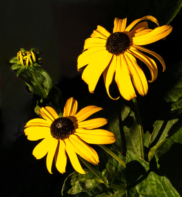
1. The square aspect and the straight-on (down?) pov is very attractive to me, along with the dark.
#2 and #3 are difficult to look at for the intensity of colors in areas that appear out of focus.
4. For me it's all about the light and the tall composition. Love it.
5. Another engaging composition and lighting.
6. Very pretty, lovely composition.
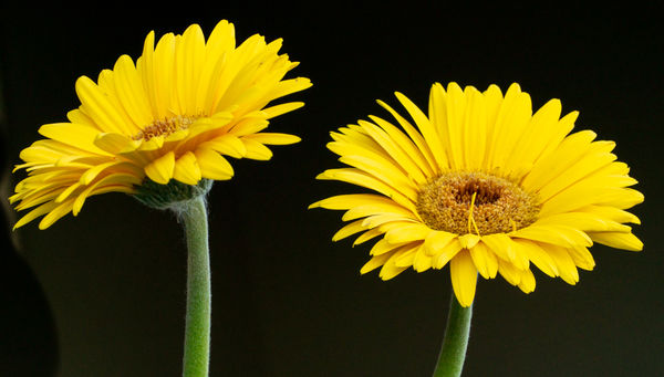
7. Sassy and fun, and a nice change from the rigid thinking of "odd-numbered is best!"
8. gives me a similar feeling as the earlier negatives: too strong on that magenta or whatever pink it is. Distracting from the subject.
9. Too dark for me, but that could very well be that I'm viewing in a very bright room at the moment.
10. Out of focus, so I am not enjoying the look. Curious if you've thought to take it further to softness, or are we in baby steps right now?
#2 and #3 are difficult to look at for the intensity of colors in areas that appear out of focus.
4. For me it's all about the light and the tall composition. Love it.
5. Another engaging composition and lighting.
6. Very pretty, lovely composition.
7. Sassy and fun, and a nice change from the rigid thinking of "odd-numbered is best!"
8. gives me a similar feeling as the earlier negatives: too strong on that magenta or whatever pink it is. Distracting from the subject.
9. Too dark for me, but that could very well be that I'm viewing in a very bright room at the moment.
10. Out of focus, so I am not enjoying the look. Curious if you've thought to take it further to softness, or are we in baby steps right now?
Aug 6, 2020 13:05:52 #
Aug 6, 2020 13:08:33 #
CHG_CANON wrote:
I didn't see the originals, so I guess I like thes... (show quote)
Paul, thanks for taking the time to look and your instructive comments. These are the "creative" edits when I put together this post (https://www.uglyhedgehog.com/t-659115-1.html)
Aug 6, 2020 13:09:00 #
MSW wrote:
nice set. I like 3, 4, 5 & 9
I appreciate you taking the time to look and comment.
Aug 6, 2020 13:11:07 #
Linda From Maine wrote:
1. The square aspect and the straight-on (down?) p... (show quote)
Linda, thanks for taking the time to provide your reactions. It is feedback that will help me sharpen my vision of what I should be presenting. You are correct that the last one was a step toward "artistic" that did not make it. BTW, liked the silhouettes.
Aug 6, 2020 13:11:33 #
UTMike wrote:
Paul, thanks for taking the time to look and your instructive comments. These are the "creative" edits when I put together this post (https://www.uglyhedgehog.com/t-659115-1.html)
I like them both, maybe the more natural views better, except for #1 here.
Aug 6, 2020 13:48:03 #
CHG_CANON wrote:
I like them both, maybe the more natural views better, except for #1 here.
Thanks, Paul, loved the film set today.
Aug 6, 2020 13:52:45 #
UTMike wrote:
Thanks, Paul, loved the film set today.
I've been doing a ton of flowers this summer, experimenting with views, where to focus, trying to achieve a natural saturation and corrected WB, etc. It's work.

Aug 6, 2020 15:19:35 #

I love 7 and 8. The backgrounds are simple and the flowers are bright. I really like dark backgrounds to simplify flower shots - black or with just a hint of the leaves and stems or alternatively, an added but non-distracting background as in #8.
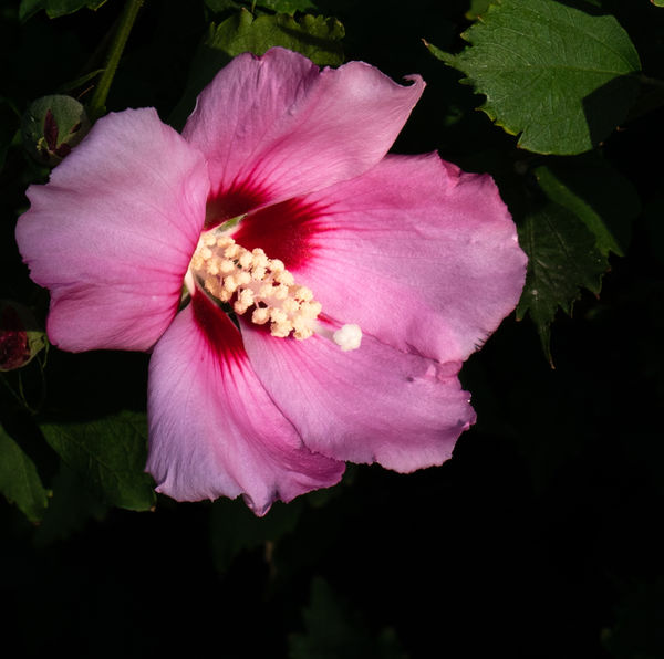
Some of the flowers are darker than I would prefer. The hibiscus looks like it may have a vignette to darken the background. I do that frequently but mask the vignette off the flower itself to help it stand out from the background.
I hope you were really looking for opinions because I like these very much just as they are. So much is just personal preference. Your wife is quite the gardener!
Aug 6, 2020 15:27:25 #
Cwilson341 wrote:
I love 7 and 8. The backgrounds are simple and th... (show quote)
Carol, I so appreciate the time you took in your reply. I know that my wife and I differ on editing issues and it always helps me to not only get "likes" but "whys".
Aug 6, 2020 15:45:06 #
If you want to reply, then register here. Registration is free and your account is created instantly, so you can post right away.