Two takes on
Jun 20, 2020 18:22:32 #

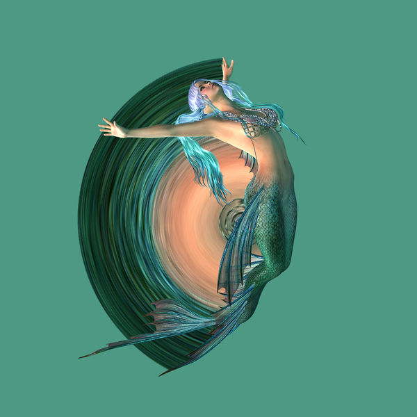
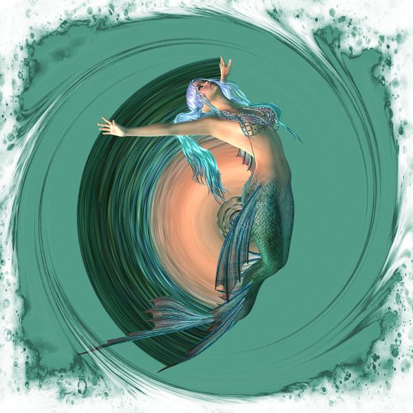
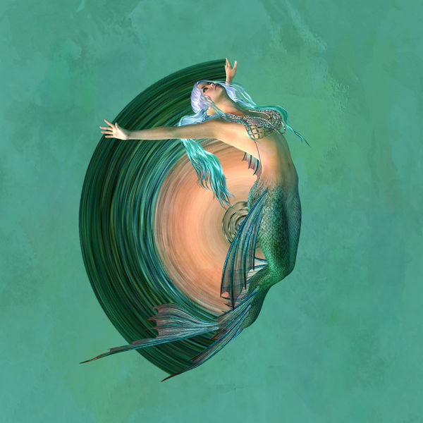
one composite. I put two different filters on from S.P.E.
Jun 20, 2020 19:37:35 #
I like the second one the best. Did you build up the mermaid? Did you make the swirl?
Jun 20, 2020 19:42:49 #

nanaval wrote:
one composite. I put two different filters on from S.P.E.
Looks like you have fun with SPE, too!
Jun 20, 2020 20:00:59 #

nanaval wrote:
one composite. I put two different filters on from S.P.E.
Great composites. The second one is my favorite.Thanks for sharing across the pond.
Jun 21, 2020 07:05:22 #

Jun 21, 2020 07:17:03 #

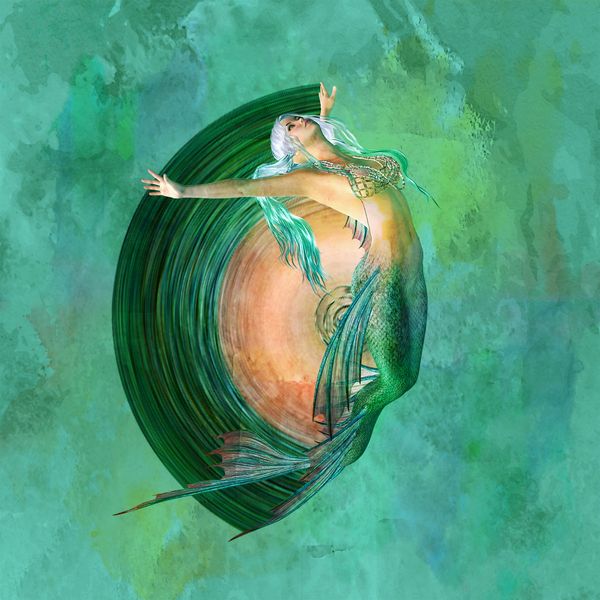
At the moment I'm leaning towards the "original" - it's quite intriguing! Take 1 has the colors that remind me of the sea but I feel it draws attention away from the subject rather than supporting it. Take 2 has a neat feeling of her emerging from the depths, but is a bit busy. The original composite feels joyful and beautifully unique in its simplicity.
Jun 21, 2020 07:18:14 #

Jun 21, 2020 09:41:49 #

To my eye one of the best parts of the original is the amazing colour gradations in the mermaid's hair. The rest of the colouring is pretty good too.
Whatever edit you settle on, try not to lose those colours.
I have a bit of a problem with the centre-most part of the swirl. I think it needs to be softened or something like that, or possibly changed. And I think the circular swirls in #3 should be concentric with the arc of the swirl behind the mermaid.
Jun 21, 2020 09:58:30 #
Jun 21, 2020 12:00:38 #
I have to go with #2, it's everything a mermaid and her habitat should be.
Jun 21, 2020 18:56:14 #
Jim-Pops wrote:
I like the second one the best. Did you build up the mermaid? Did you make the swirl?
Thank you very much Jim, the mermaid id from pixabay and I made the swirl..

Jun 21, 2020 18:57:05 #
photophile wrote:
Looks like you have fun with SPE, too!
Yes its a good program to play with..
Jun 21, 2020 18:58:04 #
PixelStan77 wrote:
Great composites. The second one is my favorite.Thanks for sharing across the pond.
Thank you very much Stan, and you are welcome...
Jun 21, 2020 18:58:44 #
Jun 21, 2020 19:01:47 #
Linda From Maine wrote:
At the moment I'm leaning towards the "original" - it's quite intriguing! Take 1 has the colors that remind me of the sea but I feel it draws attention away from the subject rather than supporting it. Take 2 has a neat feeling of her emerging from the depths, but is a bit busy. The original composite feels joyful and beautifully unique in its simplicity.
Thank you very much Linda for the comments on all three, do you like this take on 1 any better? I just put the original on top and took the opacity down
If you want to reply, then register here. Registration is free and your account is created instantly, so you can post right away.