With Photoshop Plus Topaz....or Just Photoshop?
Jun 20, 2020 14:38:19 #

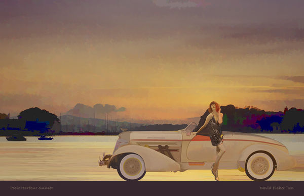
I thought I would have to put a lot more work into what I wanted to achieve but adding Topaz Simplify 'Underpainting' filter did exactly what I wanted. I have resisted buying the latest Topaz tools and don't have Studio2, just some of the original plug-ins.
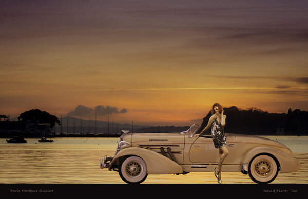
Which do you prefer - and if you have any critique I'll be grateful for it. Please download to view, the thumbnail is rather dark.
Which do you prefer - and if you have any critique I'll be grateful for it. Please download to view, the thumbnail is rather dark.
Jun 20, 2020 14:48:31 #

Jun 20, 2020 14:51:33 #

I personally prefer only PS I am basing my opinion on the sky’s colors and tones. Not sure if Topaz had anything to do with the change or if you did that on your own.
Jun 20, 2020 15:00:30 #

Hi Dave, good to see you! Hope all is well. I don't care for what Topaz did to your sky or the colors it gave your background trees. Obviously just personal preference since you like the result.
It's a fun composite and you can't go wrong with either that car or your model - whom we've come to love
Obviously an issue with color space for posting online (the thumbnail is not just "dark," it's almost devoid of color) but that's an old story too, lol.
It's a fun composite and you can't go wrong with either that car or your model - whom we've come to love
Obviously an issue with color space for posting online (the thumbnail is not just "dark," it's almost devoid of color) but that's an old story too, lol.
Jun 20, 2020 15:07:56 #

#2 manages to look ethereal without the fancy effects of #1. In fact #1 looks artificial rather than surreal.
Jun 20, 2020 15:11:41 #
Jun 20, 2020 15:14:43 #
One more observation: when I download, the image is on a black background, so the bottom of #2 disappears. Though the title and your name are tastefully done and nicely placed, I find the illusion of the car and woman being on the very bottom edge of the frame to be quite appealing!
Jun 20, 2020 15:23:21 #

Jun 21, 2020 04:12:35 #
fotoman150 wrote:
I like number two, the warmer one
I don’t think you’ll be alone! Thanks for for commenting.
Jun 21, 2020 04:14:12 #
NJFrank wrote:
I personally prefer only PS I am basing my opinion on the sky’s colors and tones. Not sure if Topaz had anything to do with the change or if you did that on your own.
I didn’t change much after Topazing Frank so I’ll blame that.
Jun 21, 2020 04:21:54 #
Linda From Maine wrote:
Hi Dave, good to see you! Hope all is well. I don'... (show quote)
Yes, Janet is one of my favourites - TOL says she’s weird but I think she’s an inventive poser. I’ve no objection to the sky colours but I will change the heavy blues in the trees, they pull the eye too much. The Auburn is also a favourite - we saw one at Beaulieu whilst on our two-day honeymoon fifty odd years ago, so I wheel mine out for a shot once in a while. Not too difficult as it’s only about ten inches long and doesn’t take up too much garage space.
Yep, forgot how fussy UHH is about colour - FB renders it much better. Thanks for your comments.
Jun 21, 2020 04:23:33 #
R.G. wrote:
#2 manages to look ethereal without the fancy effects of #1. In fact #1 looks artificial rather than surreal.
Sorry you don’t like it RG, it’s just personal taste, we see things differently - but you know that! Many thanks for commenting.
Jun 21, 2020 04:24:51 #
Electric Gnome wrote:
#2 is my preference. I like the stronger colours.
You’re in the majority by several to none by the look of things EG. Thanks for commenting.
Jun 21, 2020 04:25:55 #
UTMike wrote:
Number 2, more "human" plus sharper for these old eyes.
Thanks Mike, it’s a landslide victory for #2 I think.
Jun 21, 2020 04:30:26 #
Linda From Maine wrote:
One more observation: when I download, the image is on a black background, so the bottom of #2 disappears. Though the title and your name are tastefully done and nicely placed, I find the illusion of the car and woman being on the very bottom edge of the frame to be quite appealing!
I nearly left it like that and may try a print that way Linda. The added road and text are switchable (and a method I developed whilst adding notes to the dreaded negatives catalogue). I’m undecided on titles and signatures - although find them useful when viewing art by others.
If you want to reply, then register here. Registration is free and your account is created instantly, so you can post right away.