Lines Lines and More Lines
Jun 17, 2020 16:01:39 #
kenievans
Loc: Dallas
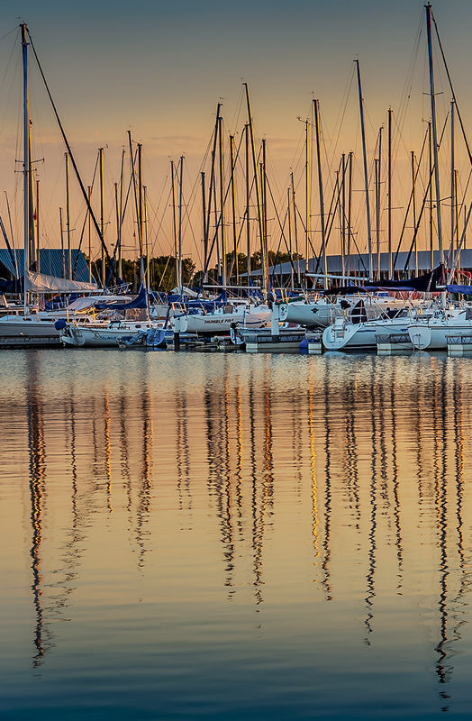
Another photo from my morning adventure to the marina. I loved the lines in this one. Because it was so busy I wanted to simplify it. I added a filter from Topaz called Fine Marker Drawing in black and white. I like the photo in color with the pretty morning light but I felt like there was no place to focus on. My other concern is the composition. I wanted to get the reflections in the water and the masts were pretty tall. I am thinking it is a little top heavy and I should have gotten more sky while cutting off some of the water. It seems to work better in the black and white than the color though. How would you do it?


Jun 17, 2020 16:39:38 #

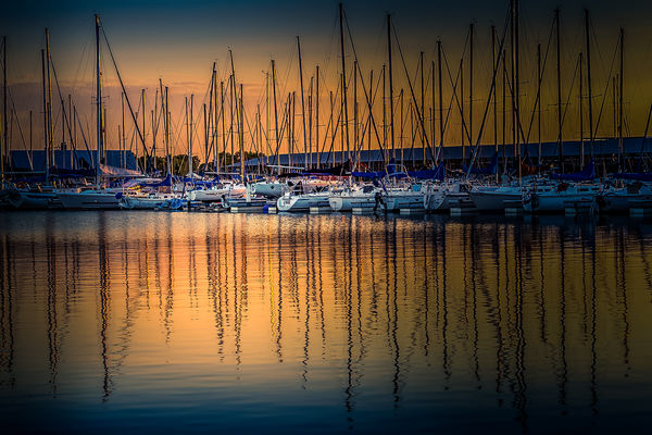
It's hard to give up those gorgeous colors. Here's a crop I think works because there are more "cut off" than in the original. With the majority cut off, the result isn't so obvious - maybe.
I personally would find more interest in the reflections (if re-composed) than the sky.
The sketch, being more abstract, I felt could work with a more drastic crop. I also gave it a little more contrast and rotated 1 degree to straighten.
Thanks Keni!
I personally would find more interest in the reflections (if re-composed) than the sky.
The sketch, being more abstract, I felt could work with a more drastic crop. I also gave it a little more contrast and rotated 1 degree to straighten.
Thanks Keni!


Jun 17, 2020 17:36:12 #

Maybe seeing all of those masts makes it difficult to lose any of them, but maybe you don't need all of them to create the visual effect. The masts that have been cropped don't look quite right, but cropping more of them seems to be a lossy way to deal with it. Maybe the answer is to crop down to the part where the masts and the reflections look like they're in good balance. The amount of contrast and saturation is a matter of taste.
.
.
Jun 17, 2020 18:11:54 #
R.G. wrote:
This is stunning, R.G.!Maybe seeing all of those masts makes it difficult to lose any of them, but maybe you don't need all of them to create the visual effect. The masts that have been cropped don't look quite right, but cropping more of them seems to be a lossy way to deal with it. Maybe the answer is to crop down to the part where the masts and the reflections look like they're in good balance. The amount of contrast and saturation is a matter of taste.
Jun 17, 2020 18:41:35 #
kenievans
Loc: Dallas
Linda From Maine wrote:
It's hard to give up those gorgeous colors. Here's a crop I think works because there are more "cut off" than in the original. With the majority cut off, the result isn't so obvious - maybe.
I personally would find more interest in the reflections (if re-composed) than the sky.
The sketch, being more abstract, I felt could work with a more drastic crop. I also gave it a little more contrast and rotated 1 degree to straighten.
Thanks Keni!
I personally would find more interest in the reflections (if re-composed) than the sky.
The sketch, being more abstract, I felt could work with a more drastic crop. I also gave it a little more contrast and rotated 1 degree to straighten.
Thanks Keni!
Thanks for posting your version Linda. I like the crop on the color version but not so much on the other one. It feels too cut off to me. I need to look at it some more. It might grow on me.

Jun 17, 2020 18:44:38 #
kenievans
Loc: Dallas
R.G. wrote:
Maybe seeing all of those masts makes it difficult to lose any of them, but maybe you don't need all of them to create the visual effect. The masts that have been cropped don't look quite right, but cropping more of them seems to be a lossy way to deal with it. Maybe the answer is to crop down to the part where the masts and the reflections look like they're in good balance. The amount of contrast and saturation is a matter of taste.
.
.
Very nice R.G.! I like your crop better than mine. For some reason I always go for the big view. Bigger is not always better.
Jun 17, 2020 19:08:08 #
I like having the sky Kenie. I'm happy to see you got another shot out of your early morning get out of bed and shoot excursion.
I like RG's tighter crop, as you said it got busy with all those masts.
I like RG's tighter crop, as you said it got busy with all those masts.
Jun 17, 2020 19:17:39 #
kenievans
Loc: Dallas
Jim-Pops wrote:
I like having the sky Kenie. I'm happy to see you got another shot out of your early morning get out of bed and shoot excursion.
I like RG's tighter crop, as you said it got busy with all those masts.
I like RG's tighter crop, as you said it got busy with all those masts.
I hung around the marina for about an hour as the sun came up taking different shots. The light was too pretty to leave.
Jun 18, 2020 02:58:26 #
Jun 18, 2020 07:12:42 #
Electric Gnome
Loc: Norwich UK
R.G. wrote:
Maybe seeing all of those masts makes it difficult to lose any of them, but maybe you don't need all of them to create the visual effect. The masts that have been cropped don't look quite right, but cropping more of them seems to be a lossy way to deal with it. Maybe the answer is to crop down to the part where the masts and the reflections look like they're in good balance. The amount of contrast and saturation is a matter of taste.
.
.
That's the best crop/composition from the original image in my humble opinion. I would have liked enough sky so that the tops of the masts were included in the frame.
Jun 18, 2020 08:00:45 #

I’ll be the odd person out here: I prefer your original version to the crops.
Jun 18, 2020 08:29:39 #

I like the color one best Keni and think the crop that R.G. did brings out the details and reflections great...
Jun 18, 2020 09:13:19 #
Jun 18, 2020 13:01:50 #
Nice set Keni. I like R.G.s crop of the color image, but oh the B&W! The processing is amazingly subtle, really only visible in DDL. I like the additional contrast in Linda's post. I was going to suggest that but no need now.
Jun 18, 2020 13:57:43 #

I'd struggle giving up that wonderful color Keni. My comment benefits from seeing (and liking a lot) RG's crop, and your comment about going with a bigger view. So I combined them and tried a slightly different approach of "cropping" with gradient filters. Bev
If you want to reply, then register here. Registration is free and your account is created instantly, so you can post right away.