Poppy color or B&W
May 22, 2020 11:54:57 #
mizzee
Loc: Boston,Ma
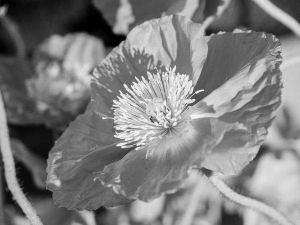
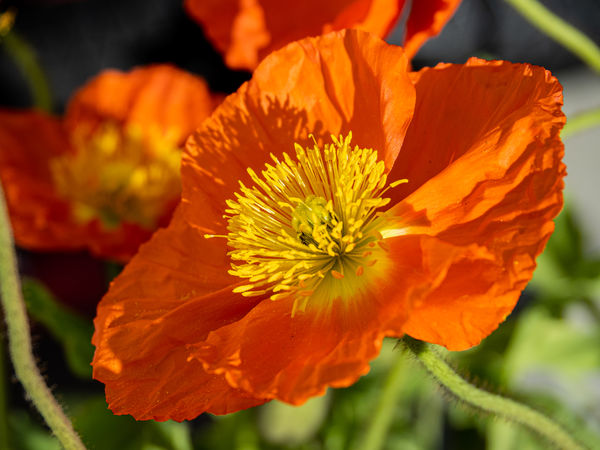
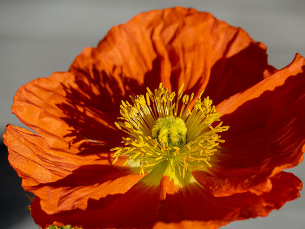
I cant decide between these two. The color , is it overwhelming? The B&W almost looks like infrared? I dont know. Just edited the third. Think I like it the best
May 22, 2020 12:01:47 #
May 22, 2020 12:03:17 #
May 22, 2020 12:05:41 #

This is a difficult subject, mizzee. Reds tend to overwhelm most sensors. So, initial exposure is a bit more critical. Additionally, if you're not already using RAW, that would be almost mandatory.
--Bob
--Bob
mizzee wrote:
I cant decide between these two. The color , is it overwhelming? The B&W almost looks like infrared? I dont know.
May 22, 2020 12:06:44 #

For me, the reason to shoot for b&w would have to do with light and shadows, contrasts, textures, etc. Because your color photo is mostly the same tones, I don't find interest in this b&w conversion.
Your late addition might make a more interesting b&w with its stronger contrast. Also, if your editor has virtual color filters, you might be able to separate the red/orange from the yellow tones more.
Your late addition might make a more interesting b&w with its stronger contrast. Also, if your editor has virtual color filters, you might be able to separate the red/orange from the yellow tones more.
May 22, 2020 12:10:23 #

I'd say the color even though the tones are basically the same. The black & white looks boring.
May 22, 2020 12:27:05 #
Color... the colorful fields of these wildflowers is what makes them so beautiful. If you choose B&W then the lighting, shadows, textures and composition become critical to bringing out the beauty of these little gems.
May 22, 2020 12:28:28 #
What do you want to emphasize: color or texture? If you choose texture, then b&w. but there is not much of a b&w range in the flower itself. For me - color because red just wants to be seen in red. Even then you could play with the color range and texture.
May 23, 2020 07:43:33 #

May 23, 2020 10:18:35 #

I don’t know much at all about editing photos but I think the last one is more visually exciting.
May 23, 2020 11:02:58 #

May 23, 2020 15:39:09 #

a lite disc screen could really help with the contrast in the color shots/beautiful tho i also like #3
May 23, 2020 15:41:23 #

JFCoupe wrote:
Definitely color in this comparison. Nice image.
second this opinion.
May 26, 2020 13:01:14 #

mizzee wrote:
I cant decide between these two. The color , is it overwhelming? The B&W almost looks like infrared? I dont know. Just edited the third. Think I like it the best
In this case the color images present better, and look better, IMHO.
Thanx for sharing.
May 28, 2020 18:05:08 #

Too much of the same colour to be a good candidate for B&W. In B&W you need contrast, this conversion has none.
If you want to reply, then register here. Registration is free and your account is created instantly, so you can post right away.