Business Advertising
Sep 16, 2012 11:13:55 #

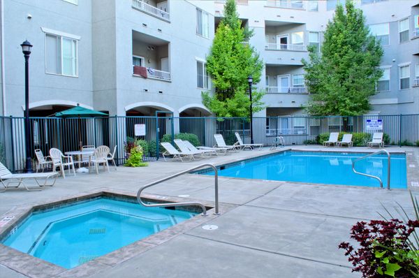
I am taking pictures to promote the Apartment complex where I live. They will be used on their Web Page, and Facebook. I did these in HDR to give an even lighting, but did not want any "over the top" effects. These are the first 4, I will also do an Excercise room, and a Lounge area. The full building view is three HDR images stitched togeather in a panorama, same with the play ground area. Let me know what you think, I apreciate your comments.


Sep 16, 2012 12:04:45 #

Generally, successful staying away from the unnatural, surreal aspect of HDR. Overall, nice portrayal of the complex which they will like.
In the first, if you could clone out the van, it's a tad distracting as it "heads out" of the frame.
Curious what pano program you used to stitch them. I've done zero with DSLR, so I'm curious-- I've got a few potential "assignments"... so PM me if you wish.
In the first, if you could clone out the van, it's a tad distracting as it "heads out" of the frame.
Curious what pano program you used to stitch them. I've done zero with DSLR, so I'm curious-- I've got a few potential "assignments"... so PM me if you wish.
Sep 16, 2012 12:53:44 #
Nice work, Mike. I use Photomatix a lot to bring out more vivid colors without looking unnatural. For me, the pool shot is a bit too blue. I used Irfanview to reduce the blue a few points, until the umbrella looks green, and like it better.
Sep 16, 2012 12:58:12 #
On second try, I also increased red a tad to bring the wall color more in line with the other shots.
Sep 16, 2012 13:13:11 #
Thanks, maybe should shoot when there is more light. This is an enclosed area and was shot early morning so not muh light in this area. I'll keep tweeking them.
OddJobber wrote:
On second try, I also increased red a tad to bring the wall color more in line with the other shots.
Sep 16, 2012 23:57:47 #
I find your first & second image a bit blue. I suggest that you crop-out the light pole on #3, and a quite a bit of the street foreground. This will increase the focus on your building.
Sep 17, 2012 03:21:09 #
Nikonian72 wrote:
I find your first & second image a bit blue. I suggest that you crop-out the light pole on #3, and a quite a bit of the street foreground. This will increase the focus on your building.
Agree comments re need to remove pole and crop out foreground considerably. But would suggest you consider cloning out the pole instead to retain the balance across the pic. The pole in that position should be relatively easy to clone out.
Peter
Sep 17, 2012 22:30:59 #
Thanks for the comments, I think you're right about the pole. I will probably be reshooting a couple of these, but it's a good place to start.
Nikonian72 wrote:
I find your first & second image a bit blue. I suggest that you crop-out the light pole on #3, and a quite a bit of the street foreground. This will increase the focus on your building.
Sep 17, 2012 22:32:03 #
Thanks, I will look at cloning out the pole, I'm still playing with these, but aprciate the input.
conkerwood wrote:
Agree comments re need to remove pole and crop out foreground considerably. But would suggest you consider cloning out the pole instead to retain the balance across the pic. The pole in that position should be relatively easy to clone out.
Peter
Nikonian72 wrote:
I find your first & second image a bit blue. I suggest that you crop-out the light pole on #3, and a quite a bit of the street foreground. This will increase the focus on your building.
Agree comments re need to remove pole and crop out foreground considerably. But would suggest you consider cloning out the pole instead to retain the balance across the pic. The pole in that position should be relatively easy to clone out.
Peter
Sep 18, 2012 05:32:04 #
Hi Mike
I feel the cloning out of the van is far too much trouble especially if you can't replace what is behind it accurately. The lighting is far too flat too. I would try again another day with the light behind you. Like the colourful flowers and fountain.
The pool image is blue and again too flat. Maybe not chop off the tips of the 2 trees.
Don't mind the lamp post in the 3rd picture and you shouldn't remove it anyway as it is part of the scene which you want to represent relatively accurately in your promotion.
The last image is great, maybe a wee bit blue.
I understand your desire to not overcook the effects but a little bit more contrast, colour and shadows will make them look more appealing, as in image 3.
Sep 19, 2012 00:25:48 #
Thanks, I apreciate your opinion. They love these, but I have primised to work on them a little and see what I can improve. It might be a few days, but hope to repost when I get time.
Chinaman wrote:
Hi Mike br I feel the cloning out of the van is fa... (show quote)
Nov 18, 2012 12:17:08 #

If you want to reply, then register here. Registration is free and your account is created instantly, so you can post right away.