Which is better?
Apr 4, 2020 21:36:19 #

Apr 4, 2020 21:59:01 #

Apr 4, 2020 23:18:53 #

I agree no contest. Even with the artifact toward the top, left of center, and the crushed blacks in some of the shadows, the BW is the clear winner for me. IMHO, the color shot is (way) over-processed, and real skies are not turquoise colored.
Apr 5, 2020 01:23:59 #
lsupremo wrote:
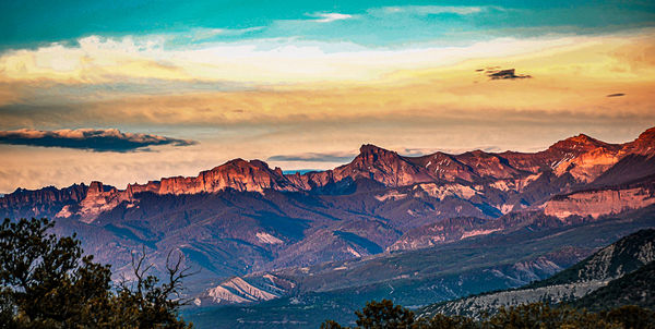
Which is better Color or Monochrome?
I always gravitate towards B&W, because the color image is overprocessed. But please fix the pixelations in the cloud bank at the top.
You would actually be better off cropping the dark cloud bank out completely.
Apr 5, 2020 06:57:11 #

I think if you toned down the colors in #1 it would work much better. I don’t recall ever seeing a turquoise colored sky. I know I am guilty of sometimes going too far with the color sliders.
Apr 5, 2020 08:21:48 #

Apr 5, 2020 10:41:29 #

Turquoise skies are possible. For me that's not the issue. But the colours look overdone to my eyes. I know that's the style of some photographers, and perhaps it's yours also. The deep contrasts in density in the B&W are really nicely done.
Apr 5, 2020 16:34:03 #

The color in this image seems to be, well, messed up, I'm not sure how else to say it. When I looked at the large image the file seemed very over-processed. Lots of processing artifacts in the color version. I did not look at the larger BW image. but from the small view shot it, too, looks very over-processed. Perhaps you started with a JPEG? You might consider starting over with the image. It might work out as a BW.
If you want to reply, then register here. Registration is free and your account is created instantly, so you can post right away.