For you to consider and critique
Mar 26, 2020 21:15:13 #

I have often offered my opinions on photos in this section even though I have not previously had photos to offer for your opinions. Now that I am getting out more (limited due to the virus) I am sharing this photo for your opinions, critiques and ideas. All the information you give me will be greatly appreciated even if it's to tell me you don't like it.
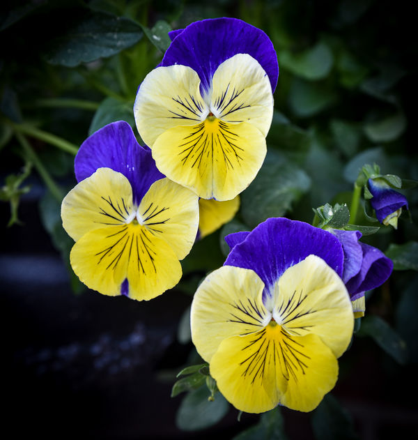
This was taken on my neighbor's patio. I have cropped it and added a heavy vignette to somewhat hide the planter.
Thank you!!
Dodie
This was taken on my neighbor's patio. I have cropped it and added a heavy vignette to somewhat hide the planter.
Thank you!!
Dodie

Mar 26, 2020 22:12:03 #
luvmypets wrote:
I have often offered my opinions on photos in this... (show quote)
A striking, lovely image, Dodie.
It makes for a strong graphic image, but I wonder if the dark background works somewhat against it? I'm trying to imagine just the flowers on a white background....but don't ask me to do that, my skill level isn't up to that yet!
 You might also consider closer cropping on the sides to emphasize the vertical arrangements of the flowers?
Mar 26, 2020 22:12:14 #

Looks good. But, the only real way to provide feedback is for you to attach and store the file.
Mar 26, 2020 22:14:54 #
CHG_CANON wrote:
Looks good. But, the only real way to provide feedback is for you to attach and store the file.
Just curious, Paul, why is a downloadable image important here?
Mar 26, 2020 22:17:14 #
CHG_CANON wrote:
Looks good. But, the only real way to provide feedback is for you to attach and store the file.
Mar 26, 2020 22:20:24 #
srt101fan wrote:
A striking, lovely image, Dodie.
It makes for a strong graphic image, but I wonder if the dark background works somewhat against it? I'm trying to imagine just the flowers on a white background....but don't ask me to do that, my skill level isn't up to that yet! You might also consider closer cropping on the sides to emphasize the vertical arrangements of the flowers?
It makes for a strong graphic image, but I wonder if the dark background works somewhat against it? I'm trying to imagine just the flowers on a white background....but don't ask me to do that, my skill level isn't up to that yet!
You might also consider closer cropping on the sides to emphasize the vertical arrangements of the flowers?Thank you for those ideas. I don't have the skillset to change the background, either. What I can do try to find something white like paper and see if my friend will help me isolate them. I will try the tighter crop also.
Stay safe in these trying times!!
Dodie
Mar 26, 2020 22:38:40 #
Thank you for re-posting. For this posted resolution at 856 x 900, there still isn't that much detail to see, but still an improvement over the embedded thumbnail.
My own preference is that an image has a specific subject and that subject is the sharpest focus within the entire image. For this image, it would seem the top-center flower is the subject. But, the focus seems a bit soft on this flower and on all three flowers overall. The bit of green above the lower-right flower seems to have the sharpest focus.
Another personal preference is the portion of the image closest to the camera has the sharpest focus. This is my own style, and of course, not a universal agreement. Using this approach, the lower-right flower would be the sharpest, even if not best-positioned to be the subject of the image. This lower flower is less sharp that the top-center.
The image seems to be cropped from a larger image, where maybe a return visit and a framing directly on these three flowers will give a sharper image / sharper subject.
These might be considered ticky-tack details, especially given the wonderful colors and position / arrangement of these three flowers in the frame. You mentioned the vignette removing distractions. This is a good use, helping to set the three flowers as the 'only thing' the viewer's eyes consider.
In the idea of continuing to remove distractions, consider removing the small bit of green coming out of the bottom of the bottom flower. Look around the edges of the entire frame, should the bit of brighter green on the middle-left be removed or covered by the vignette? Should the unopened blossom on the right be removed / covered by the vignette?
Mar 27, 2020 08:19:20 #

Hi Dodie! IMO pansies are such smile-inducing flowers, a lighter vignette or background would better emphasize their special appeal.
Regarding using white paper instead of a vignette, if you enjoy a lot of flower photography, you could collect pieces of mat board or cloth backdrops, along with clips in case there's a place to attach them. I've seen several conversations on UHH with suggestions like these. I personally wouldn't use bright white paper - too harsh a contrast and might be difficult to set proper exposure, though a high-key "studio" look is often striking. Decisions, decisions!
Regarding posting a downloadable version, if wrong color space is used (should always be sRGB for web) the thumbnail colors and brightness will be skewed. Additionally, the larger the file the more it is compressed to fit the 600 px wide thumbnail, which can make it lose clarity. Being able to open a download, whether it's 800 pixels wide or 2000, helps beyond simple "pixel peeping."
One more note about the composition: if you want to include the leaves in background, there may be relatively simple ways to disguise/diminish the planter with processing. Then perhaps a white or soft color vignette would enhance your final look. If you have time and interest, you could start a new topic here or in PP Forum, or add the original unedited shot to this thread, and let us know what pp software you currently have.
All the best!
Mar 27, 2020 10:11:07 #

Pansies are such happy flowers. One automatically smiles at them. The colours are lovely, and I like the depth of field used. The group is very pleasing, and I'm glad you included the bud to the right. My only slight quibble is that the bud is so near the edge. When you mat the print, it's going to get lost. Is there any way you could move everything slightly to the left and give the bud a bit more space?
Mar 27, 2020 13:46:45 #
luvmypets wrote:
I have often offered my opinions on photos in this... (show quote)
Hi Bodie,
It's nice to see that you have carefully considered the composition with your subject, using a triangular composition of three to achieve a pleasing effect. I see way too many flower images on this forum where people simply walk up, point the camera down at the flowers, and click the shutter without giving a thought to it. You are obviously trying to achieve something artistic. Your instincts on the vignette are good, but your execution does need a little fine tuning. Think about how you want to "ground" the flowers (i.e., not floating in space and which direction you want the eye to follow) in the image and then use a dark brush to get the desired effect. Generally, in photography, we attempt to get the subject that is closest to the viewer in focus, which could be the bottom flower in this case, although it really does not bother me that it is the top flower here, maybe because it seems to protrude more into the foreground. When I shoot flowers like this I often focus on different flowers and take multiple shots so that I can pick the one that seems to work the best. The color is spot on and this is nice, flower colors can be difficult to work with. I think this image is a really good start and I do believe you will improve over time as you are obviously giving it thought. As to the cropping, I'm not too sure about the square crop for this image, it seems to need a different crop as I view it, maybe a little more spacing. The square crop most often works great for a single image. Good luck.
Mar 27, 2020 20:46:57 #
CHG_CANON wrote:
Thank you for re-posting. For this posted resoluti... (show quote)
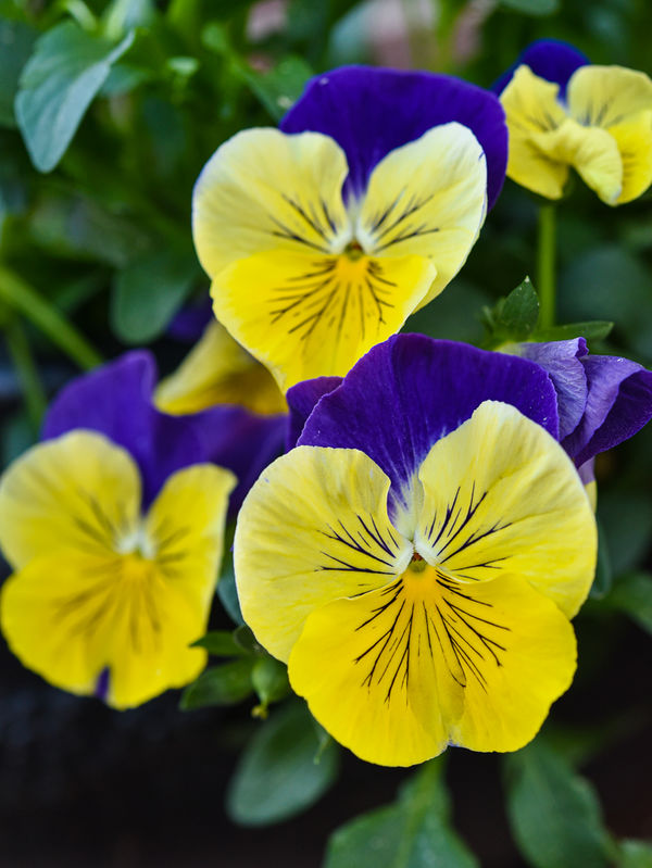
Thank you for your excellent advice and I have gone back to reshoot these pansies. This time with a Nikon 60mm macro and a tripod using your and Via the Lens suggestion to focus on the flower closest to the camera. I did not add the vignette. I also changed the export pixels to 1000 along the long edge.
The lens I used for the original was a Tamron 24-70 that is not a macro so I was pushing boundaries with the lens and focusing toward the middle of the flowers with the idea that depth of field would bring allow them all to be in focus which didn't work as well as I would have liked. I did wait too late this evening to try some shots with a greater DOF so I will go earlier tomorrow to try more of the ideas offered.
I truly appreciate any and all advice and since NC is going into "stay at home" mode on Monday, my neighbors yard will give me opportunities to try everyone's ideas.
Dodie
Mar 27, 2020 20:53:47 #
Linda From Maine wrote:
Hi Dodie! IMO pansies are such smile-inducing flow... (show quote)
Hi Linda,
Thank you for your advice and I have been thinking about setting up a table top studio and will look into obtaining cloths and other items suitable for backdrops once the "stay at home" order has been lifted from our state. In the mean time I may be able to scrounge an old t-shirt or other item to work with.
I have just purchased a video on using Lightroom so I will be able to work the image to make it more appealing.
I have done a reshoot with suggestions from others and have posted it in this post for everyone to view. I am going to post it in close up for some opinions there.
Thank you for your advice and suggestions.
Please take care in these trying times!!
Dodie
Mar 27, 2020 21:00:59 #
AzPicLady wrote:
Pansies are such happy flowers. One automatically smiles at them. The colours are lovely, and I like the depth of field used. The group is very pleasing, and I'm glad you included the bud to the right. My only slight quibble is that the bud is so near the edge. When you mat the print, it's going to get lost. Is there any way you could move everything slightly to the left and give the bud a bit more space?
Thank you, AzPicLady! I am not planning to print these photos. They are works in progress and I have gone back to the neighbors and shot them again with a different lens. The redo is posted in this post and I will submit it to the close up group for some opinions from them. I am going back tomorrow to shoot again. I waited too late this evening and didn't have the time I needed to try all the suggestions given and some ideas of my own.
Please take care during these trying times!!
Dodie
Mar 27, 2020 21:07:05 #
via the lens wrote:
Hi Bodie, br br It's nice to see that you have ca... (show quote)
Thank you Via the Lens!!! I really appreciate your advice and ideas. Following your and CHG_Canon's advice I went back this evening with a different lens (see the post above in my reply to CHG_Canon with the details and the reshoot photo) to put your advice to work. I have ordered a course on LR to learn how to use more than just the sliders and crop tool so I will be looking for more advice from everyone here as I go along. Please let me know what you think.
Take care in these trying times
Dodie
Mar 27, 2020 22:51:36 #
luvmypets wrote:
Thank you for your excellent advice and I have gon... (show quote)
Looks good. I like the strong focus on one specific blossom. Have you considered maybe a 1:1 square crop, same position of the flowers, with just a bit of space trimmed off the top and bottom. Maybe 4:3 or 5:4 with the same idea of a bit off the top and bottom. Glad to help. Have fun and stay safe!
If you want to reply, then register here. Registration is free and your account is created instantly, so you can post right away.