Trying To Create a Nostalgic Mood
Mar 24, 2020 13:11:10 #
kenievans
Loc: Dallas
I have joined the ranks of those working from home and things are a little slow but thankful to still be able to work. Dallas issued a stay at home order effective last night at midnight. I took the opportunity Sunday to go see me dad and take some photo's on his farm. Pop was happy to get out and walk the property with me looking for photos. It was great just to share each others company. It had been awhile since I was able to get out and shoot and I was seriously jonesing. May not get the chance to get out again for awhile.
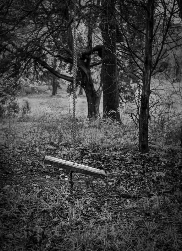
It was a rainy and overcast day so lots of flat lighting but the spring colors were beautiful. I decided to do this one in B&W to give it more of a nostalgic feel. I think I am on the right track but not quite there with it yet. I am thinking I need to darken the vignette and lighten the area around the swing a little more to give more focus to the swing. What do you think? Please feel free to show me or take it in another direction if you would like.
Be safe!
Keni
Mar 24, 2020 13:29:34 #
You did Keni. I'm glad you chose B&W for this one, it's perfect. Personally, I would leave it as it is. I know it's hard to stop, just one little tweak here, and something else there. Maybe save this one as a finished product. Re open it and make it into something else?
Jack
Jack
Mar 24, 2020 13:32:55 #

I think it's a strong composition of a wonderful subject and setting. What a find! All I did for this posting was raise the whites a skosh via levels adjustment, then a swipe or two of dodge* on the swing seat to brighten.
I tried several filters in Nik Color Efex and loved them all As Jack alluded, there are so many ways to go!
*per a UHH recommendation a couple of years ago, I don't use the dodge tool. Instead I create a new empty layer, set to overlay blend mode, then select a soft brush and use at very low opacity (8 - 12 percent). Paint with white to lighten the lighter areas, black to darken the darker areas.
I tried several filters in Nik Color Efex and loved them all
As Jack alluded, there are so many ways to go!*per a UHH recommendation a couple of years ago, I don't use the dodge tool. Instead I create a new empty layer, set to overlay blend mode, then select a soft brush and use at very low opacity (8 - 12 percent). Paint with white to lighten the lighter areas, black to darken the darker areas.

Mar 24, 2020 13:39:02 #
kenievans
Loc: Dallas
Curmudgeon wrote:
You did Keni. I'm glad you chose B&W for this one, it's perfect. Personally, I would leave it as it is. I know it's hard to stop, just one little tweak here, and something else there. Maybe save this one as a finished product. Re open it and make it into something else?
Jack
Jack
Thanks Jack. I took several different shots of the swing. There were actually two of them. I got probably 10 different shots of them separately and together. I also took a closer shot of that cool tree in the background. I think I want to try and composite one of the swings hanging from that tree. That one I would do in color.
Mar 24, 2020 15:24:02 #
kenievans
Loc: Dallas
Linda From Maine wrote:
I think it's a strong composition of a wonderful s... (show quote)
Thanks Linda! You got the look that I was going for. It definitely brought out the swing more. I have been holding off getting the Nik collection. I think it now may be time. Since I can't get out to my hairdresser this month or find any toilet paper to buy I might as well use the money on something I enjoy.

Mar 24, 2020 15:31:10 #
kenievans wrote:
It certainly seems to me you would enjoy it, but I also know that many folks prefer to stay within PS and take satisfaction from learning how to do just about everything within that software.Thanks Linda! You got the look that I was going for. It definitely brought out the swing more. I have been holding off getting the Nik collection. I think it now may be time. Since I can't get out to my hairdresser this month or find any toilet paper to buy I might as well use the money on something I enjoy.
I paid $150 for the suite about 5 years ago and have loved it ever since. The Color Efex section alone has over 50 filters, each with several pre-sets. Silver Efex (for b&w) is awesome, and there are other modules too.
Even though the pre-sets have extensive options for personalization while within the module itself, if you apply as a separate layer you have all the power of layers, layer masks, blend modes and opacity. And with Color Efex, you probably won't want to stop with a "single" filter.
I would love to play with you! 😀
Mar 24, 2020 15:43:22 #
kenievans
Loc: Dallas
Linda From Maine wrote:
It certainly seems to me you would enjoy it, but I... (show quote)
One of the "Master" photographers in my camera club was teaching a class I recently took and he showed us his workflow. He uses PS with Nikcollection and Color Efex Pro as plugins. He demonstrated how he used them on specific photos. He does some amazing work. I am looking forward to playing with you as well.
Mar 24, 2020 19:09:36 #
Is this playing together by invite only or is it open to anyone?
Really great composition kenievans but it needs some work on contrast and this would look good using a platignum tint maybe rather than the stark BW you have chose.
Really great composition kenievans but it needs some work on contrast and this would look good using a platignum tint maybe rather than the stark BW you have chose.
Mar 24, 2020 21:54:05 #

kenievans wrote:
.......I am thinking I need to darken the vignette and lighten the area around the swing a little more to give more focus to the swing. What do you think?.....
The vignette's good but I'd say it's sufficiently dark as is. I think it may only need something to make the rope stand out a bit more. The problem is the inconsistent background behind the rope. Sometimes it's darker than the rope, sometimes it's brighter. You could try lightening and darkening the rope selectively to make it more contrasted to the background.
(I suppose I should put my money where my mouth is. I'll be baaak
 ).
).Mar 24, 2020 22:26:13 #
OK, there's limited possibilities, especially at the lower end of the rope. But hey - even small improvements are a step in the right direction
.
.

Mar 25, 2020 08:32:56 #

I was going to suggest brightening the focal area of the photo, as Linda has not only done so well but also demonstrated.
Mar 25, 2020 12:00:23 #
kenievans
Loc: Dallas
Toleman wrote:
Is this playing together by invite only or is it open to anyone?
Really great composition kenievans but it needs some work on contrast and this would look good using a platignum tint maybe rather than the stark BW you have chose.
Really great composition kenievans but it needs some work on contrast and this would look good using a platignum tint maybe rather than the stark BW you have chose.
There is always room on the playground if you play nice.
I have been thinking about trying a sepia tint. I have several presets I can try.
Mar 25, 2020 12:04:03 #
kenievans
Loc: Dallas
R.G. wrote:
OK, there's limited possibilities, especially at the lower end of the rope. But hey - even small improvements are a step in the right direction
.
.
You did a good job on the lower end. It looks better. Not so sure about the other part. With the cloudy sky the shadows, if any, under the trees were very soft.
Mar 25, 2020 12:04:44 #
kenievans
Loc: Dallas
jaymatt wrote:
I was going to suggest brightening the focal area of the photo, as Linda has not only done so well but also demonstrated.
Thanks for commenting. As they say great minds think alike.
Mar 25, 2020 12:13:52 #
kenievans wrote:
Thanks for commenting. As they say great minds think alike.


If you want to reply, then register here. Registration is free and your account is created instantly, so you can post right away.