Poole Harbour Sunset
Mar 11, 2020 18:16:43 #

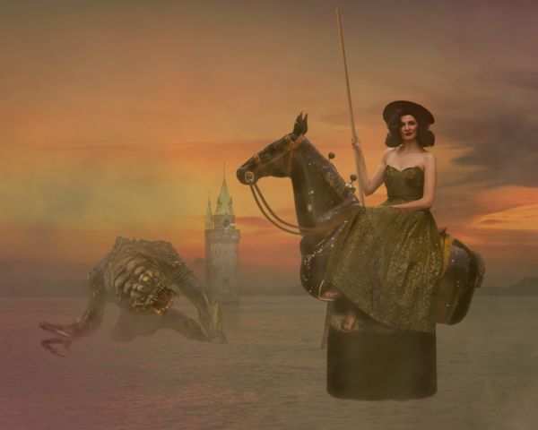
...plus a few other shots, all in one. Well, you know me. Had to mess around. Some will surely say I wrecked a good sunset shot - and they may well be right. Can't say I'm overjoyed with the outcome but it was just an idea. If you have any thoughts or critique please feel free to voice them. Cant say why there's no thumbnail, I saved a small file for UHH and low res.
Moderator note: color space says uncalibrated. Possibly other issues, but file size and resolution don't affect the system's recognizing as jpg. I've attached a png. Linda
Moderator note: color space says uncalibrated. Possibly other issues, but file size and resolution don't affect the system's recognizing as jpg. I've attached a png. Linda
Mar 12, 2020 09:08:13 #
Sorry Dave, not feeling it. Your model is beautiful and a pose that you don't often find. I can see here sitting on a bench or a wall and then start to build around that. The pedestal under the horse make it look like this might have come out of a merry go round. Maybe if the horse was in water or large amount of brush in the foreground. Not sure but if mine I wouldn't give up, the model and pose is just to good to stop working.
Jim
Jim
Mar 12, 2020 11:00:38 #

Hi Dave I usually am impressed with your posts but this is not for me, its way out of the box. Lay off the white powder for a while  and I look forward to your next masterpiece
All the best Alan
and I look forward to your next masterpiece All the best Alan
Mar 12, 2020 12:11:27 #
Jim-Pops wrote:
Sorry Dave, not feeling it. Your model is beautiful and a pose that you don't often find. I can see here sitting on a bench or a wall and then start to build around that. The pedestal under the horse make it look like this might have come out of a merry go round. Maybe if the horse was in water or large amount of brush in the foreground. Not sure but if mine I wouldn't give up, the model and pose is just to good to stop working.
Jim
Jim
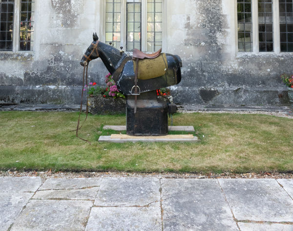
It’s a mechanical horse on which to learn riding Jim. It was parked outside a local country house on ‘Open Day’. The owner is an ex-scrap merchant who made it big time, and he has an interesting, if somewhat eclectic, collection of stuff. The model is sitting in a window, quite high up on an old ruined abbey. The horse is in water so perhaps just sink it a bit? I don’t think the monster really works - I wanted a dragon but haven’t found one to shoot yet. I probably won’t pursue this composition but will use the tower, models and horse again sometime, I just know there’s something good to be done there. Thanks for you thoughts. I think we’re on the same tack.
Mar 12, 2020 12:12:12 #
BigAl wrote:
Hi Dave I usually am impressed with your posts but this is not for me, its way out of the box. Lay off the white powder for a while and I look forward to your next masterpiece
All the best Alan
and I look forward to your next masterpiece All the best Alan
But I like that stuff Al!
Mar 12, 2020 14:03:05 #
I like it. Outrageous, and it doesn't have to meet any criteria by your own. The monster is perfect for the scene. Overall it reminds me of a Boris Vallejo print overlaid with Salvador Dali 
Mar 12, 2020 14:53:00 #
Curmudgeon wrote:
I like it. Outrageous, and it doesn't have to meet any criteria by your own. The monster is perfect for the scene. Overall it reminds me of a Boris Vallejo print overlaid with Salvador Dali
Very nice of you to say so Curmudgeon but I don’t think I’m quite in that class - for a start, my model’s overdressed!
Mar 12, 2020 15:42:02 #
magnetoman wrote:
Very nice of you to say so Curmudgeon but I don’t think I’m quite in that class - for a start, my model’s overdressed!
True but the monster is correct in every detail.
Mar 12, 2020 17:16:07 #
Curmudgeon wrote:
True but the monster is correct in every detail.
Ah well, that’s not down to me, all I did was take a photo of a model monster that somebody built, then turned it’s head in Ps!
Mar 13, 2020 09:27:19 #

I know it's odd to say that something in a fanciful work doesn't make sense, but that pedestal doesn't make sense to me  If you re-visit, I'd be very interested to see if you've submerged it a bit. As always, many thanks for sharing your creations, Dave!
If you re-visit, I'd be very interested to see if you've submerged it a bit. As always, many thanks for sharing your creations, Dave!Mar 13, 2020 13:14:04 #
Linda From Maine wrote:
I know it's odd to say that something in a fanciful work doesn't make sense, but that pedestal doesn't make sense to me If you re-visit, I'd be very interested to see if you've submerged it a bit. As always, many thanks for sharing your creations, Dave!
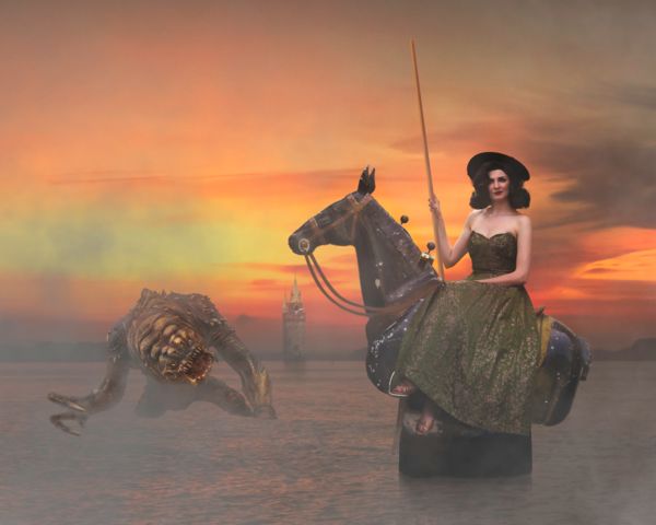
If you re-visit, I'd be very interested to see if you've submerged it a bit. As always, many thanks for sharing your creations, Dave!OK, here it is submerged a bit, plus a cheat reflection added (should probably do the same to Monster) - and with the tower reduced, pushed back and repositioned to make a better composition. It could probably now move left slightly. And that's it, Im finished with this image - unless you persuade me otherwise of course.
I've also added the original horse image so you better understand what its for. Hope all the makes things better, although I'm not convinced. Thanks for the push Linda.
I see the full file hasn't loaded as a thumbnail again. I did check, its definitely a simple jpeg, RGB, 8-bit. HELP!!
Mar 13, 2020 13:26:14 #
For web you want sRGB, not RGB. Here it is with data stripped and converted to png.
Since my exif viewer says "uncalibrated," I'm guessing you have conflicting color space information. It's a workflow issue
I will comment on your changes in a few minutes. Thanks Dave!
Since my exif viewer says "uncalibrated," I'm guessing you have conflicting color space information. It's a workflow issue
I will comment on your changes in a few minutes. Thanks Dave!
Mar 13, 2020 13:37:45 #
Linda From Maine wrote:
For web you want sRGB, not RGB. Here it is with data stripped and converted to png.
Since my exif viewer says "uncalibrated," I'm guessing you have conflicting color space information. It's a workflow issue
I will comment on your changes in a few minutes. Thanks Dave!
Since my exif viewer says "uncalibrated," I'm guessing you have conflicting color space information. It's a workflow issue
I will comment on your changes in a few minutes. Thanks Dave!
As it’s a flattened jpeg does ‘workflow’ error really matter? I’m not tech enough to argue the point but I must admit I don’t see how once it’s at this stage. I’m blaming UHH and sticking to it!
Mar 13, 2020 13:54:04 #
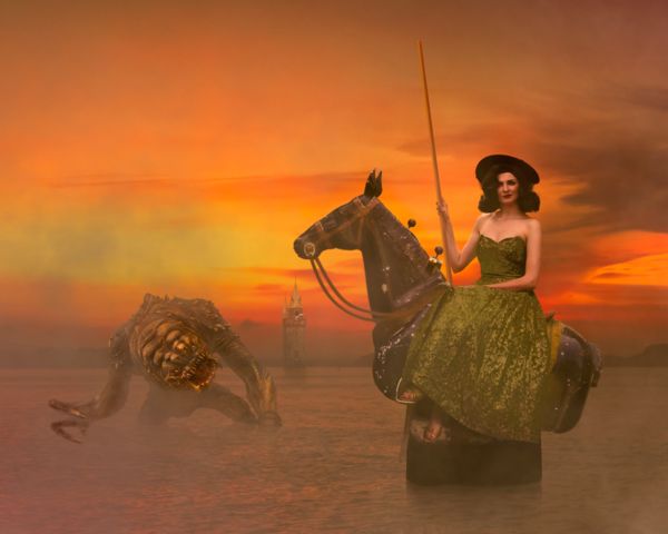
First, to your changes in the composite: love everything you did! There's a huge difference in brightness and color saturation; did you change that or was it a color space "thing" too?? That gives so much more prominence to our maiden, and the smaller tower makes the space vast and more interesting too.
Most of time the RGB vs. sRGB issue only results in a thumbnail looking less vibrant and bright than the download. But, sometimes the site (yes, it's UHH's fault ) doesn't recognize the file as an image file, so treats it the same as a pdf, doc, and other file types. It loads but doesn't show a thumbnail/preview.
magnetoman wrote:
What I meant by workflow error is something in the exif is conflicting with something else. Your original of the horse posted a thumbnail just fine, right? Look at the exif; it says sRGB color space. The composite says "uncalibrated."As it’s a flattened jpeg does ‘workflow’ error really matter? I’m not tech enough to argue the point but I must admit I don’t see how once it’s at this stage. I’m blaming UHH and sticking to it!
Most of time the RGB vs. sRGB issue only results in a thumbnail looking less vibrant and bright than the download. But, sometimes the site (yes, it's UHH's fault
) doesn't recognize the file as an image file, so treats it the same as a pdf, doc, and other file types. It loads but doesn't show a thumbnail/preview.Mar 13, 2020 14:12:44 #
Linda From Maine wrote:
First, to your changes in the composite: love ever... (show quote)
OK, I'll see what I can do in the future. Meanwhile, if you'd sort it just once more for me, this is the absolute final final! I did drop a layer when I reposted last time, which brightened things a bit - now I've pepped-up the ladies dress and added a glow all over so it looks seriously saturated. It just needs a bit of the mist removing from the horses neck and head area, so its more black.....no, I won't bother you again...
If you want to reply, then register here. Registration is free and your account is created instantly, so you can post right away.