My first semi-pro portraiture pictures
Mar 7, 2020 03:15:52 #
I rarely shoot portraits but I do want to learn.
I took part in an Expo and there were a few models, so I took some pictures.
Comments are welcome!
I took part in an Expo and there were a few models, so I took some pictures.
Comments are welcome!
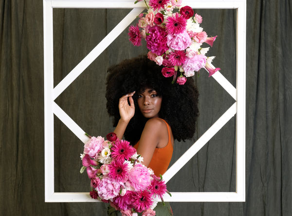
Fujifilm XH-1, XF 16-55mm f2.8
(Download)
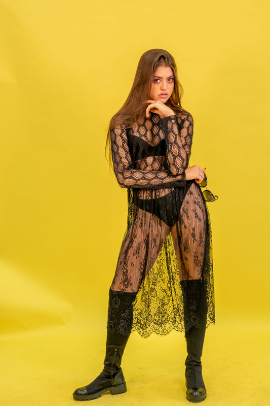
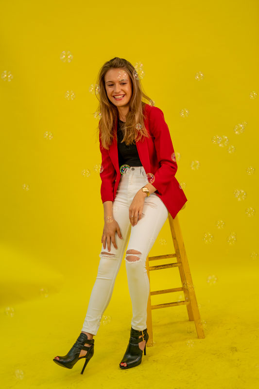
Leica TL2, Summilux 35mm f1.4
(Download)
Leica TL2, Summilux 35mm f1.4
(Download)
Mar 7, 2020 13:10:14 #

Pretty ladies and kinda cool foreground framing on the first image.
I certainly don't want to discourage folks from doing different or non-traditional kinds of photography. In classical portraiture, however, the subject, oftentimes the face of the subject should be the dominant point of interest and motif of the composition. From a traditional point of view, bright colors or tones in the foreground, background props. or clothing all become distractions form the subject.
A portrait makes a statement and that statement is up to the photographer. Sometimes the simplest statement is most impactful to the viewer. Take your first image as an example. The simplest statement would be "A beautiful Young Woman"! The more confusing statement is "A bright white frame with colorful flowers and a beautiful young woman in the background".
There is nothing wrong with a fashion photograph that features the clothing or a storytelling or lifestyle image that makes a different statement.
A bright yellow background can be problematic- it is a very high-chroma color! A cooler color such as perhaps blues or greens will enhance the warmth of the skin tone whereas bright yellow competes with the skin tones.
I do understand that this was a pre-determined set up and you just made theses images at an event. Weh you creat the setup or get to choose a background and control lighting you will have control over all of these aspects.
Mar 8, 2020 11:54:11 #

sergiohm wrote:
I rarely shoot portraits but I do want to learn.
I took part in an Expo and there were a few models, so I took some pictures.
Comments are welcome!
I took part in an Expo and there were a few models, so I took some pictures.
Comments are welcome!
You should consider posting the follow up image that you posted on the Boudoir page, the one with the model wearing red boots sitting on the boxes, with a red background.
Mar 8, 2020 18:15:26 #

Shapiro is certainly the Ace in this squadron, but I'd like to add that the "Dutch" (off-square camera angle) and foot position in #3 don't work for me--she appears to be falling--but her neutral hand position doesn't allow that to be part of the story. And not a fan of the bubbles in front of her face (these would be hard to remove in post, though). A smoother (big wrinkle in LL) and cleaner seamless background would help the photo look more pro (I know you didn't control this).
I'm with JD's suggestion about positing the "boxes" photo here for comment. I think it is quite good and the of this set.
Same comments on #2 I made in boudoir regarding footwear; smooth the paper.
I like the model in #1 and her expression but think there is too much distracting from her (assuming she is the subject, right?) especially with how white and complicated the frame is (whites tend to draw the eye first so need to be used judiciously). You might be able to improve (in my opinion) the photo by cropping out the verticals on the frames from both sides or at least cutting out the gray background. Also, this is a case where selective focus might help separate the lovely model from the complicated flowers (use low f-stop and point focus on the model's eyes).
Aug 17, 2023 16:06:03 #
All of the pictures suffer from centering the subject. In the first shot, everything is centered, maybe shoot from an angle to break up the static props. In #2 and #3, perhaps add a prop and use them to place your subjects at the "golden means' positions, and fill the blank spaces left by a lone figure in the middle of a rectangle. I agree that the bright yellow background was an unfortunate color to dominate the frame. A bit more distance between you and the background could minimize the unevenness of the paper. Don't be afraid to move into your subject and not necessarily show the whole figure.
If you want to reply, then register here. Registration is free and your account is created instantly, so you can post right away.