Which version do you like best
Sep 12, 2012 12:43:01 #

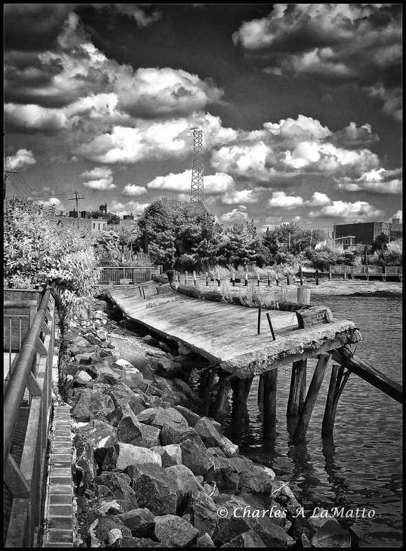
Same photo, one color-one B&W. I'm partial to the B&W but I would like to hear your opinions.
Failing Pier color
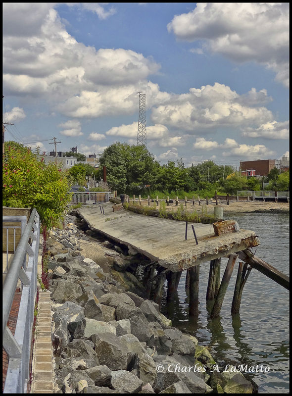
Failing Pier
Sep 12, 2012 12:46:31 #
donrent
Loc: Punta Gorda , Fl
I prefer the B/W, but its way cluttered with clutter... Its like where do I look now.... Very good B/W...
Sep 12, 2012 13:02:55 #
VietVet
I'd give it 75/25 for the BW. Donrent's comment there's too much clutter may carry some weight but, to me, for a successful BW, there needs to be several opportunities for varying shades of grey. And your shot has those. I particularly like the rip-rap under the pier, and the contrasting sky that balances the shot. I think you need the clutter to make it work. In the color, I might crop out the railing on the left - there's already a lot of inherent perspective to draw you eye into the shot.
Both shots have merit, the BW is, again to me, the more powerful of the two. Thanx for posting these...
Sep 12, 2012 13:13:57 #
Thanks for your comments. I value all input, good or otherwise. I believe perspective from other help to make a better photographer.
Sep 12, 2012 16:45:53 #

Preference goes to B&W, altho in general, it is a little "busy". Was there any post-process work, or shot straight out? Clouds appear slightly blown-out.
Sep 12, 2012 16:57:20 #
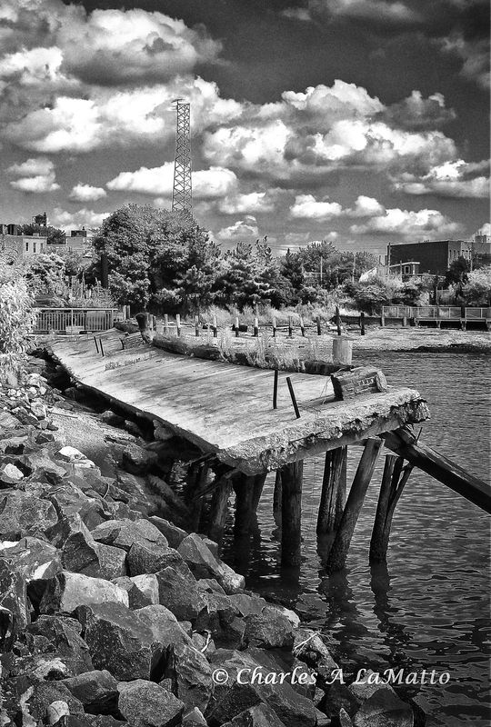
Some pp in Nik silver Efex Pro to convert to B&W.
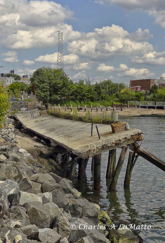
B&W cropped as was suggested.
color cropped also.
Sep 12, 2012 20:06:48 #
Sep 13, 2012 05:37:22 #

Sep 13, 2012 05:41:18 #

Sep 13, 2012 06:48:33 #

Like the cropped B/W for the contrast, but, the white in the clouds is blown out a bit. Toning them down might keep the eyeball from being directed to them, instead of the pier area.
Sep 13, 2012 08:00:15 #

I prefer the color shots. The pictures are a bit too busy and the cropped versions help to reduce that a bit.
Sep 13, 2012 08:07:11 #

Sep 13, 2012 08:24:17 #
VietVet wrote:
Same photo, one color-one B&W. I'm partial to the B&W but I would like to hear your opinions.
I would like the B&W except you've blown out the detailn the highlights of the clouds that is still there in the colour version.
Sep 13, 2012 08:25:58 #
Sep 13, 2012 08:27:56 #

If you want to reply, then register here. Registration is free and your account is created instantly, so you can post right away.