Fishing Pier Pre-Sunrise For Your Critique
Feb 25, 2020 13:41:32 #

Hey all,
I normally post in the Photo Gallery and open up to comments and critiques, but I figured I would get a more focused effort here.
My thoughts and setup for this photo:
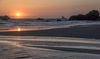
I wanted to catch that very special time during blue hour just before the sun peaked over the horizon. My reasoning for it was to capture the beautiful warm colors that seem to come alive when indirect ambient light seems be the most prominent. It is also right around the time when the almost-emerald colored water starts to become present.
The composition was meant to give the viewer a feeling of having the pier come from over the shoulder and create a leading line from above that leads the eye to the colors of the approaching sunrise and clouds that help contrast that color.
I decided with a longer exposure to soften the tidal activity enough to give a calming effect without losing too much of the color in the water. As the tidal activity was relatively calm during this time, it allowed for a gradual transition from calmer waters up to the shoreline where most of the white water effect was mitigated.
I know that is a bit to digest, but I hope it helps when providing your thoughts, opinions, and critique.
*This image is set to display at full size if your UHH settings allow for that. If not, please click on the photo for the full size and EXIF data accompanying it.

Pensacola Fishing Pier at Before Sunrise by John Gault, on Flickr
I normally post in the Photo Gallery and open up to comments and critiques, but I figured I would get a more focused effort here.
My thoughts and setup for this photo:
I wanted to catch that very special time during blue hour just before the sun peaked over the horizon. My reasoning for it was to capture the beautiful warm colors that seem to come alive when indirect ambient light seems be the most prominent. It is also right around the time when the almost-emerald colored water starts to become present.
The composition was meant to give the viewer a feeling of having the pier come from over the shoulder and create a leading line from above that leads the eye to the colors of the approaching sunrise and clouds that help contrast that color.
I decided with a longer exposure to soften the tidal activity enough to give a calming effect without losing too much of the color in the water. As the tidal activity was relatively calm during this time, it allowed for a gradual transition from calmer waters up to the shoreline where most of the white water effect was mitigated.
I know that is a bit to digest, but I hope it helps when providing your thoughts, opinions, and critique.
*This image is set to display at full size if your UHH settings allow for that. If not, please click on the photo for the full size and EXIF data accompanying it.
Pensacola Fishing Pier at Before Sunrise by John Gault, on Flickr
Feb 25, 2020 14:05:55 #

Feb 25, 2020 16:05:51 #
John, I think you got the angle perfect as it shows the suns reflected light on the pier, without having to contend with the brightness directly from the sun itself. I also very much like the saturation, it looks terrific to me.
Terry
Terry
Feb 25, 2020 20:33:44 #
northsidejoe wrote:
Very nice photo John thanks for sharing saying hello from Pittsburgh.
Thanks Joe. My mothers family is from Monongahela and surrounding areas, but haven't been back to Steel City in some years.
Feb 25, 2020 20:34:10 #
Terrym9 wrote:
John, I think you got the angle perfect as it shows the suns reflected light on the pier, without having to contend with the brightness directly from the sun itself. I also very much like the saturation, it looks terrific to me.
Terry
Terry
Thanks for the feedback Terry, much appreciated.
Feb 26, 2020 07:26:45 #

Feb 26, 2020 07:48:37 #
Beautiful lighting and composition. I wouldn't change a single thing.
Feb 26, 2020 08:47:37 #
johngault007 wrote:
Hey all, br I normally post in the Photo Galler... (show quote)
Very well done.
"Siphoning the Sunrise"

Seriously,

Feb 26, 2020 10:02:53 #

Feb 26, 2020 10:06:27 #

The colours and exposure are all spot on. Composition-wise I think I would have gone for slightly less on the right hand side and slightly more on the left. The large space under the pier draws the eye a bit too much - not badly but enough to create an imbalance. Having a suggestion of the beach was a good idea. You could have perhaps included a bit more.
Feb 26, 2020 10:22:06 #
Feb 26, 2020 10:29:23 #
R.G. wrote:
The colours and exposure are all spot on. Composition-wise I think I would have gone for slightly less on the right hand side and slightly more on the left. The large space under the pier draws the eye a bit too much - not badly but enough to create an imbalance. Having a suggestion of the beach was a good idea. You could have perhaps included a bit more.
I very much appreciate a new perspective on viewing this composition. I will check to see if I had enough space on the left after cropping to give that a try. I do know that I cropped out a good deal of beach because I perceived it as more of a distracting element, but you made a good point and it's worth a try to bring some of it back. All of the sand has the beautiful pre-sunrise glow across the composition.
Thank you R.G. for your input, it's greatly appreciated!
Feb 26, 2020 12:18:41 #

johngault007 wrote:
Hey all, br I normally post in the Photo Galler... (show quote)
Hi, John,
IMO your stated aims have been fulfilled.
IMPACT: of the image is strong, due, in part to the strong blue-orange hue complementation, as well as to your having taken maximum advantage of the offered linear perspective (see composition).
Technical: Exposure and use of deep DOF are unimproveable.
Composition. Beyond simply “grabbing” the obvious linear perspective, your placement of the horizon relative to the receding, converging major leading lines such that they pass through the left side intersections of the “thirds grid” and meet approximately centered in the left center rectangle is to make doubters of the value of the thirds grid thinks twice about their doubts!
My only quibble is the amount of open space at the right edge of the image...to my eye, anyway, that extra space is a distraction. My suggestion is to crop the right side to the bottom of the right-most piling.
Impact: 4.5/5
Tech:5/5
Composition: 4.5/5
Total: 14/15
Strong image; great job!
Dave
Feb 26, 2020 12:40:17 #
Uuglypher wrote:
Hi, John,
Composition. Beyond simply “grabbing” the obvious linear perspective, your placement of the horizon relative to the receding
, converging major leading
Composition. Beyond simply “grabbing” the obvious linear perspective, your placement of the horizon relative to the receding
, converging major leading
Thank you for the insight. Can you please expand on your last statement? I am, for lack of better terms, I am an amateur hobbyist that is not familiar with some of those terms. Thank you again!
Edit: I just saw your edited post
Feb 26, 2020 12:40:33 #
johngault007 wrote:
I very much appreciate a new perspective on viewing this composition. I will check to see if I had enough space on the left after cropping to give that a try. I do know that I cropped out a good deal of beach because I perceived it as more of a distracting element, but you made a good point and it's worth a try to bring some of it back. All of the sand has the beautiful pre-sunrise glow across the composition.
Thank you R.G. for your input, it's greatly appreciated!
Thank you R.G. for your input, it's greatly appreciated!
You're welcome.
If you want to reply, then register here. Registration is free and your account is created instantly, so you can post right away.