B&W Architecture
Feb 24, 2020 22:17:22 #
kenievans
Loc: Dallas
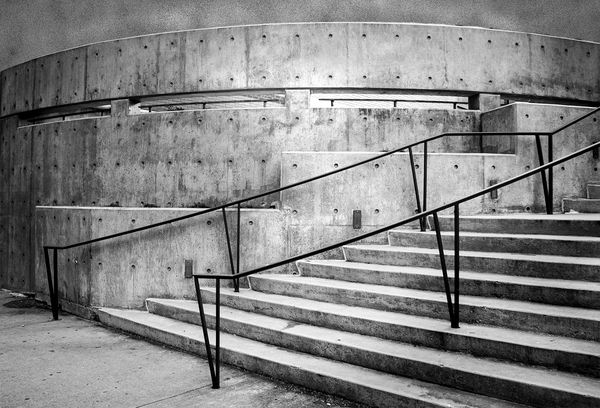
My camera club did a photo scavenger hunt this weekend and it was a lot of fun. One of the shot requirements was Architecture. I think this qualifies. I decided to process it in B&W since it was an overcast morning and the light was flat. I also wanted to work on my B&W processing skills. How did I do? Suggestions and comments welcome. Please feel free to play with it if you like.
Keni
Keni
Feb 24, 2020 22:24:01 #

Keni, I really like this. Good composition and tonality. Good job.
—Bob
—Bob
kenievans wrote:
My camera club did a photo scavenger hunt this weekend and it was a lot of fun. One of the shot requirements was Architecture. I think this qualifies. I decided to process it in B&W since it was an overcast morning and the light was flat. I also wanted to work on my B&W processing skills. How did I do? Suggestions and comments welcome. Please feel free to play with it if you like.
Keni
Keni
Feb 24, 2020 22:35:56 #
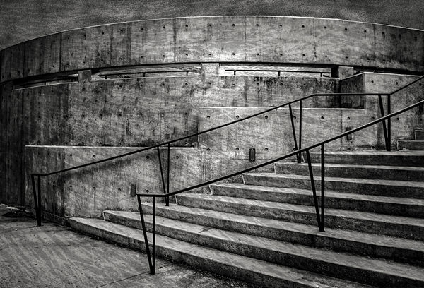
Nice shot Kini. Architectural for sure. The starkness of the environment cries out for B&W. Because I'm me I would darken it just a little bit and play with the contrast. I can't wait to see what the judges will think.
I don't know why I'm doing this but I'm actually making changes to one of your posts.
I don't know why I'm doing this but I'm actually making changes to one of your posts.
Feb 24, 2020 22:40:47 #
kenievans
Loc: Dallas
Thanks Bob! I have a lot of respect for your skills so your comments are much appreciated.
Feb 24, 2020 22:52:11 #

I, too, think this is a great architectural image, Kenie, and I
agree with Curmudgeon about "tweaking it" just a little.
I brought it into PSE and made the following adjustments:
Contrast -18, Shadows -21, Whites -13, Blacks -6,
Clarity +18 and Vibrance +18...
Tim
agree with Curmudgeon about "tweaking it" just a little.
I brought it into PSE and made the following adjustments:
Contrast -18, Shadows -21, Whites -13, Blacks -6,
Clarity +18 and Vibrance +18...
Tim

Feb 24, 2020 23:00:38 #
kenievans
Loc: Dallas
Curmudgeon wrote:
Nice shot Kini. Architectural for sure. The starkness of the environment cries out for B&W. Because I'm me I would darken it just a little bit and play with the contrast. I can't wait to see what the judges will think.
Thanks Jack. No judging on the scavenger hunt shots just a fun activity but I could enter it when the competitions start back up in May. Lots of time to play with it before then.
I did push the contrast quite a bit but I'm leery of going too far so I tend to be more conservative in B&W. Practice, practice, practice.

Feb 24, 2020 23:07:42 #
kenievans
Loc: Dallas
Rolk wrote:
I, too, think this is a great architectural image, Kenie, and I
agree with Curmudgeon about "tweaking it" just a little.
I brought it into PSE and made the following adjustments:
Contrast -18, Shadows -21, Whites -13, Blacks -6,
Clarity +18 and Vibrance +18...
Tim
agree with Curmudgeon about "tweaking it" just a little.
I brought it into PSE and made the following adjustments:
Contrast -18, Shadows -21, Whites -13, Blacks -6,
Clarity +18 and Vibrance +18...
Tim
I like that it is lighter and "cleaner" looking in the center. Nice job. Thanks for the comments and the rework.
Feb 24, 2020 23:50:19 #

Feb 25, 2020 07:50:24 #

Terrific image Keni. Great job with the conversion. Love the textural qualities and what you did with the sky. To my eye it appears to be just slightly crowded by some vignetting. This is nothing other than undoing that to the extent that the sky is evened out.

Feb 25, 2020 07:54:23 #

This is a very cool structure, Keni. Is it an open courtyard or some-such behind the curve? I love your decision to do in b&w which makes it all about the curves and angles and contrasts in tones. The other edits posted so far demonstrate how many directions one can take this.
Thanks for posting!
Thanks for posting!
Feb 25, 2020 10:04:04 #
Feb 25, 2020 10:11:57 #
kenievans
Loc: Dallas
fergmark wrote:
Terrific image Keni. Great job with the conversion. Love the textural qualities and what you did with the sky. To my eye it appears to be just slightly crowded by some vignetting. This is nothing other than undoing that to the extent that the sky is evened out.
Thank you so much! That is actually not the sky. There were buildings behind the wall and I shot too close to the top of it. Not enough of the background to clone so I extended the canvas, masked the background and added a texture layer to fill in. I was going for a concrete look. I tried to even out the color but it looked like a composite so I upped the contrast in the background layer. I agree it still needs some work. Maybe I can dodge the darker areas or reduce the contrast. Thanks for commenting.

Feb 25, 2020 10:18:28 #
kenievans
Loc: Dallas
Linda From Maine wrote:
This is a very cool structure, Keni. Is it an open courtyard or some-such behind the curve? I love your decision to do in b&w which makes it all about the curves and angles and contrasts in tones. The other edits posted so far demonstrate how many directions one can take this.
Thanks for posting!
Thanks for posting!
Thanks Linda! The steps take you up to the entrance to a building. Before I replaced the background you could see a portion of the brick wall. I flipped the image horizontally so the stairs went left to right in the photo.
Feb 25, 2020 10:22:48 #
kenievans
Loc: Dallas
Curmudgeon wrote:
Nice shot Kini. Architectural for sure. The starkness of the environment cries out for B&W. Because I'm me I would darken it just a little bit and play with the contrast. I can't wait to see what the judges will think.
I don't know why I'm doing this but I'm actually making changes to one of your posts.
I don't know why I'm doing this but I'm actually making changes to one of your posts.
I realized you must have edited your post while I was replying because I didn't see your image when I started to reply. Very nice work. The darker look is cool and you are always welcome to play with my images. You always have an interesting perspective.
Feb 25, 2020 10:44:32 #
If you want to reply, then register here. Registration is free and your account is created instantly, so you can post right away.