Couple's Portrait
Feb 8, 2020 15:19:24 #

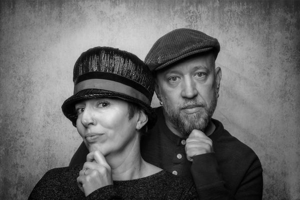
Was asked to shoot my friends photo to use in promotion for a fund raising dance contest. Would like constructive advice. They went for the B&W, which I also prefer.
Thanks
Marty
Thanks
Marty
Feb 8, 2020 16:17:13 #
Feb 8, 2020 16:21:34 #

Feb 8, 2020 16:40:05 #
Feb 9, 2020 10:46:13 #

MartyM wrote:
Was asked to shoot my friends photo to use in promotion for a fund raising dance contest. Would like constructive advice. They went for the B&W, which I also prefer.
Thanks
Marty
Thanks
Marty
It's interesting what a difference is obtained in converting colour to black and white. The tones in your colour photo worked particularly well in this conversion. The only thing I would try to change is the "strip" patterning on the background to the right of the couple. It's a bit distracting. The couple themselves look great.
Feb 9, 2020 11:57:27 #

MartyM wrote:
Was asked to shoot my friends photo to use in promotion for a fund raising dance contest. Would like constructive advice. They went for the B&W, which I also prefer.
Thanks
Marty
Thanks
Marty
Marty, Thank you for posting these images.
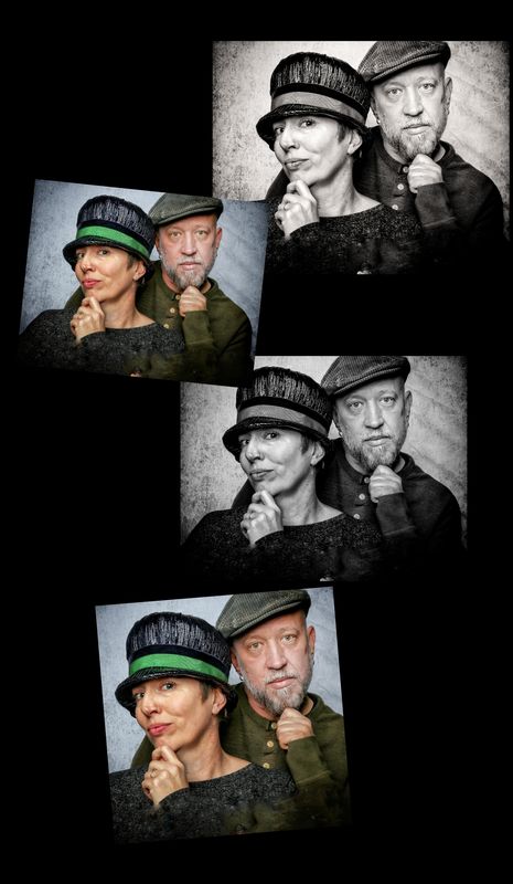
First, let's discuss the usage- a publicity portrait for a fundraising dance contest. The subjects are interestingly posed and the expressions are good. In the composition, I would like to see a more "theatrical" approach that better maximizes the eye contact you have established. There is too much space at the top of the frame and too little space at the bottom. The subjects are "falling out of the frame". So...in a rough edit (for the purposes of critique) I added space at the bottom and cropped into the gentleman's cap and brought the eyes into the upper 1/3 of the composition. I added a vignette to DE-emphasize the background and draw the viewer's eyes to the subjects.
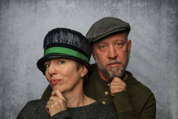
Color or black and white? I like both versions. Again, for the purpose, the color is more festive and theatrical- the green hat is cool! The black and white is effective as well- it's a matter of taste and how the images are going to be displayed, reproduced or advertised.
I also did a tighter crop- in a small ad, it might be more impactful.
Hands- When the hands are included in a portrait you have to better define them- fists and knuckles are not flattering views of the hands. Just posing the hands to show a side view- just a sight turn of the hands without moving the h faces or the camera position works well.
I hope this helps.
I'm sure the image will help with your charitable endeavors. Good job!
Ed
Feb 9, 2020 15:13:45 #

MartyM wrote:
Was asked to shoot my friends photo to use in promotion for a fund raising dance contest. Would like constructive advice. They went for the B&W, which I also prefer.
Thanks
Marty
Thanks
Marty
I'm all in on the B&W.
Something that might be a fun thing tho, use the B&W and do a color pop of the green band around the ladies hat.
Tom
Feb 9, 2020 17:11:52 #
Thanks Ed. I like the tight crop very much. Thank you for that suggestion. I’m sure that will make a huge impact in the small booklet produced for the program. Also your suggestion about the hands. This is my first ever compensated photo shoot. Thank you for your insight.
Marty
Marty
Feb 9, 2020 17:13:10 #
Feb 9, 2020 23:15:05 #
Wow, sorry Tom for my jumbled mess of a response I made above. I meant to say, first off, thanks for your input, much appreciated. I'll show the clients that look as well for their consideration. I have no clue as to how I fouled up the above response??
Feb 9, 2020 23:18:10 #

As always, E.L. has spot-on comments. I would just add that when I downloaded, his face and eyes appear sharper than hers. The blur on her skin is fine, but maybe sharpen her eyes a tad?
Handsome couple and nice pix!
Handsome couple and nice pix!
Feb 9, 2020 23:19:35 #
And posing his hand lightly on her shoulder would emphasize the "couple" connection.
Feb 9, 2020 23:21:23 #
Thanks for your input dat2ra! I think I used f7.1 hoping for crisp image. I will work on sharpening the eyes! Thanks.
Feb 9, 2020 23:25:34 #
And thanks for that suggestion as well. I am really excited to learn more about portraiture. I have watch many tutorials about lighting etc. Posing needs much more work.
Feb 25, 2020 13:51:53 #
MartyM wrote:
Thanks Tom. I’ll show thanks that not consideration as well
Just happened to notice you are right down the road from me....Mineral Springs is my home, I see you are in Monroe....
If you want to reply, then register here. Registration is free and your account is created instantly, so you can post right away.