You Choose............
Feb 2, 2020 10:27:09 #

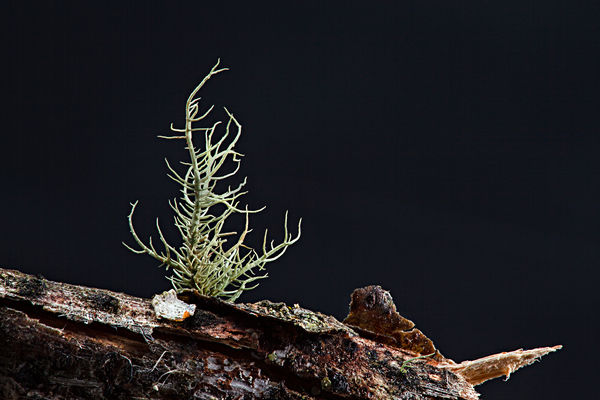
These images are experiments in lighting using 3 diffused Speedlites...............which one to you prefer? All comments welcome. Especially the critical ones..........or if you have an idea.........

Feb 2, 2020 10:34:34 #

It kind of looks as though you'e almost where you want to be with the shots but each one is missing what the other has. The one with the backlit wall has good foreground detail but the shadow on the wall in back is a bit distracting and in my estimation, distracting is a mistake. The one with the black background is nicely set off from that background but is missing a certain amount of detail in the foreground. If it were me, a stop or so more of light in the foreground of the black wall shot to illuminate the blocked up areas would fix that. Maybe a reflector would fill it in. If you disagree with this assessment, that's what makes art. 
Feb 2, 2020 10:41:31 #
photosbytw wrote:
These images are experiments in lighting using 3 diffused Speedlites...............which one to you prefer? All comments welcome. Especially the critical ones..........or if you have an idea.........
Number 1 shows significant amounts of vignetting. Number 2 draws the eye sharply to the subject without any distraction due to the solid background. Preference? It depends on the taste of the individual.
Feb 2, 2020 10:42:20 #

Feb 2, 2020 11:02:51 #
Feb 2, 2020 11:19:41 #
Burtzy wrote:
If you disagree with this assessment, that's what makes art.
I never disagree with anyone as we all have our opinions, likes and dislikes, phobias...........and I always appreciate honest comments


Feb 2, 2020 11:24:36 #
bbrowner wrote:
The real question is... which one do you, the photographer, prefer.
Thanks Barry, actually I don't. In trying something different I was looking for honest opinions and comments.
Feb 2, 2020 11:25:56 #
FotoHog wrote:
..........Number 1 shows significant amounts of vignetting. Number 2 draws the eye sharply to the subject without any distraction due to the solid background. Preference? It depends on the taste of the individual.
Comment appreciatedFeb 2, 2020 11:36:39 #

Feb 2, 2020 11:45:40 #

photosbytw wrote:
These images are experiments in lighting using 3 diffused Speedlites...............which one to you prefer? All comments welcome. Especially the critical ones..........or if you have an idea.........
Number 1, however I would tone down the wood on the right so your eye does not go to it with an adjustment brush in Lightroom
Feb 2, 2020 14:08:52 #
Feb 2, 2020 16:12:24 #

#2 for me by a bunch. The download has a lot of detail and the subject pops!
Feb 3, 2020 07:46:13 #

I like them both, for different reasons, but I would suggest you try losing the sliver of wood on the right lower portion of the image in #1 because it is a distraction, being so light in color.
Feb 3, 2020 08:00:29 #

Feb 3, 2020 08:15:38 #

They both have their merits, so it all comes down to what your intent was. The first one does have a bit of a dark streak on the left side which bothers me a bit, but that’s just me.
If you want to reply, then register here. Registration is free and your account is created instantly, so you can post right away.