Old pic, but one of my better ones.
Jan 9, 2020 08:59:19 #
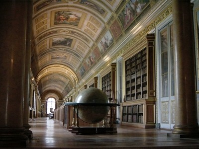
Here is a shot I took maybe fifteen years ago, with a point and shoot. I'm putting it up here in the hope that I'll get comments about composition...
Jan 9, 2020 09:10:43 #
In my humble opinion, the two sets of columns at each side are kind of useless because of the shadows, too dark. Could it be cropped so that long diagonal line proceeds out of the corner of the photo. Also the foremost globe in the center is a primary point of interest and perhaps should be lightened up a bit. Interesting photo overall.
Jan 9, 2020 09:14:59 #

I disagree about the cropping. For me, the columns give the photo the depth it needs to complete the subject.
Jan 9, 2020 09:17:12 #

I would prefer that you store the file when asking for feedback. The thumbnail provides very little detail. What can partially be seen is a question of 'level' where the various different lines in this wide angle make it hard to decide what to use as a guide to make the image 'seem' level. To me, the image seems unnaturally tilted to the right. You might consider leveling using the horizontal line of the setting that holds the globe in the foreground. Or, maybe using the pillar near the image center, behind the globe, as the guide to level the image.

Jan 9, 2020 09:20:59 #

Some will like it and some will not. The important question is did you like it when you took the picture?
Jan 9, 2020 09:24:56 #
Jan 9, 2020 13:45:43 #
I can't seem to decide about the columns but just a bit of leveling and maybe just a hair of lightening in the shadows.
Jan 10, 2020 07:58:32 #

cbabcock wrote:
Here is a shot I took maybe fifteen years ago, with a point and shoot. I'm putting it up here in the hope that I'll get comments about composition...
I think it's a wonderful picture.
Jan 10, 2020 08:47:58 #
Jan 10, 2020 10:33:42 #

I think it’s a fine composition. The columns help frame but it does appear to be slightly tilted. Nice tone to this shot.
Jan 10, 2020 11:14:48 #

That is a very nice photo, very good composition, too. Notice the columns. The picture doesn’t need to be leveled. If you look closely, you will see that both columns tilt in from the top of the image. It’s a function of the lens and lens angle at close quarters to the foreground, causing the vertical converging lines/columns. It’s not a big deal and can be corrected to vertical in post. I also agree that the big globe could be lightened up a tiny bit, but I wouldn’t do that much, just a subtle lightening. Those nits aside, you have a very nice photo there.
Have a great day, and thanks for sharing.
Have a great day, and thanks for sharing.
If you want to reply, then register here. Registration is free and your account is created instantly, so you can post right away.