Signature curiosity
Jan 8, 2020 22:10:26 #

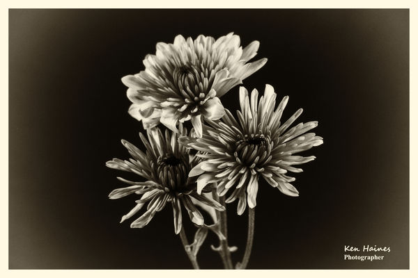
Recently, I submitted this photo, and as always I ask for comments. All the comments were favorable, but there were two comments noted that the signature was intrusive and takes away from the photo impact. Now, I'm not complaining or whining as I know the comments were passed on with all good intent. However, I am curious as to what makes it intrusive. Is it the size, color, or??? Does it appear that I'm trying to advertise my work? Or does it bother you at all? It's only been recently that I started to sign them, and only those that I'm particularly proud of. I know there are several other Hoggers that do the same.
So as I said, the comments about the signature were meant for positive feedback and I appreciate the time spent carefully looking the photo over. So, no harm done. I'm always open to suggestions that will improve my work.
Your thoughts? I would appreciate your consideration. Ken
So as I said, the comments about the signature were meant for positive feedback and I appreciate the time spent carefully looking the photo over. So, no harm done. I'm always open to suggestions that will improve my work.
Your thoughts? I would appreciate your consideration. Ken
Jan 8, 2020 22:16:34 #

I like your image, and I have no problem with your signature being on it.
I think it is fairly unobtrusive, and neatly done.
The way I look at it, it is your work and you should do what you want with it. JMHO.
will
I think it is fairly unobtrusive, and neatly done.
The way I look at it, it is your work and you should do what you want with it. JMHO.
will
Jan 8, 2020 22:23:20 #

Soul Dr. wrote:
I like your image, and I have no problem with your signature being on it.
I think it is fairly unobtrusive, and neatly done.
The way I look at it, it is your work and you should do what you want with it. JMHO.
will
I think it is fairly unobtrusive, and neatly done.
The way I look at it, it is your work and you should do what you want with it. JMHO.
will
Everything he said.
Jan 8, 2020 22:26:14 #

Possibly the contrast here. One's eye is attracted to bright.
Size looks fine.
Now I try to use a font color that kinda blends with the background it is on.
Sometimes I have to try a few colors, and/or reposition it.
For this shot, I'd try a shade of gray, not too much brighter that the background.
Some of the older monograms here were before I decided on low contrast signature colors.
You can see that some are loud, some are soft:
https://mymindseye.us/Essay.phtml
It does not appear to advertise your work as much as let people know that the work is yours.
Jan 8, 2020 22:27:10 #

It draws the eye to it. Admittedly, just for an instant. It doesn't really take away from the image to a meaningful degree. It's just an observation on my part. If you like it you should certainly keep it.
Jan 8, 2020 22:29:01 #

Photobum wrote:
Recently, I submitted this photo, and as always I ... (show quote)
I don't think the signature is intrusive unless I wanted to frame the photo and place it on my wall. Howeverm if you made you signature more as a script type and less a printed type it might be better. Perhaps more of a simple logo. I think it needs to be something more than just a typical, common font type signature.
I think a signature needs to look like a signature of some sort and using common fonts just doesn't hack it. I guess it needs to have some artistic quality but certainly not overly artistic, just not plain, common fonts.
Good luck! I wish you well and much success.
Jan 8, 2020 22:29:59 #
Personally it does not bother me at all. If I want to view the image larger on the screen I have the simple option of placing my hand over it if it were to hinder me making an opinion of the work.
But, if it was an image I was going to buy and hang on my wall, I may have a different view
But, if it was an image I was going to buy and hang on my wall, I may have a different view
Jan 8, 2020 22:32:01 #

The watermark doesn't bother me, either, but it does draw my eye to the corner of the image and away from the flower. To address, try a different opacity. Rather than being 100%, experiment with settings between 80% and 20% with the goal the signature is closer to the darker flower petals or even the stems. The watermark will still be clearly visible, but won't compete for attention by drawing your eyes away from the flowers.
Jan 8, 2020 22:48:50 #
I think if it were a print and if the signature is to be viewable within the mat on a print, it should be signed personally and unobtrusevly to indicate your approval of the final result, no digital signature.
For a website it would be according to your goal: promote your business, protect your copyrighted image, etc. Your name and/or website should be easily visible but not overdone, but as the artist it is your judgement that counts.
For a website it would be according to your goal: promote your business, protect your copyrighted image, etc. Your name and/or website should be easily visible but not overdone, but as the artist it is your judgement that counts.
Jan 8, 2020 22:49:38 #

I find signatures within the field of the photograph a bit obnoxious. I've never seen a photographic exhibit at a museum wherein the works were signed within the field of the photograph.
All of my framed photographs are signed at the lower-left corner of the photo but on the matte.
--Bob
All of my framed photographs are signed at the lower-left corner of the photo but on the matte.
--Bob
Photobum wrote:
Recently, I submitted this photo, and as always I ... (show quote)
Jan 8, 2020 22:59:02 #
Flying Three
Loc: Berthoud, CO
I missed the photo the first time. It is really nice. As to the signature, I agree with longshadow. Also, I would drop the "photographer". To me that is redundant.
Jan 8, 2020 22:59:56 #
Well. I certainly appreciate the constructive comments so far. Thank you all.
Jan 9, 2020 00:56:23 #
Soul Dr. wrote:
I like your image, and I have no problem with
your signature being on it.
I think it is fairly unobtrusive, and neatly done.
The way I look at it, it is your work and you
should do what you want with it. JMHO.
will
I like your image, and I have no problem with
your signature being on it.
I think it is fairly unobtrusive, and neatly done.
The way I look at it, it is your work and you
should do what you want with it. JMHO.
will
Agreed. But given a choice, I'd rather be
viewing it minus the small distraction. It
is a detailed light colored thing calling to
me from what should be a "quiet space"
same as the other lower corner. No big
deal, but as I put it, "given a choice". If
that were my image and if I had need to
add my sig, I'd go with Longshadow and
minimize its contrast, dark grey on grey.
I said "if I had need to add my sig" cuz
it's not anything I actually need to do.
Jan 9, 2020 01:42:25 #
Photobum wrote:
Recently, I submitted this photo, and as always I ... (show quote)
I think it does, because that's what the eye intend to move first, even before looking what's going on in the picture and a signature should never do that!
Jan 9, 2020 04:03:54 #

If you want to reply, then register here. Registration is free and your account is created instantly, so you can post right away.