Check out Traditional Street and Architectural Photography section of our forum.
Reprise in response to previous post--nude and space
Dec 23, 2019 09:55:25 #
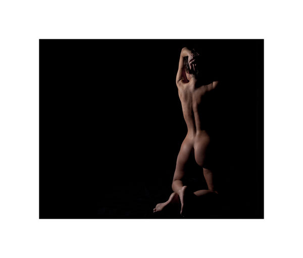
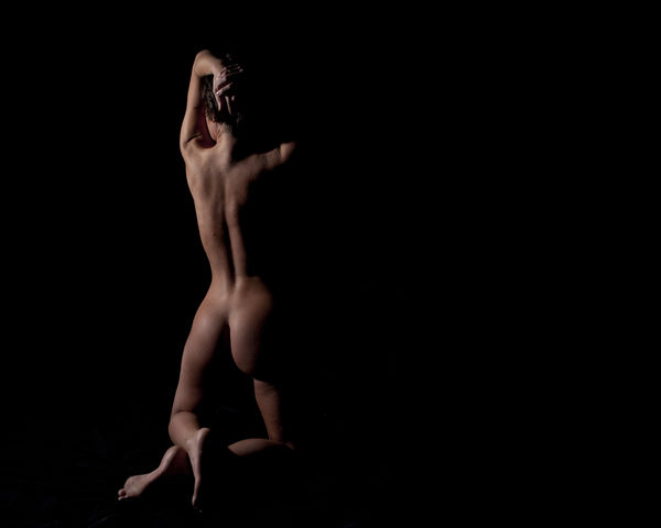
Here are some variations on the negative space--do they affect you differently. Think emotion and not technique.


Dec 23, 2019 15:01:56 #
I like the second from the top the most. hey are all very well done! What a great experiement you did here.
Dec 24, 2019 06:42:50 #
Beautiful set. I like #2 & 3 best. I think because she is looking towards the left, I like the images with more space on the left.
Check out Film Photography section of our forum.
Dec 24, 2019 07:05:38 #
vertigo wrote:
Here are some variations on the negative space--do they affect you differently. Think emotion and not technique.
If we are taking emotion, then, in my opinion, the first image shows more emotion than the others. The absence of some negative space brings you more into the image than the others...You feel much closer to the model with less neg space between you. To me, there is a feeling of "oneness" with the model.
ich...
Dec 24, 2019 07:19:15 #
Beautifully shot photo of a beauty, especially #1 ... But... do I need to see her right foot? With foreshortening, the foot appears to be as big as her upper arm shoulder to elbow.
Dec 24, 2019 07:56:48 #
vertigo wrote:
Here are some variations on the negative space--do they affect you differently. Think emotion and not technique.
Well done photos.
To me, emotion is not part of my reaction to images. Discernment is. I find the kneeling pose awkward in all. When it comes to such studies, I see them as dance steps with the environs. Hence, emotion is part and parcel in the image.

Dec 24, 2019 10:47:51 #
Check out Bridge Camera Show Case section of our forum.
Dec 24, 2019 13:35:04 #
DocDav
Loc: IN
# 3 is my fav. I like empty or negative space and she seems to be looking "into it". I always seem to like empty space on the left vs right but also the other pics make it seem as if she is looking away or avoiding something?
Just me. Great set.
Just me. Great set.
Dec 24, 2019 16:08:27 #
smf85
Loc: Freeport, IL
Very well done set - I like #1 in particular as it seems to offer more of a connection; the others seem detached or formalized - the feeling of a well done sculpture.
Dec 24, 2019 17:15:30 #
#1 was the original crop. The others were done to illustrate what different cropping can do to the final look. The last two have her facing slightly out of the frame for a more lonely or as DocDay says avoiding look. Now that I look at all of them I'm not sure the original composition was the right one (for me.) Thank-you all for your input and reflections.
And to all, whether it is your holiday or not, have a Merry Christmas.
And to all, whether it is your holiday or not, have a Merry Christmas.
Dec 26, 2019 00:22:18 #
Thanks, vertigo. This continues our discussion from a few days ago. I like #2, but find #4 most interesting. Great examples because they are otherwise all identical.
Check out The Dynamics of Photographic Lighting section of our forum.
Dec 26, 2019 00:22:20 #
Thanks, vertigo. This continues our discussion from a few days ago. I like #2, but find #4 most interesting. Great examples because they are otherwise all identical.
Dec 27, 2019 11:09:36 #
dat2ra wrote:
Thanks, vertigo. This continues our discussion from a few days ago. I like #2, but find #4 most interesting. Great examples because they are otherwise all identical.
Yep--makes her look like she just heard something scary in the dark. (Didn't we all do that when we were little?!
Dec 27, 2019 11:58:44 #
AZNikon
Loc: Mesa, AZ
I like 1 best, then 2 and 3 with negative space on the left where she might be gazing. Negative space to the right makes no sense to me. Very well done! 


Dec 27, 2019 12:02:22 #
smf85
Loc: Freeport, IL
I think the foreshortening adds to the feeling of disquiet in the images, particularly the 3rd and 4th. Still I like #1 the best as it has both disquiet and connection at the same time.
If you want to reply, then register here. Registration is free and your account is created instantly, so you can post right away.
Check out Infrared Photography section of our forum.


