Warm Winter
Dec 16, 2019 14:25:27 #

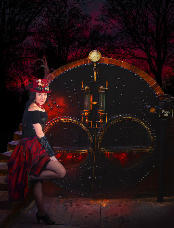
This is a multi-layered composite using techniques learned from some of Brooke Shaden tuts. I do like the way she works, it seems so much more straightforward than some I've seen.
Please feel free to critique, I always appreciate it. (It has uploaded a little darker than intended but I think it will be OK in download).
Please feel free to critique, I always appreciate it. (It has uploaded a little darker than intended but I think it will be OK in download).
Dec 16, 2019 14:47:32 #

The lighting and the colour all seem nicely coordinated, especially the red sky in the background. The only thing that looks a bit off to my eye is that the boiler seems to have a softness about it that seems a bit at odds with the more contrasty background. Or is it the highlights that need subduing?
Perhaps the blacks aren't dark enough - and that might apply to the model as well. Hard to tell without experimenting.
Perhaps the blacks aren't dark enough - and that might apply to the model as well. Hard to tell without experimenting.
Dec 16, 2019 14:55:41 #
R.G. wrote:
The lighting and the colour all seem nicely coordinated, especially the red sky in the background. The only thing that looks a bit off to my eye is that the boiler seems to have a softness about it that seems a bit at odds with the more contrasty background. Or is it the highlights that need subduing?
Perhaps the blacks aren't dark enough - and that might apply to the model as well. Hard to tell without experimenting.
Perhaps the blacks aren't dark enough - and that might apply to the model as well. Hard to tell without experimenting.
Yes, I see what you mean RG. I think a touch more contrast in those areas would do the trick. I’ll experiment. Thanks for the pointer.
Dec 17, 2019 05:09:20 #

Dec 17, 2019 05:39:51 #
Dec 17, 2019 08:14:18 #

Dec 17, 2019 10:20:47 #
Linda From Maine wrote:
Quite mesmerizing; your "punks" are growing on me 
They are all really pleasant folk Linda, I’ve not come across a bad one yet. Some have had some rough times and found the steampunk community welcoming. It’s all good. This has come up a bit darker than intended. Rachel is made from six or seven pieces and the rest is obvious I guess. Pleased to say the computer is back in sorts now - I just need some inspiration and I’ll be at it again.
Dec 17, 2019 12:39:33 #
Jwshelton
Loc: Denver,CO
Interesting! Love the colors.
Complex and busy image that remains very enticing and pleasing.
Thanks for sharing.
Complex and busy image that remains very enticing and pleasing.
Thanks for sharing.
Dec 17, 2019 13:04:14 #
Another one of those grab me shots. I tend toward the dark and this is just perfect. The colors are wonderful and the subject perfectly placed. The only thing I find slightly distracting is the "Feed Off" sign on the right side of the picture, it seems glaringly bright in the dark mood of the picture.
Dec 17, 2019 17:27:49 #
Curmudgeon wrote:
Another one of those grab me shots. I tend toward the dark and this is just perfect. The colors are wonderful and the subject perfectly placed. The only thing I find slightly distracting is the "Feed Off" sign on the right side of the picture, it seems glaringly bright in the dark mood of the picture.
I did think about cloning the sign out but in the end decided it was odd enough to leave in - but most will probably disagree! Thanks again for commenting Curmudgeon, much appreciated.
If you want to reply, then register here. Registration is free and your account is created instantly, so you can post right away.