Same Pic
Dec 9, 2019 02:42:27 #
Dec 9, 2019 04:59:23 #
Dec 9, 2019 05:53:41 #
Dec 9, 2019 07:42:16 #
Nice renditions.
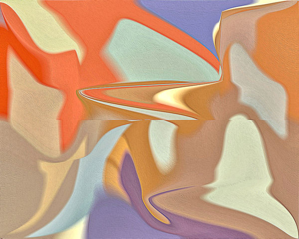
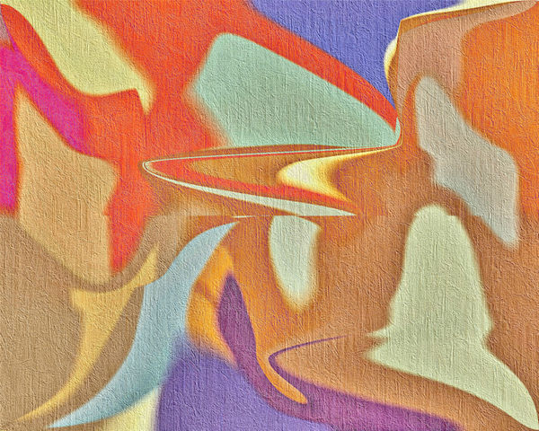
For me, the top image has more color tonality blended with vibrancy while the bottom expression shows the same blend but with a tad more detail and texture.
Again, both interpretations are nice.
For me, the top image has more color tonality blended with vibrancy while the bottom expression shows the same blend but with a tad more detail and texture.
Again, both interpretations are nice.
Dec 9, 2019 07:42:16 #
Nice renditions.
For me, the top image has more color tonality blended with vibrancy while the bottom expression shows the same blend but with a tad more detail and texture.
Again, both interpretations are nice.
For me, the top image has more color tonality blended with vibrancy while the bottom expression shows the same blend but with a tad more detail and texture.
Again, both interpretations are nice.
Dec 10, 2019 08:34:29 #
MrMophoto
Loc: Rhode Island "The biggest little"
Some unsolicited advice from one who teaches art:
When you find a niche that works, you have to find a way to keep your images looking new and fresh, otherwise they start to all look the same.
I think you have something unique - keep it going & good luck
When you find a niche that works, you have to find a way to keep your images looking new and fresh, otherwise they start to all look the same.
I think you have something unique - keep it going & good luck
Dec 10, 2019 11:32:22 #

Dec 10, 2019 17:01:45 #

roadsideron wrote:
two different texture modes.
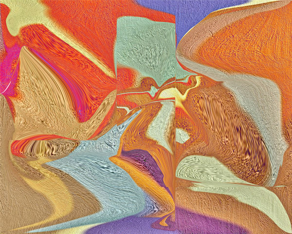
I really like #3. While the first two are very nice abstracts that have interesting lines and wonderful color, I see in the 3rd one rivers, lakes, valleys, monoliths, plateaus -- it reminds me of the area you are from in Arizona and maybe that was a conscious or subconscious inspiration for this. All three are very nice.
Dec 10, 2019 17:08:10 #
roadsideron
Loc: Apache Junction, AZ
Thanks for all the comments. I was going to give these abstracts a rest and take a break until I discovered how to contort them.
Dec 11, 2019 08:32:40 #
drc023
Loc: North Little Rock, Arkansas
#3 is interesting. I can see the unhappy face of a fish and with an otter that has a toucan on its head on top of it. Maybe that's the beauty of abstract art.
Dec 18, 2019 18:55:32 #
If you want to reply, then register here. Registration is free and your account is created instantly, so you can post right away.