Motel Room 201
Dec 5, 2019 12:16:37 #
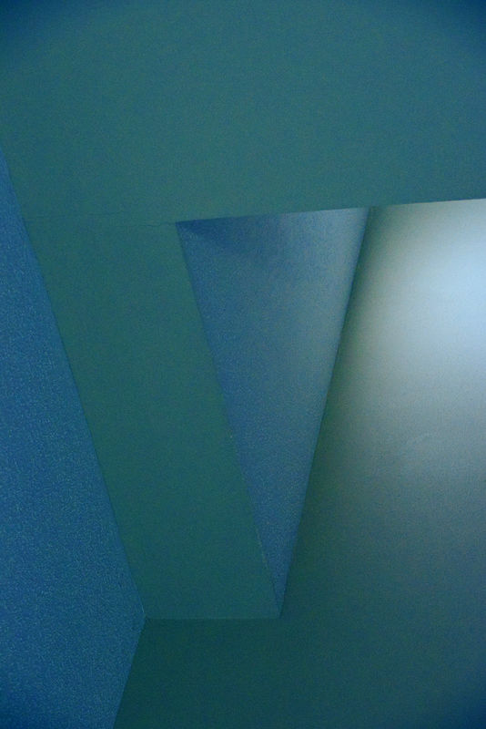
Visual minimalism; a respite from hyper-saturated colors and aggressive pictorial content; but is there enough to see here....?
I am interested in your reactions - the "good, the bad and the ugly" - regarding subject/content, impact and anything else. Feel free to play with the image if you wish.
(Sorry! Meant to put this in "For Your Consideration" but don't know how to move it; maybe Admin will do that)
I am interested in your reactions - the "good, the bad and the ugly" - regarding subject/content, impact and anything else. Feel free to play with the image if you wish.
(Sorry! Meant to put this in "For Your Consideration" but don't know how to move it; maybe Admin will do that)

Dec 5, 2019 12:20:53 #
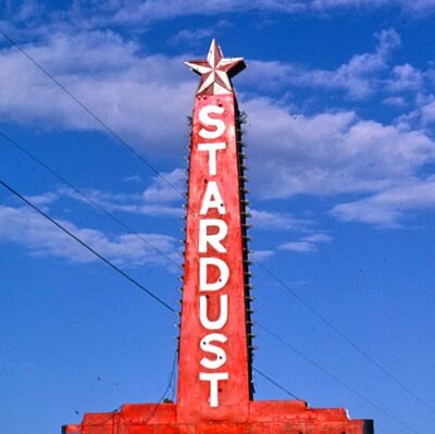
Not my thing but found the photo equally interesting (maybe more so) when I turn it 90° left or right, or 180°.
Dec 5, 2019 12:25:30 #

Believe I see what caught your eye - worth pursuing. This particular capture doesn't quite make it for me. I find it a bit bland. Post processing, relighting or just another similar with a bit more drama. I think you are on the right track and can come up with something of value.
Dec 5, 2019 12:31:51 #

srt101fan wrote:
.../... (Sorry! Meant to put this in "For Your Consideration" but don't know how to move it; maybe Admin will do that)
Ask the admin under 'report issue' link
Dec 5, 2019 12:37:23 #

Dec 5, 2019 13:05:19 #

srt101fan wrote:
Visual minimalism; a respite from hyper-saturated colors and aggressive pictorial content; but is there enough to see here....?
I am interested in your reactions - the "good, the bad and the ugly" - regarding subject/content, impact and anything else. Feel free to play with the image if you wish.
(Sorry! Meant to put this in "For Your Consideration" but don't know how to move it; maybe Admin will do that)
I am interested in your reactions - the "good, the bad and the ugly" - regarding subject/content, impact and anything else. Feel free to play with the image if you wish.
(Sorry! Meant to put this in "For Your Consideration" but don't know how to move it; maybe Admin will do that)
Yeah, I can't really grab on to this one. I'm not sure what is distracting my attention more, the ceiling or the entrance way. But the minimal color is not an issue for me at all.
Dec 5, 2019 14:20:10 #

I like the angle and the difference in color and texture, but to me it's lacking a subject or focal point. I see exactly what you were going for though.
Andy
Andy
Dec 5, 2019 15:43:26 #

Dec 5, 2019 17:51:02 #

I was curious about Stardust's observation re rotating. With your generous offer to play, I'm submitting this pov. The color as posted was hard to get past (I won't state what it reminds me of  ). I think I'd also have liked to not know the origin via the title; leave it open to interpretation.
I'm not sure if my edit follows your "respite from hyper-saturated colors," but I like it for the geometry, the spot of light, and the uncertainty of what it is.
). I think I'd also have liked to not know the origin via the title; leave it open to interpretation. I'm not sure if my edit follows your "respite from hyper-saturated colors," but I like it for the geometry, the spot of light, and the uncertainty of what it is.
Kmgw9v wrote:
I have often used the word in the context of this dictionary definition: "arousing curiosity or interest; holding or catching the attention" when I can't (or have not yet been able to) state specifically what it is that catches or holds my attention. Perhaps the opposite of boring?The word “interesting” so often means nothing. Why use it?
Dec 5, 2019 17:58:43 #
Stardust, quixdraw, jaymatt, AndyH – Thanks for looking and commenting. This being an abstract (and maybe not a good one!) I didn’t expect much in the way of positive reactions. Yes it is bland, and yes it lacks a focal point. I seem to be drawn to abstract subjects with interesting (to me) lines, patterns, shapes, etc. Most don’t work out too well! In this case I was attracted by the composition and subtle variations in texture, color, and light & dark areas.
This was a grab shot. I did nothing to the lighting. Shot in RAW; developed in Affinity with only minor contrast and clarity tweaks. I will use this to continue learning post-processing with Affinity and I think I can have fun with it – maybe convert to monochrome? Maybe black & white with some added red or other color? Many possibilities….
This was a grab shot. I did nothing to the lighting. Shot in RAW; developed in Affinity with only minor contrast and clarity tweaks. I will use this to continue learning post-processing with Affinity and I think I can have fun with it – maybe convert to monochrome? Maybe black & white with some added red or other color? Many possibilities….
Dec 5, 2019 18:00:26 #
Rongnongno wrote:
Ask the admin under 'report issue' link
Thanks, Rongnongno, I did contact Admin and they moved it.
Dec 5, 2019 18:12:49 #
Linda From Maine wrote:
I was curious about Stardust's observation re rota... (show quote)
Wow, Linda, I love it! Great edit, motivates me to keep learning PP. The original color, yeah, not to my liking either. Interesting comment re the title! And I agree with you 100% on the use of the word "interesting", that's exactly the way I use it..... (As an aside, do you remember Arte Johnson on Laugh-In and his line "Very interesting ...,"?). Thanks much for responding and editing.
Dec 5, 2019 18:16:24 #
srt101fan wrote:
I sure do remember Arte's signature line Wow, Linda, I love it! Great edit, motivates me to keep learning PP. The original color, yeah, not to my liking either. Interesting comment re the title! And I agree with you 100% on the use of the word "interesting", that's exactly the way I use it..... (As an aside, do you remember Arte Johnson on Laugh-In and his line "Very interesting ...,"?). Thanks much for responding and editing.

The only pp here was to push the color temperature slider to the cool* end, using an online app I have on my Chromebook (it's from befunky.com) Very glad you enjoyed!
*Cool colors: blue, green. Warm colors: red, orange, yellow
Click for a 2018 FYC discussion: The Colors of Light
.
Dec 5, 2019 21:18:02 #
Linda From Maine wrote:
I was curious about Stardust's observation re rota... (show quote)
Very nice take. The rotation makes it much more abstract, and the color palette gives a focus.
Andy
Dec 6, 2019 03:29:01 #

srt101fan wrote:
Visual minimalism; a respite from hyper-saturated colors and aggressive pictorial content; but is there enough to see here....?
I am interested in your reactions - the "good, the bad and the ugly" - regarding subject/content, impact and anything else. Feel free to play with the image if you wish.
(Sorry! Meant to put this in "For Your Consideration" but don't know how to move it; maybe Admin will do that)
I am interested in your reactions - the "good, the bad and the ugly" - regarding subject/content, impact and anything else. Feel free to play with the image if you wish.
(Sorry! Meant to put this in "For Your Consideration" but don't know how to move it; maybe Admin will do that)
A welcome respite for sure.
This image is boring to me. It has some interesting elements, perhaps a dutch tilt might make it more appealing.
If you want to reply, then register here. Registration is free and your account is created instantly, so you can post right away.