Sisters
Sep 5, 2012 21:08:24 #

A few from a free session last week. Your comments and suggestions always welcome.
Sep 5, 2012 21:44:23 #

The last photo really pops. I like that one best but they are all beautiful young ladies and I hope you keep snapping that camera lens in their direction. You cannot fail if you do. :)
Sep 5, 2012 21:58:40 #

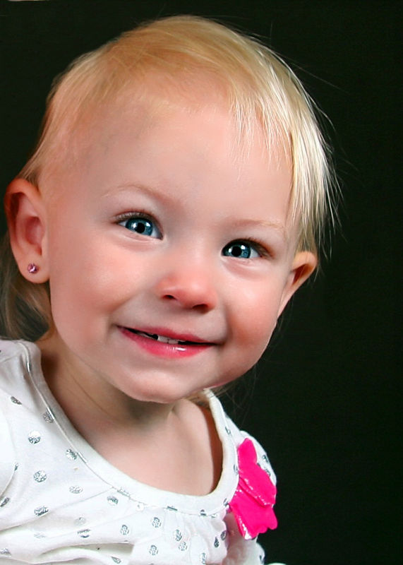
#1 is adorable - cropped a bit tight for my taste, but great expression. I might like to see the light to camera left down just a bit as the lighting is on the flat side, but overall, really nice.
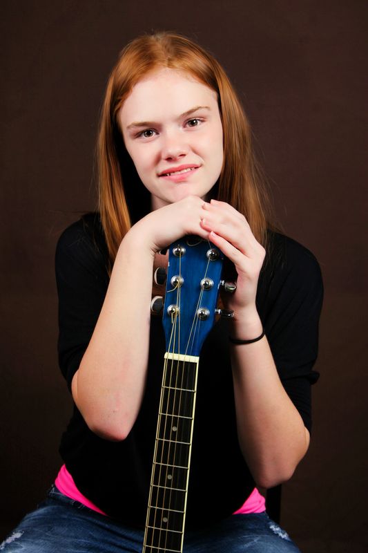
#2 - nice pose, but we have those darn bare arms that are every bit as bright as her face. Try burning dow the arms if you can - don't overdo it, just tone them down so they are not such competition for the face. The hands are too bright as well, so tone those down a little. Just a little less light on the camera left side would sculpt her face nicely. Your lighting is pretty good here, but a little more of a ratio would help.
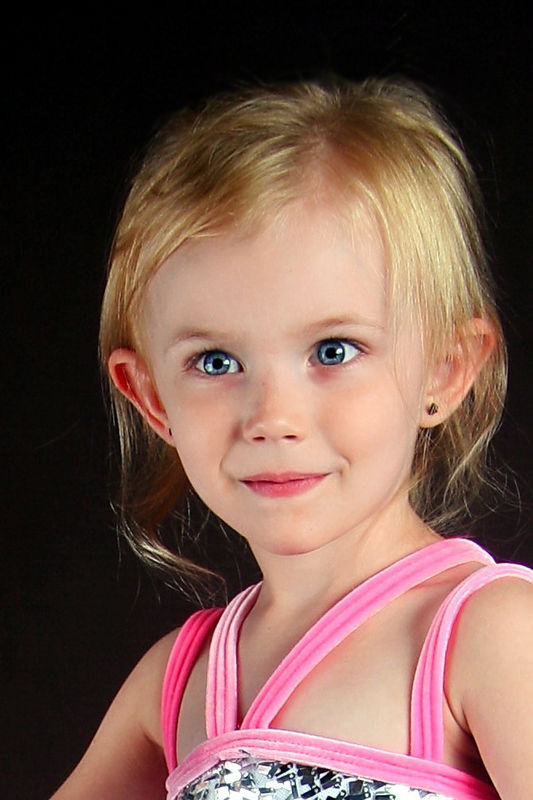
#3 is my favorite. The camera is just a touch lower than optimum and the light to camera right is also a bit lower than optimum, but not all that bad. Ideally, that nose shadow should fall down close to the corner of the mouth, but that is the ideal and not alway easy to do with kids!
An addition light to separate her hair from the background would have been nice, but not critical.
You have the lights close enough to make GREAT soft light. Just some tweaking on the angles is all you need. Oh - and varying the side-to-side light to get better face modeling.
#2 - nice pose, but we have those darn bare arms that are every bit as bright as her face. Try burning dow the arms if you can - don't overdo it, just tone them down so they are not such competition for the face. The hands are too bright as well, so tone those down a little. Just a little less light on the camera left side would sculpt her face nicely. Your lighting is pretty good here, but a little more of a ratio would help.
#3 is my favorite. The camera is just a touch lower than optimum and the light to camera right is also a bit lower than optimum, but not all that bad. Ideally, that nose shadow should fall down close to the corner of the mouth, but that is the ideal and not alway easy to do with kids!
An addition light to separate her hair from the background would have been nice, but not critical.
You have the lights close enough to make GREAT soft light. Just some tweaking on the angles is all you need. Oh - and varying the side-to-side light to get better face modeling.
Sep 5, 2012 22:10:39 #
CaptainC wrote:
#1 is adorable - cropped a bit tight for my taste,... (show quote)
To get "more of a ratio" do I need to turn one light more than one stop less than the other? Is there a book you would recommend about lighting ratios? I'll try your suggestions on tomorrow's model!
Sep 5, 2012 22:22:38 #
Dr Rae wrote:
quote=CaptainC #1 is adorable - cropped a bit tig... (show quote)
Yes, that is the basic idea - just get more light from one than the other. About 1 stop difference as measured at the subject is a good start. You have heard me drone on and on and on about using an incident meter. :-)
Your main light is the one that casts the shadows, the lesser one is the fill and it should just fill in the shadows but NOT make any shadows. In images in which there are no shadows from the nose, we know the ratio is to close to 1:1. Flat lighting certainly can be used and you will see it often in fashion stuff, but good portraits - in most cases - benefit from properly placed shadows.
Sep 6, 2012 09:12:04 #
Georgia Peddler
Loc: Brunswick, GA
What Cap'n said
About #2 - maybe crop under elbows and get rid of the two pink triangles that draw your eye down there
Love #2 - great capture.
Play with your lighting - shoot many with different slight changes and you will see instantly where shadows, fill, etc. are going. Keep it up- fun, eh?
About #2 - maybe crop under elbows and get rid of the two pink triangles that draw your eye down there
Love #2 - great capture.
Play with your lighting - shoot many with different slight changes and you will see instantly where shadows, fill, etc. are going. Keep it up- fun, eh?
If you want to reply, then register here. Registration is free and your account is created instantly, so you can post right away.