training day portraits
Sep 5, 2012 15:49:13 #

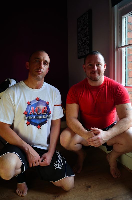
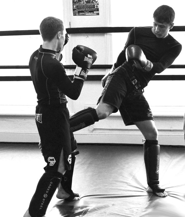
A few shots from a training night at a local MMA gym owned by a friend.... (watch the comments he may come round to see you :lol: )


Sep 5, 2012 15:57:55 #

Sep 5, 2012 16:08:50 #
Erv wrote:
I like 2 and 3 for the framing and lighting.
Erv
Erv
Thanks ERV.. I wasnt sure on #1 too light for the subjects
Sep 5, 2012 21:52:49 #

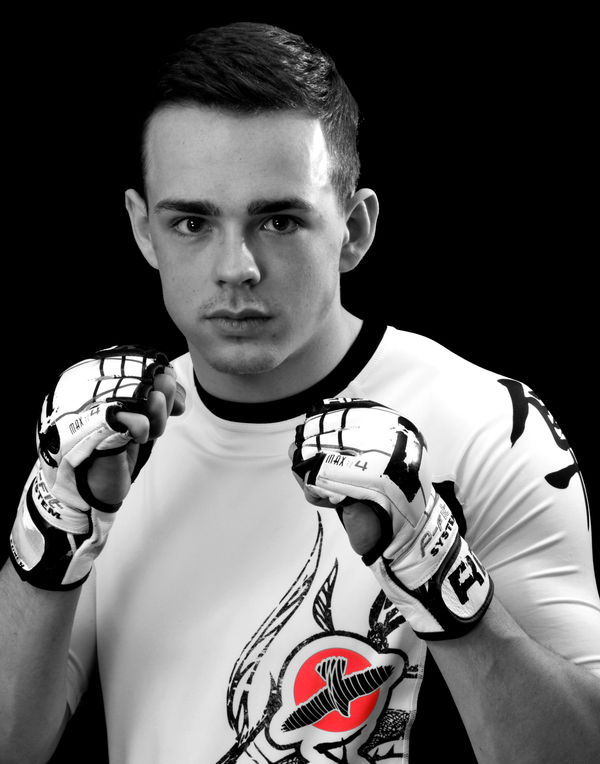
Two men I do not want mad at me lol. I would vote 8 for framing. The spot of color is done well IMHO. Thanks for sharing.
Sep 5, 2012 22:39:12 #

# 2 & 3 are great use of window light. Might crop a bit closer, but excellent concept.
WildBill likes the spot color - I go the other way - I have NO idea why you would choose a blue t-shirt, a painting on the wall, and a red thing on a shirt. I think the spot color degrades the images.
The blue shirt image has a very interesting view of the background person, but you made a t-shirt the subject.??? That IS where the eye is drawn.
An out of focus picture on the wall is the subject? I could have sworn the guy with his hand up is the subject.
The image of the guy with his hands up - #8- is wonderful B&W image. I LOVED it until I realized the subject is not the person but a red disc on his shirt. :-)
OK, I admit it, I think spot color is nothing more than a "look what I can do with Photoshop" thing. Seldom is it used well - or with any purpose.
Sep 6, 2012 10:11:46 #
WildBill wrote:
Two men I do not want mad at me lol. I would vote 8 for framing. The spot of color is done well IMHO. Thanks for sharing.
I wouldnt argue with them either.... Thanks for the feedback WildBill
Sep 6, 2012 10:21:35 #
CaptainC wrote:
# 2 & 3 are great use of window light. Might c... (show quote)
CaptainC Take your point on the spot colouring especially the blueshirt. the Focus was always meant to be the lad in the background(just a bit out of focus though), The picture was meant to lift the foreground man with his hand up. The spot (my own nephew) was just a colour on his shirt no real purpose and shouldnt detract from the overall visual or so I thought.....Will resist the urge to play in Photoshop in the future. B&W or Colour... B&W or Colour...see i'm reinforcing the subliminal message.... Thanks for the feedback and comments something to work on in the future
Sep 7, 2012 00:09:26 #
CaptainC wrote:
# 2 & 3 are great use of window light. Might c... (show quote)
I was not a fan of the other two but did like the logo on the shirt. Not something I would do to every photo but every once in a great while, it works for me. That one worked for me.
I am not a fan of turning photos into abstract art with Photoshop so I understand you not liking the spot of color. I do think it is getting over utilized (making it less attractive) but I did not feel it was used badly in this photo. It was not a random logo but very pertinent to the subject. I also thought the location of the logo helped prevent it from becoming the main subject. I am not a pro and your opinion is revered but I did want to explain my position.
Sep 7, 2012 00:34:06 #
WildBill wrote:
quote=CaptainC # 2 & 3 are great use of windo... (show quote)
Sure - and I agree that the shirt logo was the least-bad use. :-)
The spot color thing can work in commercial/product photography and it can create dramatic images. I think its use in people/portrait photographs is just an overused/poorly used gimmick. The B&W image with color only in the iris of the eyes has been done, and done, and done. What can work reasonably well is to desaturate the image to some degree but keep one color less desaturated. It is very subtle, but can still accentuate your subject.
That is the problem with most of the terrible spot color images: the maker chooses something that has nothing to do with the subject - drawing you eye to something for no earthly reason - like the blue shirt in our example here.
Sep 7, 2012 11:31:44 #
CaptainC wrote:
quote=WildBill quote=CaptainC # 2 & 3 are gr... (show quote)
Thanks CaptainC I am definately leaving the spot colour alone from now on... Thanks for the desaturate advice will have a play with that from now on...subtle use hopefully
Sep 14, 2012 03:23:52 #
JoboX wrote:
A few shots from a training night at a local MMA gym owned by a friend.... (watch the comments he may come round to see you :lol: )
I liked the action look of them, the use of window light to light the subjects. What I didn't like was all the background. I think less depth of field and a blurry background would have added to the "strength" of them. IMHO.
If you want to reply, then register here. Registration is free and your account is created instantly, so you can post right away.