Light Processing: Desktop, Evening
Nov 17, 2019 18:11:11 #

Sometimes a fair amount of work does not appear obvious. I'd like to hear responses to this, in any area, technical or communicating, just to see what I THINK will strike the viewer as opposed to what really strikes people.
Nov 17, 2019 20:02:46 #

Technical:
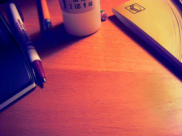
The white balance apears to be a bit red, although that may be to give it that warm evening light.
The image is a bit noisy, maybe some noise reduction is needed, or shooting at a lower ISO value.
Esthetics:
I like the contrast in technology. The person is well organised with a neat desk.
The white balance apears to be a bit red, although that may be to give it that warm evening light.
The image is a bit noisy, maybe some noise reduction is needed, or shooting at a lower ISO value.
Esthetics:
I like the contrast in technology. The person is well organised with a neat desk.
Nov 17, 2019 21:10:33 #

Nov 17, 2019 21:14:43 #
RichardTaylor wrote:
Technical:
The white balance apears to be a bit red, although that may be to give it that warm evening light.
The image is a bit noisy, maybe some noise reduction is needed, or shooting at a lower ISO value.
Esthetics:
I like the contrast in technology. The person is well organised with a neat desk.
The white balance apears to be a bit red, although that may be to give it that warm evening light.
The image is a bit noisy, maybe some noise reduction is needed, or shooting at a lower ISO value.
Esthetics:
I like the contrast in technology. The person is well organised with a neat desk.
Thanks for looking, You are right about the red. I cut it back, but then added some back in because I wanted the warm, "lamp" light. Too much maybe. Thanks, and I'll be on the lookout for what others say.
As usual with me, feel free to modify my image. That gives everyone a more precise understanding of your meaning.
Nov 17, 2019 21:15:40 #
AndyH wrote:
It needs a fountain pen.
Andy
Andy
I get your drift. I chewed up the pencil eraser trying to decide. 😊
Nov 18, 2019 00:00:07 #

Nov 18, 2019 06:20:29 #

Nov 18, 2019 06:36:11 #

I think the warmth of the colors just right. A couple of things I found myself looking at a couple of times. The book on the right.........at first I thought the lines indicated a round table, and the symbol on the cover kept pulling at the eye. It makes me wonder if perhaps a different book might work better, or perhaps not a corner of the book showing.......I would try changing out that book for a different one, or moving it so that it comes across plain, or even try turning it over and letting the open side show?? Otherwise, I think the composition is good..........like someone said, shows a fairly organized area, with someone who chews on erasers, lol.
Nov 18, 2019 08:10:57 #
Uuglypher wrote:
What?
No touch screen stylus?
No touch screen stylus?
😊 "Old fashioned" feeling here.
Nov 18, 2019 08:11:52 #
OnDSnap wrote:
Ya gotta stop chewing on pencil erasers... :)
Good idea! My wife agrees. But, I'm on a diet. 😊
Nov 18, 2019 08:15:00 #
Wanda Krack wrote:
I think the warmth of the colors just right. A co... (show quote)
Thanks for taking the time. You are right about the book. I'd like to simply clone out the symbol. A quandary: does that make it a dishonest shot? While definitely a no-no as photo journalism, has the photo now become "digitally manipulated," or is it still just a good ol' photo?
Nov 18, 2019 10:17:24 #
artBob wrote:
😊 "Old fashioned" feeling here.
Then how about a few colored pencils for hand-coloring b&w prints?. There was a brand available in the 50s for that specific purpose. I have some. but can’t find them...can’t remember the brand. “Martin” rings a bell...but not sure. Most any oil-based colored pencils will work, however. I earned G.A.S.money by hand coloring for two portrait photographers when I was in highschool and college..(mid to late 50s)...good money!
Nov 18, 2019 12:11:08 #
artBob wrote:
I get your drift. I chewed up the pencil eraser trying to decide. 😊
The colored pencils are also a good idea - honestly that imprinted cheap ball point clashes with the rest of the tableau. The notebook / book on the right has a modern look to it, which I think is part of the effect you're seeking (am I wrong?) leading across a timeline of change. A leather bound journal or hardcover book would produce an entirely different emotional effect, IMHO. But that ballpoint has got to go....
Andy
Nov 18, 2019 12:22:44 #
And maybe replace the tablet of paper with a partially used watercolor “block” ?
Nov 18, 2019 12:24:41 #
And maybe replace the tablet of paper with a partially used watercolor “block” ?
And I agree about losing the ball-point pen.
And maybe a bound book in the background with title visible on the back( Guptill’s “Rendering in Pen and Ink” would work well....or that great Hungarian watercolorist...Kautschky (sp?)
I know, y’can’t use ‘em all!
And I agree about losing the ball-point pen.
And maybe a bound book in the background with title visible on the back( Guptill’s “Rendering in Pen and Ink” would work well....or that great Hungarian watercolorist...Kautschky (sp?)
I know, y’can’t use ‘em all!
If you want to reply, then register here. Registration is free and your account is created instantly, so you can post right away.