Which do you prefer?
Oct 6, 2019 12:20:50 #
I like these, just not sure which is most pleasing to the eye. You do need to see in download.
Thank you for your comments!
Thank you for your comments!
Oct 6, 2019 12:26:33 #
Oct 6, 2019 12:27:57 #
Oct 6, 2019 12:35:24 #
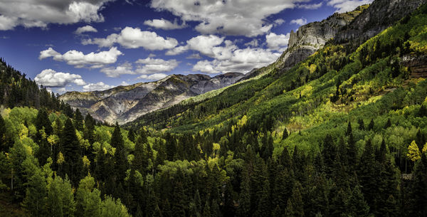
I like #1 best but generally too much processing for my taste particularly i the sky.
Oct 6, 2019 12:36:24 #
Oct 6, 2019 12:39:45 #
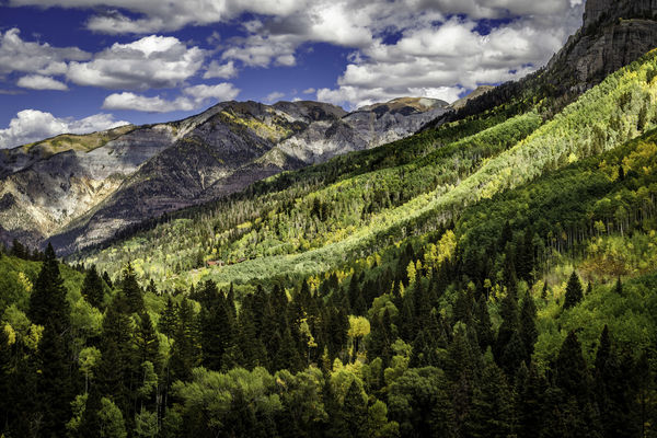
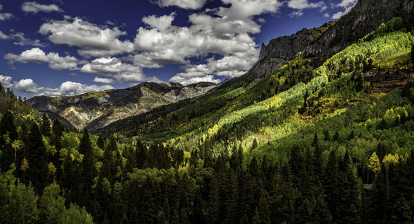
#2 - the landscape is front and center due to the light. In the other two the sky seems the same tonal value as the landscape.
Oct 6, 2019 12:42:31 #
Oct 6, 2019 12:43:39 #
Photolady2014 wrote:
I like these, just not sure which is most pleasing to the eye. You do need to see in download.
Thank you for your comments!
Thank you for your comments!
#2 for me personally although #1 is equally appealing.
Oct 6, 2019 13:06:09 #
Note the importance of using the sRGB colorspace when you export your JPEGs for posting. None of the thumbnails looks like your edited results. Anyone opening the attachments may / may not see anything similar to your intended edits as we (you) cannot predict how their OS will respond to an uncalibrated colorspace.
This link provides a discussion of resizing of digital images and a screen print of an example LR export window at the bottom in the examples for various software: Recommended resizing parameters for digital images
This link provides a discussion of resizing of digital images and a screen print of an example LR export window at the bottom in the examples for various software: Recommended resizing parameters for digital images
Oct 6, 2019 13:14:22 #
amfoto1
Loc: San Jose, Calif. USA
Definitely #1... it has the most interesting composition.
I agree with Bill P... to me they all seem a little over-saturated, the blue of the sky appears a bit over-polarized.
I agree with Bill P... to me they all seem a little over-saturated, the blue of the sky appears a bit over-polarized.
Oct 6, 2019 13:24:20 #
amfoto1
Loc: San Jose, Calif. USA
CHG_CANON wrote:
Note the importance of using the sRGB colorspace w... (show quote)
I downloaded and looked at the image in Photoshop.... It shows Pro Photo RGB color space. That may be shown as "uncalibrated" by some EXIF readers. Images also probably appear differently depending upon the viewer's browser. I use Firefox, which is color calibrated and seems to work well with sRGB (although I don't know about Pro Photo RGB, as in this case). I don't think Internet Explorer is calibrated. Don't know whether Chrome is or isn't.
Pro Photo RGB is fine to use for image editing on your own computer, so long as it's supported by the various programs you're using (as it is w/Lightroom and Photoshop).
But it's "dangerous" to put out on the Internet, where it's very likely most programs viewers will be using don't support it.
As you suggest, sRGB is the best color space to use online... at least it's the "safest", most likely to be viewed correctly across all the different possible platforms (as correctly as possible, consider most peoples' monitors are nowhere near calibrated).
Oct 6, 2019 13:29:06 #
I like number one better for composition, brightness, and contrast. Would you consider warming up the sky a touch? No I don't see any color cast, just feels right.
Oct 6, 2019 13:33:37 #
Photolady2014 wrote:
I like these, just not sure which is most pleasing to the eye. You do need to see in download.
Thank you for your comments!
Thank you for your comments!
I like number 1 Photolady as is. I like the sharp contrast of colors.
Oct 6, 2019 14:57:25 #
Basically, contrasts attract our eyes. Based on that, #1 is the Goldilocks pic, the bright contrasts illuminating most of the ridges, alternating with darks, which creates a good contrast pattern.
Oct 6, 2019 15:21:39 #
Photolady2014 wrote:
I like these, just not sure which is most pleasing to the eye. You do need to see in download.
Thank you for your comments!
Thank you for your comments!
#2
If you want to reply, then register here. Registration is free and your account is created instantly, so you can post right away.


