Golden Butterfly
Sep 22, 2019 16:57:54 #
kenievans
Loc: Dallas
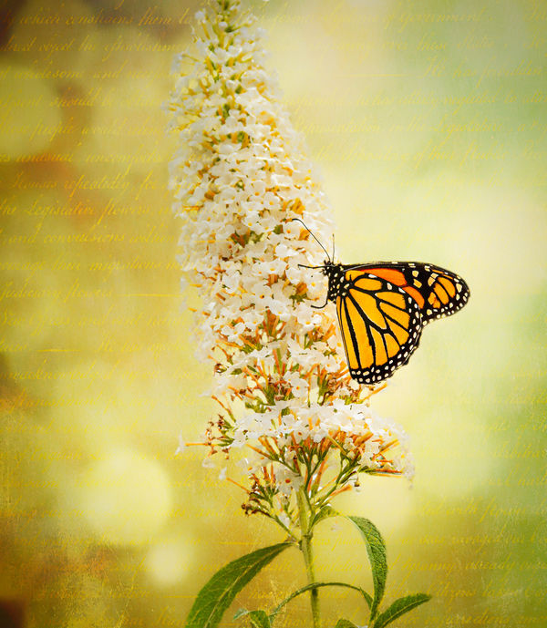
I wanted to evoke memories of a soft summer morning. Your comments are always appreciated.
Sep 22, 2019 20:59:44 #

Quite surprising from you. While the colors are richly harmonious with just enough complementaries to bring out your stated intent, your usual strengths do not show up. The composition is a no-no: near symmetrical, yet dividing the space half-and half on a diagonal--a veritable U.N. of compositions. The lines made up of words are just a distraction, further muddying the composition. And the idea is very simplistic, especially compared to your usually rich content. I'm baffled.
Sep 23, 2019 08:36:27 #

I do get the summer morning feel Keni but, like Bob, I’m not keen on the overall thing. It is a popular style though, promoted by many of the Ps gurus, but one I struggle to get fulfilment with or from. Having said that, I do follow Sebastion Michaels and am a member of both his Awake and Kaizen groups - interestingly it’s mainly the ladies that create this type of image in those groups. If it is a direction you’re interested in perusing you could do worse than take a look at his training. It does comes with a ton of useful ‘assets’ (images, textures etc) in the form of bonuses to assist your creations, and his enthusiasm definitely rubs off!
Sep 23, 2019 10:20:38 #
Sep 23, 2019 10:54:15 #

Nice work, Keni. I like the angle of the flower and the placement of the butterfly. The background is a lovely colour and certainly gives the "summer sunshine" mood you're wanting. I'm trying to decide if I like the writing or not. It's interesting. I like that it's muted and out of focus and therefore not really legible. I'm not sure I would have chosen it, and I would like to know why you did. (Not asking as a criticism, but wanting to understand your thinking.) I'm sure there's some symbolism here that I'm missing.
Sep 23, 2019 10:57:19 #
kenievans
Loc: Dallas
artBob wrote:
Quite surprising from you. While the colors are richly harmonious with just enough complementaries to bring out your stated intent, your usual strengths do not show up. The composition is a no-no: near symmetrical, yet dividing the space half-and half on a diagonal--a veritable U.N. of compositions. The lines made up of words are just a distraction, further muddying the composition. And the idea is very simplistic, especially compared to your usually rich content. I'm baffled.
Bob I always appreciate your honesty. A lot of my work tends to be darker both in mood and color. I wanted to go in the direction of something lighter. I have a club competition coming up that must have a high key and low key entry. This was kind of my first step in the high key direction. To me the writing gave it a nostalgic, journal feel. I wasn't concerned what the words said since they were not actually meant to be read. I suppose I should have considered that people would try to read them. The composition might have worked better had I rotated the flower to a diagonal line with the butterfly on an intersection in a rule of thirds grid. I will play with it some more. Thanks for the comments.
Sep 23, 2019 11:07:13 #
kenievans
Loc: Dallas
magnetoman wrote:
I do get the summer morning feel Keni but, like Bo... (show quote)
As I explained to Bob I was working towards a high key look and I liked the journaling feel the writing gave. I can't use this image in my club competition because I didn't "create" all the elements in the photo, like the writing, but I thought it would be good practice. I did do the free Awake tutorial from Sebastion Michaels with some free downloads and I keep a link to the magazines to go back and review for inspiration. I like a lot of the work from that series. My girls on the stairs fighting evil magic was done shortly after I finished his tutorial. I haven't explored much of the Kaizen group yet.
Sep 23, 2019 11:08:47 #
kenievans
Loc: Dallas
sbohne wrote:
The text leaves me cold, but I LOVE the image!
I am glad you like it. I agree that the text content should have been more in keeping with the image or something that made a statement rather than just random writing. Thank you for commenting.
Sep 23, 2019 11:17:14 #
kenievans
Loc: Dallas
AzPicLady wrote:
Nice work, Keni. I like the angle of the flower a... (show quote)
I really didn't consider the content of the writing. I like the writing as a visual aspect. It would have probably been better if I had considered giving it a deeper meaning or at least reflect the mood of the image. I was just going for an overall "look" of a memory or reflection. I am glad that the summer light came through. Thank you so much for commenting.
Sep 23, 2019 13:23:02 #
Here I go, against the crowd again. I like it unreservedly. If it had been posted without credits I would not have recognized the style as yours and I think that's a good thing. I think in composites, light, bright, happy subjects are for some reason considerably more difficult to render than dark, moody ones. I think you are well on your way to developing that skill.
Sep 23, 2019 14:04:04 #
kenievans wrote:
As I explained to Bob I was working towards a high... (show quote)
Must say I like that club rule Keni - so many creators simply download stuff off the internet and assemble their vision. For me it’s so much more satisfying if you can use your own images. Hope we get to see your entries in due course.
Kaizen is, to my mind, quite expensive - but it does give value and inspiration.
Sep 23, 2019 18:53:20 #
kenievans
Loc: Dallas
Curmudgeon wrote:
Here I go, against the crowd again. I like it unreservedly. If it had been posted without credits I would not have recognized the style as yours and I think that's a good thing. I think in composites, light, bright, happy subjects are for some reason considerably more difficult to render than dark, moody ones. I think you are well on your way to developing that skill.
Thank you Larry. I was excited to shoot my first butterfly and I wanted it to be the star of the show. You have to be happy with a butterfly!

Sep 23, 2019 19:02:08 #
kenievans
Loc: Dallas
magnetoman wrote:
Must say I like that club rule Keni - so many creators simply download stuff off the internet and assemble their vision. For me it’s so much more satisfying if you can use your own images. Hope we get to see your entries in due course.
Kaizen is, to my mind, quite expensive - but it does give value and inspiration.
Kaizen is, to my mind, quite expensive - but it does give value and inspiration.
I wasn't too happy at first but it has pushed me to improve my photography and not rely on my PS skills. I am of course in the beginner category but in this past month's three entries I took 1st in Projected (digital only, no printing) and 2nd in Printed Color and Printed B&W. I am working hard on getting 1st place in all three next month.

Sep 23, 2019 20:02:52 #

Hinting of a journal entry is a cool idea; I think you should create that background with your own whimsical or romantic writings - so that those of us too curious for our own good (c'est moi) can zoom in and read words that compliment the scene.
I see the near-symmetrical composition as promoting the feeling: harmonious, steady, mellow. The position and strong colors of the butterfly balances the more detailed background on the left. I'm relaxed and smiling, with my face lifted towards the sun
I see the near-symmetrical composition as promoting the feeling: harmonious, steady, mellow. The position and strong colors of the butterfly balances the more detailed background on the left. I'm relaxed and smiling, with my face lifted towards the sun
Sep 23, 2019 20:51:23 #
kenievans
Loc: Dallas
Linda From Maine wrote:
Hinting of a journal entry is a cool idea; I think... (show quote)
With my childish and illegible handwriting it would not be pretty but I could get someone else to write down my words. I've been known to write a poem or two. Would I get points for combining two art forms? 😁
If you want to reply, then register here. Registration is free and your account is created instantly, so you can post right away.