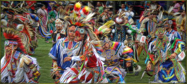
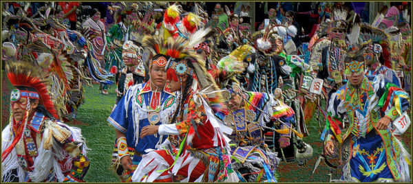
Three images for your opinion
Sep 21, 2019 23:56:56 #
rborud
Loc: Minnesota
Hi All I have never done this before, but while working on a couple of PP techniques my curiosity of this group given choice and thoughts might be very helpful. The main goal if which servers better to separate the frontal dancers. So here they are, tear them apart!! RBorud

Sep 22, 2019 00:24:55 #
I think the first one? These are major sensory overload, there is just too much going on to concentrate on anything.
Sep 22, 2019 00:47:05 #

Sep 22, 2019 00:47:21 #

With respect they all look the same to me. I just don't see any difference at all. As Curmudgeon stated there is too much going on and no obvious focal point. May I also point out that if you are taking photos of dancers I think it would help the photograph to include their feet. This would make a fantastic puzzle though.
Dennis
Dennis
Sep 22, 2019 01:02:16 #

rborud wrote:
Hi All I have never done this before, but while working on a couple of PP techniques my curiosity of this group given choice and thoughts might be very helpful. The main goal if which servers better to separate the frontal dancers. So here they are, tear them apart!! RBorud
They are far too busy for me, and I don’t see much difference in any of the three.
I do have a suggestion, though: how about doing some cropping? First, eliminate the fellow on the left. Second, split the remaining photo at what looks like a natural break, giving you two photos with a general point of reference in each. You wind up with the center part of the photo being one crop, and the right side being the other. Doing that would make each of the remaining photos more interesting than the busy ones presented here.
At least, that’s what I would do; others may think I’m crazy.

Sep 22, 2019 01:55:27 #

Sep 22, 2019 02:57:25 #

Sep 22, 2019 06:34:19 #
Sep 22, 2019 07:16:37 #

On looking at all the pictures I think that on the last one you have put a filter on it but left the 4 front dancers with out it. May be this was to separate them .The dancer in the right has the filter on one hand and some of the feathers. Maybe if you could isolate them and blur the background they would stand out more. At the moment they are very busy with all the colour... It must be hard to get dancers on their own with so many there...
Sep 22, 2019 08:13:54 #

I’m not sure why but I find the first shot does more to bring out the foreground dancers. I thought that both before and after downloading.
Sep 22, 2019 08:15:46 #

For me, #1 has the edge ( better saturation) and I think it is a great picture. Busy yes, but i guess that is the whole idea? the whole pic being what it's all about. You filled the frame nicely. However, I think cropping the left hand side, leaving two lines of dancers, would also work, with no dancers looking out of the picture?
Thanks - I enjoyed the contemplating, and that small sensor does well.
Thanks - I enjoyed the contemplating, and that small sensor does well.
Sep 22, 2019 08:18:24 #

To my eyes, as Goldilocks would say: #2 appears to be over sharpened; #3 is a little too vivid; and #1 is just right!
Nice capture!
Nice capture!
Sep 22, 2019 08:38:51 #

No doubt in my mind, the first. The highlights behind those in the front could be toned down a little more IMO. Some of those, especially in the hat to the right, pull my eye away from the front, and dissolve the front row.
Sep 22, 2019 08:53:39 #

Separate the dancers you want to emphasize in the front, inverse the separation and turn the remainder of the image into a black and white............and you could further lessen their impact by other sliders, such as darkening or lightening the b&w area. Gives you something to try. The overall colors seem just a tad oversaturated on my screen.
Sep 22, 2019 09:10:30 #

rborud wrote:
Hi All I have never done this before, but while working on a couple of PP techniques my curiosity of this group given choice and thoughts might be very helpful. The main goal if which servers better to separate the frontal dancers. So here they are, tear them apart!! RBorud
I can say as an amateur, first and foremost, the colors are great. After that I agree with others, too busy and the lack of feet.
If you want to reply, then register here. Registration is free and your account is created instantly, so you can post right away.