Playing With Blending Modes and Color Lookup
Sep 17, 2019 18:04:14 #
kenievans
Loc: Dallas
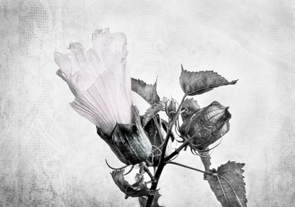
I started this project in Photoshop with somewhat of an idea in mind. I knew I wanted the flower to have a lace background and I wanted soft colors with perhaps a slight wash of one color using a Color Lookup adjustment. In the first photo I began by creating a black and white version of both the flower and the lace background. I applied the lace layer using the multiply mode.
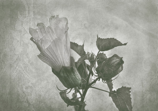
In the second photo I applied a Color Lookup called FoggyNight in a normal blend mode. It had the look I was going for but not the color. I began going through all the different Blend modes to see what effect they would have on the color.
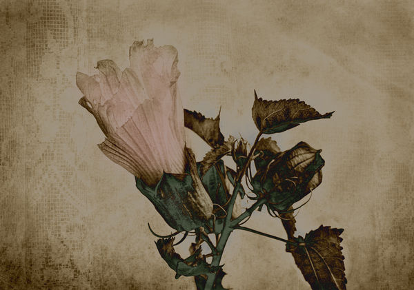
In the final image I applied the Difference blend mode and regardless of what I started this out to be I immediately loved what this mode did to my photo but it still needed a couple of touches. The blend mode made the shadow part of the stems a nice blue color but I wanted them closer to green so I added a Hue/Saturation adjustment and pushed the blue hue all the way to the left then desaturated it changing it to more green than blue. The flower petals did not stand up to the color in the stems so I painted them a light pink with the opacity set at 12. I am really happy with how it turned out.
Your comments are always appreciated.
In the second photo I applied a Color Lookup called FoggyNight in a normal blend mode. It had the look I was going for but not the color. I began going through all the different Blend modes to see what effect they would have on the color.
In the final image I applied the Difference blend mode and regardless of what I started this out to be I immediately loved what this mode did to my photo but it still needed a couple of touches. The blend mode made the shadow part of the stems a nice blue color but I wanted them closer to green so I added a Hue/Saturation adjustment and pushed the blue hue all the way to the left then desaturated it changing it to more green than blue. The flower petals did not stand up to the color in the stems so I painted them a light pink with the opacity set at 12. I am really happy with how it turned out.
Your comments are always appreciated.
Image 1 B&W
(Download)
Image 2 Color Lookup applied Normal Blend mode
(Download)
Final Image Color Lookup Difference Blend mode
(Download)
Sep 17, 2019 19:45:35 #

Sep 17, 2019 21:03:25 #

You really worked this! I see how the Difference Blend Mode took your piece from soft and delicate lovely to a much more moody, somber place.
Sep 17, 2019 21:16:38 #

Very subtle, in resistance to all temptations. Well done!
Andy
Andy
Sep 18, 2019 09:07:06 #
foggypreacher
Loc: Dickinson, Texas
Wow, it is beautiful! The results are well worth all the work and trials you put into the marvelous end result. thank you so much for showing us your work flow and the wonderful final result.
Sep 18, 2019 09:52:58 #

Sep 18, 2019 10:17:23 #
kenievans
Loc: Dallas
UTMike wrote:
What a wonderful result, Keni! So creative.
Thank you Mike. I never get tired of experimenting.
Sep 18, 2019 10:19:24 #
kenievans
Loc: Dallas
artBob wrote:
You really worked this! I see how the Difference Blend Mode took your piece from soft and delicate lovely to a much more moody, somber place.
Thank you Bob. It wasnt what I originally envisioned but I like it better than what I had planned to do.
Sep 18, 2019 10:20:00 #
kenievans
Loc: Dallas
AndyH wrote:
Very subtle, in resistance to all temptations. Well done!
Andy
Andy
Thank Andy.

Sep 18, 2019 10:21:54 #
kenievans
Loc: Dallas
foggypreacher wrote:
Wow, it is beautiful! The results are well worth all the work and trials you put into the marvelous end result. thank you so much for showing us your work flow and the wonderful final result.
Thank you so much. I have learned from so many on UHH I want to help pass on the knowledge.
Sep 18, 2019 10:22:19 #
Sep 18, 2019 11:32:24 #

Your penchant for experimentation and use of blending modes is really inspiring. But you say you have an image in mind before you start your processing - I wish I was that creative! I really like the final image, especially seeing where it came from in the original image... 
Sep 18, 2019 12:17:48 #
kenievans
Loc: Dallas
tommystrat wrote:
Your penchant for experimentation and use of blending modes is really inspiring. But you say you have an image in mind before you start your processing - I wish I was that creative! I really like the final image, especially seeing where it came from in the original image...
Thanks Tommy! I don't always have an image in mind when I get started. As a matter of fact most of the time I don't but occasionally like with this flower I had an idea of where I wanted to go or I will see someone else's work and it gives me an idea. At least 75% of the time its just throwing things on wall and seeing what sticks.

Sep 18, 2019 13:28:00 #
Wow, moody without being dark. Very well executed. Blend modes can be fun to play with but what is Color Lookup? I have missed an important tool here.
Sep 18, 2019 13:59:33 #

Keni, wonderfully creative. Thanks for the tutorial while you stepped through your workflow. I have yet to use color look up tables, but I'll get there. Bev
If you want to reply, then register here. Registration is free and your account is created instantly, so you can post right away.