First Real Posting Here
Sep 9, 2019 21:47:23 #
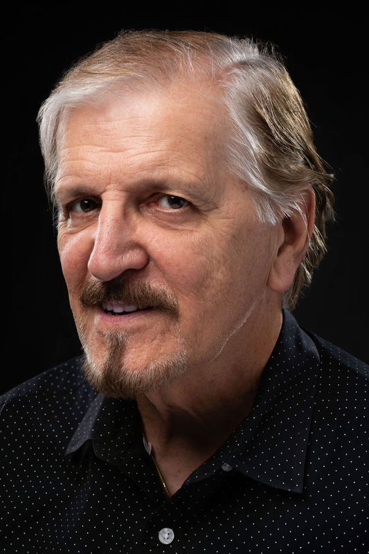
I work in a tight home studio space with low ceilings. I've had good equipment for several years but my biggest handicap is getting people to sit. This is my best friend who lives in Florida who came up for a visit and I finally got him to sit for me. A mannequin will only take you so far. I'm trying to up my consistency. It takes a lot of shots to get one I like.
For the gear hounds this is what I used.
Grey seamless paper background
Main Light Einstein with 37" Octobox gridded camera left
Kicker/Hair Light Einstein with 10"x36" Stripbox gridded camera left behind for hair & shoulder kick
Accent Einstein w/Barndoors behind camera right
White Reflector camera right for fill
20"x30" Foamcore for fill below
I tried pushing a little more light than usual to take some years off. My biggest complaint with this headshot is the main light height. It needed to come down a little more. Next time I'll watch it more when I first adjust. Any helpful tips appreciated. If there's wise words you can share to up my keeper rate I'd appreciate them exponentially. I know more sittings would be the biggest help to become a better portrait photographer. I'd like to thank Ed in advance. He's been patient with me in PM. He's an asset to UHH on a very high level and knows how to critique.
Sep 9, 2019 22:01:11 #
Great shot, but that shirt is not your friend. The highlight on the right collar tab lines up too perfectly with the soul patch, making it look like an extension. The left side of the neck is badly underexposed.
The general balance, posing, and lighting is excellent. I’d try again with a solid color shirt of a contrasting color. Bringing the light on the right side of the face closer to the camera might help with the overexposed collar point.
It’s such a good shot that it’s probably worth some work in post processing to either bring out or eliminate the contrasts. Those dots don’t flatter the subject at all.
Just my thoughts - YMMV!
Andy
Sep 9, 2019 22:18:43 #
Thanks Andy, I think I need to pull the light back more and drop it slightly. That would have thrown light on his left clavicle and lit his eyes better. Not trying to make excuses but I'm really confined for space. Next time I'll have to pay more attention. I won't bust him on his shirt. It separated well from the background if nothing else. Typically I go by the Joe Ederman's words, no plaids, no patterns, no prints. You can only take so much clothing when fleeing from Dorian :) Thank you!
Sep 9, 2019 22:31:24 #
Haydon wrote:
Thanks Andy, I think I need to pull the light back more and drop it slightly. That would have thrown light on his left clavicle and lit his eyes better. Not trying to make excuses but I'm really confined for space. Next time I'll have to pay more attention. I won't bust him on his shirt. It separated well from the background if nothing else. Typically I go by the Joe Ederman's words, no plaids, no patterns, no prints. You can only take so much clothing when fleeing from Dorian :) Thank you!
Just my thoughts, based mostly on my own past failures!
I don’t mean to suggest that the portrait is any less than excellent. But between PP and a potential reshoot with a different shirt, it could rise to gallery status.
Your friend looks like the “second most interesting man in the world” already. With a little in-Camera and post-processing tweaking, he could be #1.
Andy
Sep 10, 2019 01:46:29 #

You might also want to try Rembrandt lighting. It's very complimentary to men especially older men. I know a lot of photographers are getting away from it and filling in the shadows but I think it adds dimension. Try it and see what you think.
Sep 12, 2019 22:42:06 #

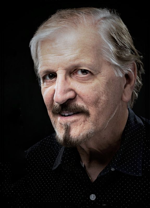
Good view of the face- this is a 2/3 view- better than other shot we previously discussed.
The eyes- that main ligt can still go slightly lower to bring more light into the orbital part of the face- the eye sockets and more shadow detail and brilliance into the eyes. The catch-lights are indicating a good lateral position of the main light.
Not seeing the subject in person and not havig a full face view to analyze, I can't advise exactly. So rather than a critique, I'll offer some general principles that you can apply to facial analysis and possibly this subject.
Eyes and facial structure: Most folks do not have symmetrical faces and eyes. One side of the face is usually broader than the other and one eye is usually smaller than the other. Most people want to look like an egg- I know that sounds silly but thy like oval faces so a good bet is to light the thinner side of the face and place the broader side in some degree of shadow. If the smaller eye is further from the camera and the larger eye closer the smalle eye is perceived by the viewer as perspective. So...we are not trying to distort the face to make one eye larger or smaller but just using the perception of perspective in the elements that are farther away always seem "smaller" so it is a natural perception.
Hairline: If the subject has a receding hairline on one side of the face, you may want to shoot the other side in a 2/3 view.
So...you have to make compromise decisions as to what is the most important feature to "correct" for- the width of the face, the asymmetry of the eyes or the hairline issue. Which is more extreme and maybe more of an issue with the subject. Sometimes, everything falls into place with the right camera position.
Composition: I know we call them HEAD shots but usually a "floating " head does not balance as well as a head with base. You have a choice- show more of the shoulder to create a triangular base or come in even tighter where the eyes are 1/3 down from the top and make a dramatic closeup. you don't want a larger than life head size in a larger display print so once you get past 11x14 or 16x20 or thereabouts, you need a head and should image with good base and balance. So in your image I added some space and re-composed leaving more space in FRONT of the subject's gaze- you want him to look out of the frame and not too close to the edge which seems a bit claustrophobic. In a 2/3 face, the eyes shod be centered and look out of the fram rather than eyeballing the camera. A full-face image benefits for eye contact where the subject is looking into the lens and thereby making contact with the viewer.
Background management- Folks tend to believe that a low key portrait must have a jet-black background. The background in a low key image should be dark but should have just a wink of light to add color or tonal mass. This creates the illusion of a third dimension- the feeling of space in the back of the subject so the viewer's eye can enter the frame and seem to be able to walk around the subject. Hues of blue or green emphasize the warmth of the skin tone. Warmer backgrounds have more of a monochromatic sepia look. I don't' want it to imitate a painting but just and a touch of color or texture to the background- VERY SUBTLE! If the background is slightly lighter, just a bit of spill from the other light may be enough to add just the right amount of tone. If the background is darker, it may require a separate background light.
Fill light: My favorite fill light source is bounce fill. That is a ligh bounced of a WHITE ceiling or the juncture of the ceiling and the back wall in the back of the camera. I sometimes use a Syklighter, that is a large troth-like softbox without a scrim with a light or two aimed into it. This produces a general fill lig all over the room. There is no fill light stand to adjust, move about and get in your way. It works well on subjects with eyeglasses in that it high enough to preclude reflections so all you need to contend with is the main ligh. The fill sour at about 15 feet from the background work well.
Main lighting patterns_ There are a number of traditional lighting patterns namely Butterfly, Modified Butterfly or "Loop", Rembrandt, Split, Rim, and Kicker. One common mistake that many of those new to portraiture make is to try to impose a lighting pattern on any particular facial structure. Not every pattern fits every face. For example, Butterfly Lighting, named for the butterfly-shaped shadow that appears under the nose, is considered "glamour" lighting for some but it only works well aesthetically on a symmetrical face. Modified Butterfly or Loop lighting is named for the loop-shaped shadow that appears to one side under the nose. This offer more control over facial shaping. Rembrandt lighting features the triangular highlight on the shaded side of the face, however, it can be problematic in a subject with deep-set eyes because the light may need to be too high to produce the aforementioned highlight. Split lighting is very dramatic but it can thin an already thin or long face.
My general advice is to first analyze the subject's facial features under flat lighting, conder the shape of the face, the setting of the eyes, the length of the nose and base you lighting, posing and camera angle accordingly. Do not start with a preconceived pose, lighting or camera position and try to fit the subject into it.
Prepare the subject as to clothing color, style, and hairstyle. If you don't advise them on theses preparation, then you are stuck with whatever the show up with.
Portraitraiture is very unique in terms of control and preparation. Especially in a studio or studio-like environment, we do not have to depend on the weather or existing light. We are not limited by immovable objects or obstructions. We are not shooting unknown folks on the street or rapidly moving sports events or sports news. it's like producing on a movie set and being the director, lighting director, prop-master and camera operator. In simpler terms, it's like painting the interior of you home- preparation is half the battle!
If you want to reply, then register here. Registration is free and your account is created instantly, so you can post right away.