Sunset questions
Sep 8, 2019 12:40:35 #

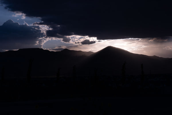
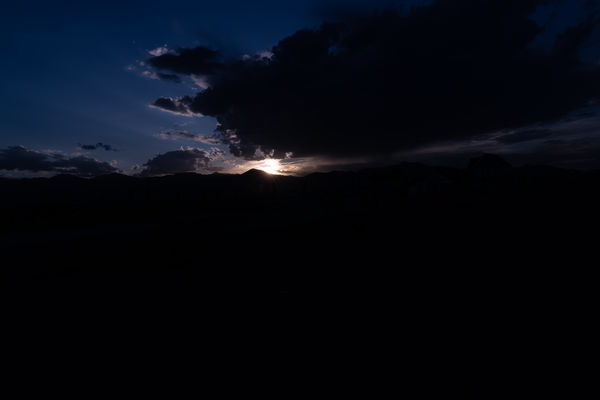
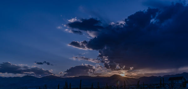
Recently I took some "alpen glow" shots of the Wasatch Mountains and, paying attention to UHH tips, I turned around. The sun was setting behind the Oquirrh Mountains. I took various shots in manual, with a 100 ISO (looking for a sharp shot) and an f/20 aperture because of the direct sun. The two shots I am working with and the results of the work are posted below.
I would appreciate any suggestions or comments, to include your rework (and an explanation of what you did, if possible)
Thanks.
I would appreciate any suggestions or comments, to include your rework (and an explanation of what you did, if possible)
Thanks.

Sep 8, 2019 13:59:28 #
Cany143
Loc: SE Utah
UTMike wrote:
Recently I took some "alpen glow" shots ... (show quote)
In my *opinion*, in both instances you took your processing twice as far as you should've.
Worked only with your first shot. Had it been possible to include either the raw or a dng rather than a jpg, its possible more could have been done....
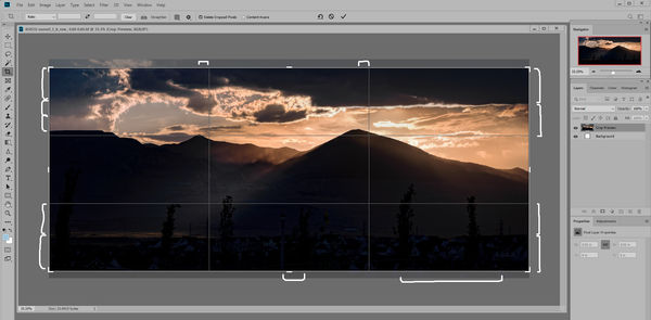
What *I think* is the area of main importance is the diffuse light that streams diagonally between the mountains, so I accentuated that. In doing so, I found three sensor spots, so those were removed. Finding the double exposure-like bleed of light over the larger of the mountains distracting, I eliminated that. Cropping further --and why I'd done so-- is indicated on the attached.
There were a variety of other color/hue tweaks, both globally and locally, plus an alteration of the color balance (warmer). Took about two minutes.
I agree with what Aristotle wrote in his 'Poetics.' If it doesn't further the work, eliminate it.
Sep 8, 2019 14:37:59 #
Sep 8, 2019 17:35:39 #

Such fine shots, you COULD have done a lot and a lot differently--but why? Personal taste is not a reason for critique, while APPROPRIATE technique and composition is. Viewing them as a juror, each has a great presence and appropriate technique, making for good content. The composition of the first two would be better, I think, if cropped on the left side, for the sake of balance--the right, with the focal point (highest contrast, subject) makes that side too weighty. The third has fine balance, and the fourth is a radial composition, with the hub near the center, so it's fine.
Very enjoyable, and not just "scenic." If you wanted more usual, natural shots, my critique would be different. Those type of shots, however, flood every photo competition. Yours would fit in the "finer" competition or exhibition realm.
Very enjoyable, and not just "scenic." If you wanted more usual, natural shots, my critique would be different. Those type of shots, however, flood every photo competition. Yours would fit in the "finer" competition or exhibition realm.
Sep 8, 2019 17:55:04 #
artBob wrote:
Such fine shots, you COULD have done a lot and a l... (show quote)
Thanks for taking the time and the information, Bob.
Sep 9, 2019 11:34:10 #

I agree with Cany's assessment and processing. The mountains and the foreground vegetation are at their most dramatic when they're close to being silhouettes, so they don't need much lifting, if any. I also agree that the strength of the photo is the light, and the purple/magenta cast of the original isn't the strongest alternative. I haven't had a go at it myself but you could try using split toning to add a touch of orange or amber to the highlights and blue or green/blue to the shadows.
Sep 9, 2019 15:47:12 #
R.G. wrote:
I agree with Cany's assessment and processing. The mountains and the foreground vegetation are at their most dramatic when they're close to being silhouettes, so they don't need much lifting, if any. I also agree that the strength of the photo is the light, and the purple/magenta cast of the original isn't the strongest alternative. I haven't had a go at it myself but you could try using split toning to add a touch of orange or amber to the highlights and blue or green/blue to the shadows.
I appreciate that, R.G. I have done the "split toning" tutorial and this might be the time to apply it.
If you want to reply, then register here. Registration is free and your account is created instantly, so you can post right away.