Shades of red
Aug 12, 2019 06:58:25 #

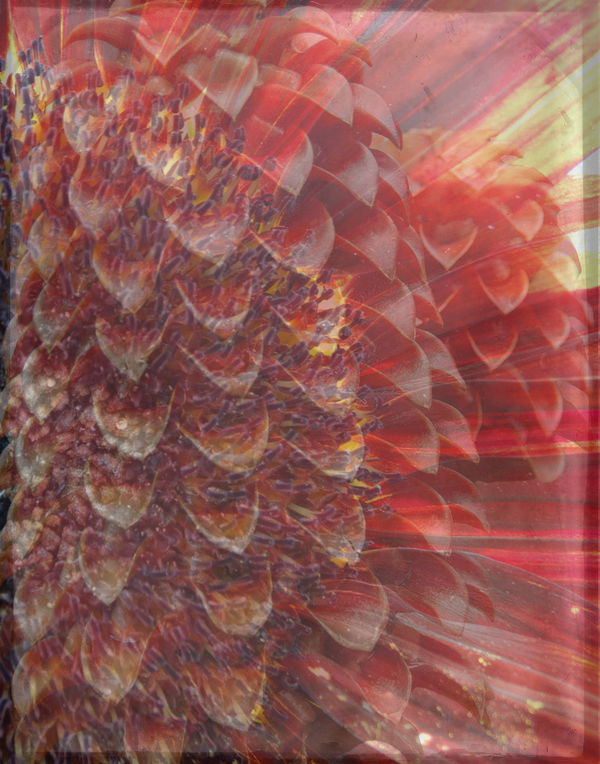
I used two flowers and a texture from a group called Old Film Set. I used one flower as the background layer and placed it so it was showing half, then put the texture layer which I reduced in opacity and the second flower which was cut out on top. I also took the opacity down on this layer..
Aug 12, 2019 09:24:26 #

Interesting visuals. I wonder if you had a full range of values it might not be even closer to your intention.
Aug 12, 2019 10:54:18 #
Aug 13, 2019 05:17:50 #

Aug 13, 2019 05:57:50 #

You gave us a one-paragraph "How-To Webinar"... thank you.
artBob would be happier if you went to Topaz Clarity and kicked the color saturation. Same photo but a different version. High saturation?... well at times less is more and at times more is not necessarily the better, rather just different.
artBob would be happier if you went to Topaz Clarity and kicked the color saturation. Same photo but a different version. High saturation?... well at times less is more and at times more is not necessarily the better, rather just different.
Aug 13, 2019 08:15:21 #

Aug 13, 2019 08:51:57 #
dpullum wrote:
You gave us a one-paragraph "How-To Webinar"... thank you.
artBob would be happier if you went to Topaz Clarity and kicked the color saturation. Same photo but a different version. High saturation?... well at times less is more and at times more is not necessarily the better, rather just different.
artBob would be happier if you went to Topaz Clarity and kicked the color saturation. Same photo but a different version. High saturation?... well at times less is more and at times more is not necessarily the better, rather just different.
No, he wouldn't ("be happier").
Here's the key sentence: "I wonder if you had a full range of values it might not be even closer to your intention." Any processing depends on the creator's intent. If the OP's intent was to celebrate the reds and the shapes, then my suggestion is objectively good. If the intent was something else, then not.
This relates to judging photos in general. There are objective criteria RELATED TO THE INTENT of the photo, as well as subjective DESIRES of maker and viewer, as I experience it.
Aug 14, 2019 11:44:56 #
artBob wrote:
Interesting visuals. I wonder if you had a full range of values it might not be even closer to your intention.
Thank you for your comment artBob, this is the result that I am happy with otherwise I would have asked for advive. No disrespect to you but you do not know what my intention was...
Aug 14, 2019 11:48:50 #
kenievans wrote:
Beautiful colors. It makes me think of dragon scales. Very imaginative.
Thank you very much keni, the top layer flower was taken at the Eden Project in the rain forest biome and I agree with you that it does look like dragon scales..

Aug 14, 2019 11:49:35 #
rlaugh wrote:
Very dramatic my friend...you always come up with unique ideas!!
Thank you very much Bob, glad you like it..
Aug 14, 2019 11:51:34 #
dpullum wrote:
You gave us a one-paragraph "How-To Webinar"... thank you.
artBob would be happier if you went to Topaz Clarity and kicked the color saturation. Same photo but a different version. High saturation?... well at times less is more and at times more is not necessarily the better, rather just different.
artBob would be happier if you went to Topaz Clarity and kicked the color saturation. Same photo but a different version. High saturation?... well at times less is more and at times more is not necessarily the better, rather just different.
Thank you very much dpullum, you are welcome. I am happy with what I did with the pictures..
Aug 14, 2019 11:52:29 #
NJFrank wrote:
I like the final results. Very creative.
Thank you very much NJFrank, glad you like it..
Aug 14, 2019 15:37:02 #
nanaval wrote:
Thank you for your comment artBob, this is the result that I am happy with otherwise I would have asked for advive. No disrespect to you but you do not know what my intention was...
Nor did I assume to know. All my responses are predicated upon the intent of the maker.
As I wrote (and quoting my first comment): "Here's the key sentence: 'I wonder if you had a full range of values it might not be even closer to your intention.' Any processing depends on the creator's intent. If the OP's intent was to celebrate the reds and the shapes, then my suggestion is objectively good. If the intent was something else, then not."
So what was your intent?
Aug 14, 2019 16:36:31 #
artBob wrote:
Nor did I assume to know. All my responses are predicated upon the intent of the maker.
As I wrote (and quoting my first comment): "Here's the key sentence: 'I wonder if you had a full range of values it might not be even closer to your intention.' Any processing depends on the creator's intent. If the OP's intent was to celebrate the reds and the shapes, then my suggestion is objectively good. If the intent was something else, then not."
So what was your intent?
I do not start off with anything firm in my mind, I tend to see how things go as I progress and see what I come up with..
Aug 14, 2019 17:43:28 #
nanaval wrote:
I do not start off with anything firm in my mind, I tend to see how things go as I progress and see what I come up with..
That is not the way good creatives do it, and might explain the softness of your visuals and your concept.
I often suggested your approach to students, as a great starting place. However, when playing around has gone on for a while, creatives usually step back, see what the work is "saying to them," then work on strengthening that. Then perhaps play with that for a while, step back.......
The hard part is to know when to stop. The easy answer is "when every aspect of your piece pushes your intent."
If you want to reply, then register here. Registration is free and your account is created instantly, so you can post right away.