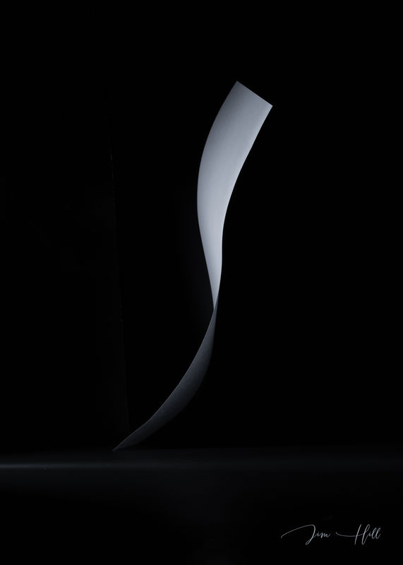
Start With A Clean Sheet
Aug 2, 2019 14:32:57 #
of paper that is. This is the second picture of a sheet of paper I did a couple of days ago called "Edge of Light". In the other one the paper was quite obscure. Haven't decided witch one might draw more attention to a judge. I might decide to enter it in a local photo contest in the spring.
Aug 2, 2019 16:31:56 #

Graceful, flowing lines! Simplicity for sure. I really like your creativity and the execution of this shot.
Aug 2, 2019 17:54:41 #
Aug 2, 2019 18:42:25 #

Aug 2, 2019 21:33:56 #

I am loving this piece of art, Jim-pops. I love the flowing, graceful lines and the simplicity of the image. Because I had not seen Edge of LIght, I checked it out too. I think I am partial to this image (Clean Sheet) maybe because I saw it first but I think its more contrasty. I'd like to know how you set up and did this. Well done!
Aug 3, 2019 08:27:29 #

Terrific image Jim. Simplicity is paramount for this sort of work and the contrast/lighting/form, work superbly here. Being the picky bugger I am, I wonder how a very slightly off-centre image might work just to provoke the mind a little further. Either way, wonderful shot mate 
Aug 3, 2019 09:19:48 #
Thank You Richard👍
_________
Thanks Carlysue, I can't tell witch one I like. Both have a different look and working relationship with the light. I will PM you with the set up. Jim
__________________
Simplicity was the goal Paul and it came across that way to you.👍 I moved the picture around as you suggested before posting and decided on this one. It was a tough decision.😏
Aug 3, 2019 11:19:22 #

Great photo, Jim. I really like the tonality.
--Bob
--Bob
Jim-Pops wrote:
of paper that is. This is the second picture of a sheet of paper I did a couple of days ago called "Edge of Light". In the other one the paper was quite obscure. Haven't decided witch one might draw more attention to a judge. I might decide to enter it in a local photo contest in the spring.
Aug 3, 2019 20:01:48 #
foggypreacher
Loc: Dickinson, Texas
Jim-Pops wrote:
of paper that is. This is the second picture of a sheet of paper I did a couple of days ago called "Edge of Light". In the other one the paper was quite obscure. Haven't decided witch one might draw more attention to a judge. I might decide to enter it in a local photo contest in the spring.
Very sultry and easy to follow the graceful lines. Thank you for sharing. I really like it.
Aug 3, 2019 21:43:21 #
rmalarz wrote:
Great photo, Jim. I really like the tonality.
--Bob
--Bob
Happy you like it Bob.👍
Aug 3, 2019 21:47:41 #
foggypreacher wrote:
Very sultry and easy to follow the graceful lines. Thank you for sharing. I really like it.
Thank you for stopping by and commenting. Pleased to see so many favorable comments.
Aug 5, 2019 21:07:45 #

Startlingly unique and well done. Certainly eye catching. I'm just wondering how you were able to get the paper into this shape.
Aug 5, 2019 21:24:00 #
SteveR wrote:
Startlingly unique and well done. Certainly eye catching. I'm just wondering how you were able to get the paper into this shape.
Thank you Steve, I will send you info and photo of the set up via PM.
Aug 10, 2019 17:59:01 #

Jim-Pops wrote:
of paper that is. This is the second picture of a sheet of paper I did a couple of days ago called "Edge of Light". In the other one the paper was quite obscure. Haven't decided witch one might draw more attention to a judge. I might decide to enter it in a local photo contest in the spring.
Hi, Jim,
You are, indeed, on to something most promising with these gently curved figurative “tone poems”.
Given the two you’ve posted, I like them both, but am partial to the first...mainly for its more firmly implied mystery of what it is.
I’m glad you are doing this....very enjoyable!
Dave
Aug 12, 2019 19:30:27 #
Thanks so much Dave. I think I will enter one of them in a photography show in the spring. Keep going back and forth on what one to enter.
If you want to reply, then register here. Registration is free and your account is created instantly, so you can post right away.