SOLD??
Jul 26, 2019 21:21:27 #

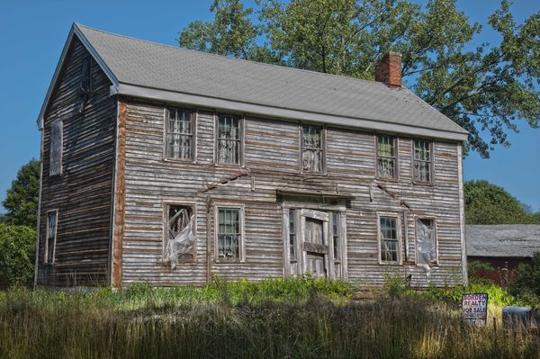
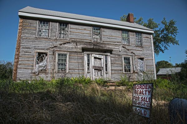
I can't decide which photo I like better. On one hand, the house is the main subject, but on the other hand, the for sale sign certainly adds to the story.
Jul 26, 2019 21:31:57 #
Jul 26, 2019 21:34:24 #

I like the second the best, the sign bumps up the impact.
Jul 26, 2019 21:44:26 #
lowkick wrote:
I can't decide which photo I like better. On one hand, the house is the main subject, but on the other hand, the for sale sign certainly adds to the story.

#2 is definitely the best for the story it tells.
Jul 26, 2019 21:53:15 #

Jul 26, 2019 22:16:27 #

Jul 26, 2019 22:55:31 #

lowkick wrote:
I can't decide which photo I like better. On one hand, the house is the main subject, but on the other hand, the for sale sign certainly adds to the story.
Ira, I like the first image because the sign is in the image and you need to look at the entire image. I enjoyed looking at all the elements of this old house.
In the second image the sign pops out at you and the house is the secondary element. My 3 cents
Jul 27, 2019 02:27:51 #

Jul 27, 2019 06:30:33 #

Jul 27, 2019 06:53:08 #

After looking at the downloads, I prefer the first one because the real estate sign is plenty prominent in the download (not so much in the thumbnail); but in the second downloaded image, the sign approaches overwhelming the photo, for me at least.
Jul 27, 2019 07:15:13 #

What a great fixer-upper. #1 is my favorite for the house is the main subject. In #2 the For Sale sign takes the fore front. Like the mailbox in the lower right corner. Mahalo for sharing.
Jul 27, 2019 07:40:09 #

lowkick wrote:
I can't decide which photo I like better. On one hand, the house is the main subject, but on the other hand, the for sale sign certainly adds to the story.
My $0.02 is the second one. Nicely done.
Jul 27, 2019 08:09:20 #

Jul 27, 2019 08:24:34 #

I like #1. It shows the depth of the house and I like the shadow on the side of the house.
Jul 27, 2019 08:54:38 #

The sign is there in both. It just doesn’t draw the eye in the first one. I like the first one best for composition. But you might try editing to make the sign more noticeable. Enlarge it, or lighten it so the eye notices it more.
If you want to reply, then register here. Registration is free and your account is created instantly, so you can post right away.