canal boats
Jul 1, 2019 06:29:37 #

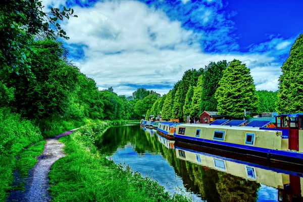
I am trying out a new program for my pics, here is a photo of the Leeds- Liverpool canal near Crooke village , Wigan, UK.
Is it any good?.
Is it any good?.
Jul 1, 2019 06:47:01 #

Hard to say, depending on your taste, but the greens and blues are oversaturated for mine. Nice photo, though.
Jul 1, 2019 06:47:04 #

Jul 1, 2019 06:52:25 #

Might be OK for a once in a while shot perhaps. don't make it a habit unless you want to get boring.
Jul 1, 2019 06:59:46 #
Jul 1, 2019 07:04:34 #

OZMON wrote:
I am trying out a new program for my pics, here is a photo of the Leeds- Liverpool canal near Crooke village , Wigan, UK.
Is it any good?.
Is it any good?.
It is a very nice picture. Sadly every thing looks over "cooked. Too vibrant/saturated.
Jul 1, 2019 07:25:56 #
I don't know what was done to it but the color is off. I tried to finagle it a bit in Lightroom, but color adjustments have never been my forte.
Jul 1, 2019 07:36:21 #

OZMON wrote:
I am trying out a new program for my pics, here is a photo of the Leeds- Liverpool canal near Crooke village , Wigan, UK.
Is it any good?.
Is it any good?.
I'm a fan of deep colors and doing what pleases YOU, so I like it.
You're not a restaurant, so cook it YOUR WAY.
Jul 1, 2019 07:37:24 #

Jul 1, 2019 07:48:15 #

Jul 1, 2019 08:00:35 #
tommy2
Loc: Fort Worth, Texas
My dream vacation, traveling through the locks on one of those quaint boats. My friend who lives in Brierley Hill has one and posts photos of his "sailing" through the countryside. He's invited me over the pond several times but haven't had the chance to do that YET. Thank you for the nice photo!
Jul 1, 2019 08:53:55 #

markie1425 wrote:
Love this statement ...You're not a restaurant, so cook it YOUR WAY.

Ozmon, I could see this as part of a series that showcases your personal style - if that is the direction you're going. As a one-off, it has and will receive mixed reviews. There is no good or bad; it's strictly personal preference. I think you have a strong composition and engaging subject. The colors are fun, but there's one result of the edit that I'm not fond of: the dark outlining of the trees, especially on the right side.
What is the name of the software you used?
In the meantime, I don't know if Admin will move your topic to Gallery (I haven't quite figured out the rules for Photo Analysis), but if he does, consider next time posting to the volunteer-moderated* PP Forum:
https://www.uglyhedgehog.com/s-116-1.html
*I manage that section
 If you aren't subscribed, you will need to do so in order to see future topics. Happy editing!
Jul 1, 2019 11:28:57 #

Even overcooking can look good in some circumstances - but this isn't one of them  . You'll have to be very selective in what you choose to process with your new software because most of the time it'll just look like overkill. And I wouldn't recommend basing your personal style on it.
. You'll have to be very selective in what you choose to process with your new software because most of the time it'll just look like overkill. And I wouldn't recommend basing your personal style on it.Jul 1, 2019 12:15:11 #
thanks for all replies, I agree the colour is much too much, I used aurora hdr 2, not got used to it yet, but it has possibilities.
Jul 1, 2019 13:10:48 #

OZMON wrote:
I am trying out a new program for my pics, here is a photo of the Leeds- Liverpool canal near Crooke village , Wigan, UK.
Is it any good?.
Is it any good?.
Kodachrome on LSD!
If you want to reply, then register here. Registration is free and your account is created instantly, so you can post right away.