Young Hannah
Jun 30, 2019 15:28:10 #
I was invited to tag along yesterday, Saturday, to photograph this young lady. Her grandmother and I are in our local photo club, and the grandmother Susan wanted to learn more about shooting portraits outdoors. Though I have been photographing for 50 years and seem to be in arrested development, I told Susan I would try and teach her what ever I could in portraiture. I was dumbstruck on how cute and self assured Hannah was but still very pleasant, and excited. I am posting these here because of the work that is shown here and foremost the critique by Ed and others trying to help us struggling photogs. Hannah was very pleased with the couple of images I showed her and wants to go out again soon. PLEASE give me honest, not brutal, critique and suggestions to improve my craft.

Jul 1, 2019 06:19:34 #

Jul 1, 2019 07:07:30 #
berchman
Loc: South Central PA
A10 wrote:
PLEASE give me honest, not brutal, critique and suggestions to improve my craft.
Isn't it possible that an honest critique might strike you as brutal? In picture #1 I suggest you crop up from the bottom just past the lower stripe on her clothing and then clone out the upper stripe which is distracting. The brown leaves on the right don't help the picture. Maybe find a better background or move your subject further from the background which you can then blur more. There is too much light on her hair on the left; it looks unnatural. Perhaps have Grandma hold a translucent screen to block the sun. https://www.diyphotography.net/shooting-in-direct-sunlight-here-are-some-ways-to-create-shade/
In photo #2, putting her against a painted wall of concrete blocks doesn't seem an appropriate background for a dreamy beauty shot. Also, the way her hand is on her stomach makes it seem as though she has a stomach ache. I think it would be better if her right shoulder were lower; it's a little too visually prominent. Finally, I suppose this is the way she likes to do her hair, but the messy hair on the right gets even more emphasis by being lit.
In photo #3 her hair and right arm are again too bright. If you're going to have her square to the camera, perhaps show her entire body, feet included? I think a solid color dress would work better than the patterned one she is wearing.
Finally, her skin has perhaps been overly smoothed in post processing. She is a pretty girl and the pictures are not "bad," but could be improved if you think my suggestions make sense.
Jul 1, 2019 15:43:03 #
I appreciate you taking the time to critique all three of the photos. With the first photo I am not much in agreement. #2, I agree that the background might not be appropriate for the look. As for her arm and hand, i wanted to do something beside have it on her hip or just hanging. Having it on her waist was copying another photo I saw and liked. On #3 you are right. I hope to do some studio work with the young lady and have more control with my light and background.
Jul 1, 2019 15:43:59 #
ronz wrote:
Success is when your client purchases prints....
Ronz you are 100% right.
Jul 1, 2019 16:23:38 #

Good day folks and thanks for posting images and critiques in this section- you participation is appreciated. These are great images for this kind if critiquing- the subject is lovely, the setting is interesting and there are many points to discuss.
Let me start by mention that "brutal" commentary is not acceptable in this section. Critiquing is one of the most effective learning tools in photography and folks should not confuse honesty with brutality. A good critique shod includes technical and aesthetic pointers with no unnecessary deriding of the photographer or the subject. Good and perhaps not so good aspects of each image should be noted along with remedial suggestions and instructions that can be applied to the image and of course, more importantly, future opportunities for improvement on images yet to come. So...let's get started!
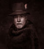
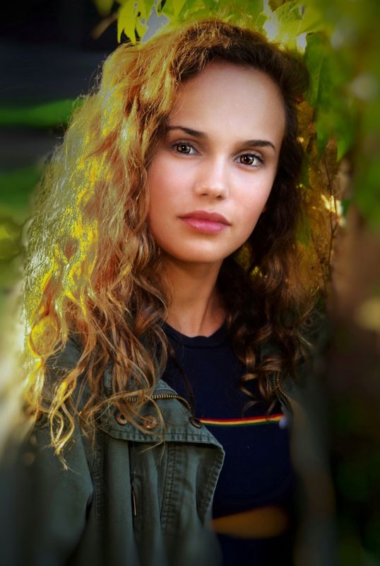
Image #1
Nice feeling and expression.
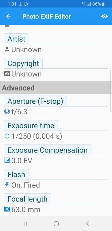
The natural light seems to be dominant. The majority of the light is coming in from the left side at a high angle of incidence- in excess of 100 degrees to the camera-subject axis. This is providing a very intense hair light. The mask of the face seem to be illuminated by some open shad and the EXIF data indicates that the FLASh was activated- which is also apparent in the almost central catchlights in the eyes. The ratio is nice but this results in slight disunity of lighting. The natural catch light from the daylight is there as well and shod be the dominant one. Reciting or modifying the flash illumination or REPLACING flash the fill sour with a reflector would unify the lighting. The intense hair lig becomes a KICKER and the reflector becomes the main light. By carefully placing the subject so that the side or backlighting just skims the hair, the far cheek and the bridge of the nose is the ideal lighting for this scenario.
The background detail does not add anything to the aesthetics image so is should have been kept more out of focus. Work at a wider aperture would enable more selective focus. In-camera edge diffusion or vignetting are specialized techniques that can assist in background management. My edit gives more attention to the face and added detail t har and de-emphasizes the imbalanced lighting.
As a side note, I am going to post a tutorial in this section, in the near future, that addresses subtractive and additive lighting methods which enables full controls in natural light condition just using reflectors and gobos- no flash. Attached, is a basic diagram. The sun is the principle ligh source- ir skim s the side of the face and the "profil of the cheek and nose- the light also strikes the reflector with is feathered in an becomes the main aesthetic source. The gobo can be a black screen or panel to black ligh and creat shadow and modeling whe the lightg is too falt OR it can be a translucent diffusion paneel to modify the incoming sunlight.
On-camer vignettes or edge diffusers (as shown in the attachments) can also be employed to SUBTRACT or modify light as the image passes through the lens. This is an "old school" method but it works beautifully and waht you see is waht you get. If done correctly theses accessories will impart a smooth, natural and subtle result in the aforementioned aesthetic controls.
Pose. In #1 image the pose is called a SIMILAR pose, sometimes called the MASCULINE pose. The body and head are both placed in the same or similar direction. Next time, try a CONTRA- POSE, the is where the subject's body is turned away for the camera and the head is gently turned, not twisted, toward the direction of the light. It is more dynamic and if the head is gently tilted toward the far shoulder, this creates an
S- curve line that is more graceful and therefore FEMININE. Please y'all, don't consider this comment kinda gender/politically/incorrect. There is nothing bad about the similar pose- the contra-pose is just another alternative to employ.
Hair- Style and the extent of hairdressing is something that needs to be discussed and planned with the subject prior to the shoot. Casula portraiture sometimes negates formal hair styling. I do carry a can of hair spray to out-of-door session. I NEVER apply it directly to the subject's hair, I spray it on the palm of my had, and WITH PERMISSION, I pat the hair- this reduces static and fly- away hairs.
FACIAL ANALYSIS: You subject has one eye larger than the Many folks don't have perfectly symmetrical eye sizes and unequal eyes are more pronounced in full-face images. You Port-Pro software has some eye correction functions. When shoot, also try some 2/3 facial poses and position the subject so that the smaller eye is further from the camera. This doesn't enlarge or reduce either eye, it just is perceived by the viewer as a normal perspective. Again- a full face port is fine- just try the alternatives as well.
MY EDIT- Firstly, I do not encourage haphazard shooting and radical correction in post-processing. In this section, I use editing to illustrate what I would have liked to see in the original camera work. In my own work, I use post processing for complexion retouching and minor tweaks only.
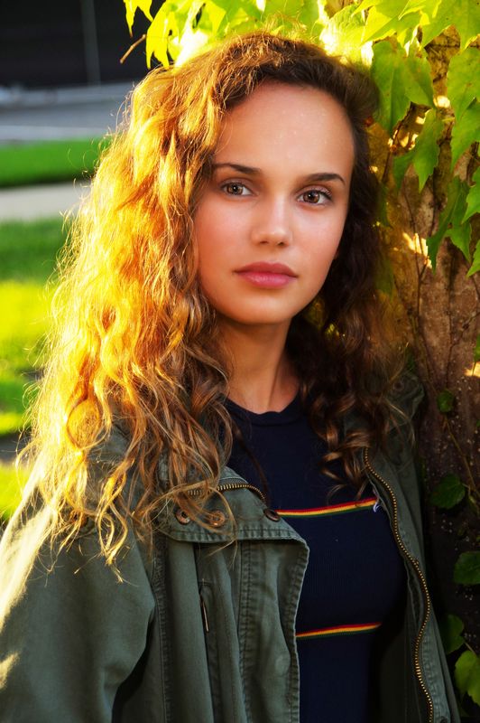
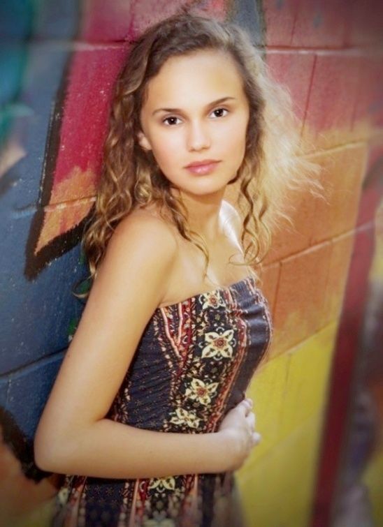
Pose # 2. As the young folks would say "COOL SHOT" Obviously, the graffitied wall is not a traditional portrait background. Not every portrait needs to be traditional. Sometimes the younger folks prefer a GENRE setting. So...you have a choice- you can go traditional and avoid or totally blur such a background OR use it to tell a different story about the subject. My own approach is that it's still a PORTRAIT so I might include whatever it is but de-emphasize it slightly so that more attention goes to the subject's face and expression. Sometimes graphic shapes and lines add a dynamic touch to a background!
Pose: In this image, I find the subject's body shod have been turned a bit more toward the camera so as to provide more support and base for her head. The arm is almost placed at a
90-degree angle- lowering a bit would provide a more graceful line. The had is no well defined so it looks like the fingers are missing. The hand can be brought up to the face and gracefully placed or defined by holding a prop or simply placed carefully.
In my edit, I de-emphasize the background but did not obliterate it- I use it to create a graphic pattern.
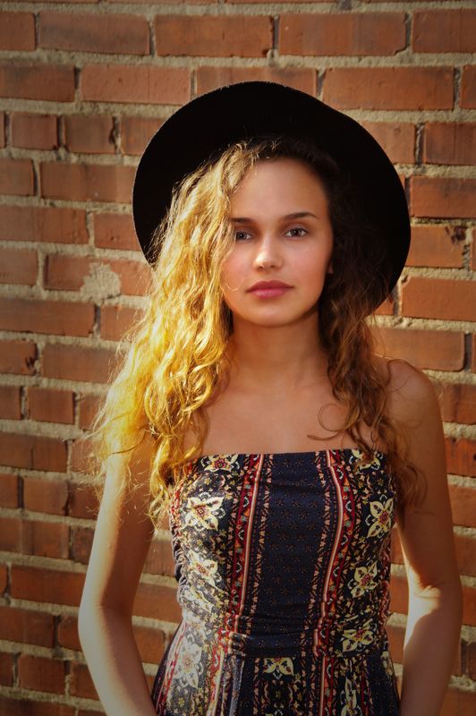
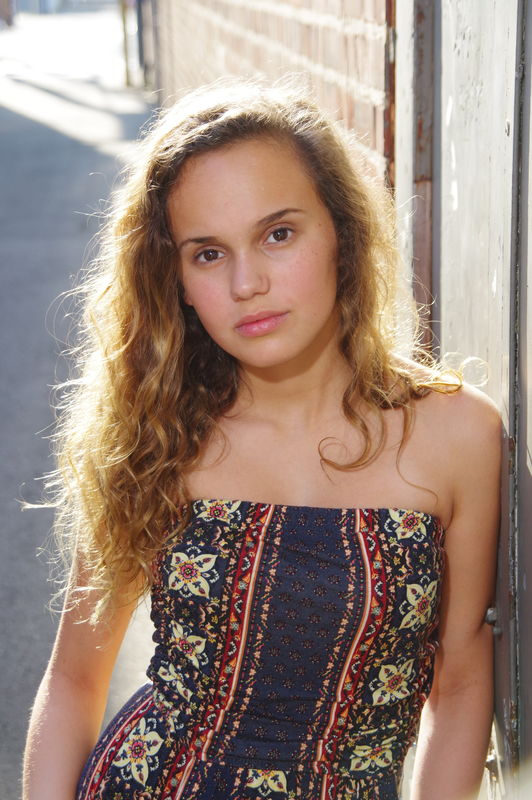
#3. Brick walls are not my favorite backgrounds. They do serve contrast to the subject's lovely complexion but they are nonetheless distracting.
The 3/4 long pose does not work well - it cuts off abruptly, especially at the arms, however, the expression and the had are fine elements. This would have worked well in a headshot so I illustrated this in a tight crop, blurring the bricks and adding a black border to pick on on her black hat.
Again, in all of you images, you have captured good expressions. There might have been later afternoon light- seems some the color balance on the skin tones are a bit on the red side, however, that ain't bad- better warm than cold in portraiture.
General suggestions: If you want to de-emphasize the background you can work wider apertures, reduce your ISO setting to enable this or use high shutter speeds. Try adding light with reflectors or subtracting light with GOBOS. Modify your flash so it does not compete with the natural light AESTHETICALLY and still provides fill. Explore all the possibilities in your Portrait-Pro software. There is a lot of automation but there is a goodly degree of user control and very precise corrective techniques. Stick with longer focal lengths- 50mm to 85mm with a cropped sensor body and 85mm-to 105mm with a full frame camera.
I also understand from your "tag-along" remarks, that this was a kinda impromptu session and you did extremely well. Camera club outing and seminars can get kinda chaotic what with "too many cooks" so just steel that absolutely lovely granddaughter away for a couple of hours and do some more shots. I maintain a "bribery" fund for my sometimes somewhat unwilling grandkids.
More questions, feedback, comments and ideas are invited!
Images of edits, screenshots of EXIF data and diagram to follow- they are stored in another device. Stand by!
Let me start by mention that "brutal" commentary is not acceptable in this section. Critiquing is one of the most effective learning tools in photography and folks should not confuse honesty with brutality. A good critique shod includes technical and aesthetic pointers with no unnecessary deriding of the photographer or the subject. Good and perhaps not so good aspects of each image should be noted along with remedial suggestions and instructions that can be applied to the image and of course, more importantly, future opportunities for improvement on images yet to come. So...let's get started!
Image #1
Nice feeling and expression.
The natural light seems to be dominant. The majority of the light is coming in from the left side at a high angle of incidence- in excess of 100 degrees to the camera-subject axis. This is providing a very intense hair light. The mask of the face seem to be illuminated by some open shad and the EXIF data indicates that the FLASh was activated- which is also apparent in the almost central catchlights in the eyes. The ratio is nice but this results in slight disunity of lighting. The natural catch light from the daylight is there as well and shod be the dominant one. Reciting or modifying the flash illumination or REPLACING flash the fill sour with a reflector would unify the lighting. The intense hair lig becomes a KICKER and the reflector becomes the main light. By carefully placing the subject so that the side or backlighting just skims the hair, the far cheek and the bridge of the nose is the ideal lighting for this scenario.
The background detail does not add anything to the aesthetics image so is should have been kept more out of focus. Work at a wider aperture would enable more selective focus. In-camera edge diffusion or vignetting are specialized techniques that can assist in background management. My edit gives more attention to the face and added detail t har and de-emphasizes the imbalanced lighting.
As a side note, I am going to post a tutorial in this section, in the near future, that addresses subtractive and additive lighting methods which enables full controls in natural light condition just using reflectors and gobos- no flash. Attached, is a basic diagram. The sun is the principle ligh source- ir skim s the side of the face and the "profil of the cheek and nose- the light also strikes the reflector with is feathered in an becomes the main aesthetic source. The gobo can be a black screen or panel to black ligh and creat shadow and modeling whe the lightg is too falt OR it can be a translucent diffusion paneel to modify the incoming sunlight.
On-camer vignettes or edge diffusers (as shown in the attachments) can also be employed to SUBTRACT or modify light as the image passes through the lens. This is an "old school" method but it works beautifully and waht you see is waht you get. If done correctly theses accessories will impart a smooth, natural and subtle result in the aforementioned aesthetic controls.
Pose. In #1 image the pose is called a SIMILAR pose, sometimes called the MASCULINE pose. The body and head are both placed in the same or similar direction. Next time, try a CONTRA- POSE, the is where the subject's body is turned away for the camera and the head is gently turned, not twisted, toward the direction of the light. It is more dynamic and if the head is gently tilted toward the far shoulder, this creates an
S- curve line that is more graceful and therefore FEMININE. Please y'all, don't consider this comment kinda gender/politically/incorrect. There is nothing bad about the similar pose- the contra-pose is just another alternative to employ.
Hair- Style and the extent of hairdressing is something that needs to be discussed and planned with the subject prior to the shoot. Casula portraiture sometimes negates formal hair styling. I do carry a can of hair spray to out-of-door session. I NEVER apply it directly to the subject's hair, I spray it on the palm of my had, and WITH PERMISSION, I pat the hair- this reduces static and fly- away hairs.
FACIAL ANALYSIS: You subject has one eye larger than the Many folks don't have perfectly symmetrical eye sizes and unequal eyes are more pronounced in full-face images. You Port-Pro software has some eye correction functions. When shoot, also try some 2/3 facial poses and position the subject so that the smaller eye is further from the camera. This doesn't enlarge or reduce either eye, it just is perceived by the viewer as a normal perspective. Again- a full face port is fine- just try the alternatives as well.
MY EDIT- Firstly, I do not encourage haphazard shooting and radical correction in post-processing. In this section, I use editing to illustrate what I would have liked to see in the original camera work. In my own work, I use post processing for complexion retouching and minor tweaks only.
Pose # 2. As the young folks would say "COOL SHOT" Obviously, the graffitied wall is not a traditional portrait background. Not every portrait needs to be traditional. Sometimes the younger folks prefer a GENRE setting. So...you have a choice- you can go traditional and avoid or totally blur such a background OR use it to tell a different story about the subject. My own approach is that it's still a PORTRAIT so I might include whatever it is but de-emphasize it slightly so that more attention goes to the subject's face and expression. Sometimes graphic shapes and lines add a dynamic touch to a background!
Pose: In this image, I find the subject's body shod have been turned a bit more toward the camera so as to provide more support and base for her head. The arm is almost placed at a
90-degree angle- lowering a bit would provide a more graceful line. The had is no well defined so it looks like the fingers are missing. The hand can be brought up to the face and gracefully placed or defined by holding a prop or simply placed carefully.
In my edit, I de-emphasize the background but did not obliterate it- I use it to create a graphic pattern.
#3. Brick walls are not my favorite backgrounds. They do serve contrast to the subject's lovely complexion but they are nonetheless distracting.
The 3/4 long pose does not work well - it cuts off abruptly, especially at the arms, however, the expression and the had are fine elements. This would have worked well in a headshot so I illustrated this in a tight crop, blurring the bricks and adding a black border to pick on on her black hat.
Again, in all of you images, you have captured good expressions. There might have been later afternoon light- seems some the color balance on the skin tones are a bit on the red side, however, that ain't bad- better warm than cold in portraiture.
General suggestions: If you want to de-emphasize the background you can work wider apertures, reduce your ISO setting to enable this or use high shutter speeds. Try adding light with reflectors or subtracting light with GOBOS. Modify your flash so it does not compete with the natural light AESTHETICALLY and still provides fill. Explore all the possibilities in your Portrait-Pro software. There is a lot of automation but there is a goodly degree of user control and very precise corrective techniques. Stick with longer focal lengths- 50mm to 85mm with a cropped sensor body and 85mm-to 105mm with a full frame camera.
I also understand from your "tag-along" remarks, that this was a kinda impromptu session and you did extremely well. Camera club outing and seminars can get kinda chaotic what with "too many cooks" so just steel that absolutely lovely granddaughter away for a couple of hours and do some more shots. I maintain a "bribery" fund for my sometimes somewhat unwilling grandkids.
More questions, feedback, comments and ideas are invited!
Images of edits, screenshots of EXIF data and diagram to follow- they are stored in another device. Stand by!


Jul 1, 2019 19:52:47 #

A10 wrote:
I was invited to tag along yesterday, Saturday, to... (show quote)
I think they are good shots for an non-planned session, but a bit over processed. You have to be careful in "fixing" people's faces. Just a touch too much and it's obvious that you have tweaked the image.
Jul 1, 2019 22:40:32 #
I did not address the matter of retouching or tweaking in my critique for a number of reasons. Firstly, is difficult to asses the extent to which the image was altered without seeing an un-retouched version. According to the EXIF data accompanying the image, Portrait-Pro software was used to process the images. This, to some extent, is automated and will produce certain pre-set results based on the gender and age of the subject and the extent of retouch required. The photographer has to select the parameters. Besides that procedure, there are many sliders and controls specific to various facial features, the extent of the effect and other facial sculpting actions that can be controlled by the photographer.
The basic presets will correct flaws or blemishes, which should no alter the physiognomy of the subject, however, many of the sculptings, thinning, elongation and another tool can radically misrepresent the actual appearance of the subject. The application of many of these effects, require the skills of an experienced retoucher who fully understand facial structures and most importantly, what exactly to retouch, what NOT to retouch and WHEN to stop retouching. Again, without sen the un-retouch version, it is difficult to tell if anything is really "tweaked" too much.
Another ongoing issue is that many folks, as soon a the see a softened complexion, immediately assume that it is overly retouched. any given image may be indeed overly corrected. Thing is, after over 50 years in the PORTRAIT biz I can tell you that relatively few paying clients want a documentary interpretation of their face, age, an/or complexion complexions. Soe demand virtual "plastic surgery" few wanna see "character"! May of my character portraits do exceptionally well in professional print competitions but the clients have somewhat different standards.
I do not like "plastic faces" and really excellent portrait retouch is a fine art in and of itself.
In really fine professional and advance portraiture most of the aesthetics shod be addressed in the shooting. Facial analysis is extremely important in determining the subject's best side, Most folks do not have symmetrical facial structures and determining their best side will provide the best camera angle and lighting direction. That's how to shape or sculpt a face- not after the fact in retouching.
Another observation- In a critique, many suggest raising or lower a shoulder, repositioning an arm or a hand or creating a particular pose. Unless the subject is a gymnast, a contortionist, or perhaps a professional model, most of these instructions will not produce a natural pose. It might be difficult to believe that all of this postures, poses, and lines start to the subject's feet and legs, their stance. If they are not standing or seated correctly with their weight evenly distributed they can not position the torso, shoulders, neck or head gracefully or naturally.
Allot of this is too much for each individual critique- you gotta take it a little at a time. I wish I had more time to write some more of these basic tutorials- maybe after I retire- but I may be dead by then. Not too many folks wanna get into the basics anymore- the don't like traditional rules but they are at the basis of creative work!
Jul 2, 2019 08:20:54 #
Thank you Ed, I value your opinions and suggestions. I also find the preset Portrait Pro setting too heavy handed, with Hannah I "zeroed" most of them. I retouched under her eyes and removed "zits" from her forehead, sharpened her eyes slightly. Included is a jpeg SOOC. I usually shoot RAW and jpeg but did not for this. Still working on a couple more of her. Thanks again.
If you want to reply, then register here. Registration is free and your account is created instantly, so you can post right away.