Money talks
Jun 10, 2019 15:31:57 #
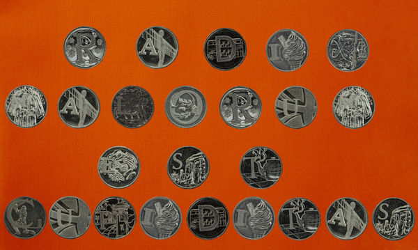
In 2018 the British Mint issued new 10p coins. 26 different coins each with a letter of the alphabet on them with a design representing something quintessentially British. https://www.royalmint.com/coinhunt/2018/
Although only about 200k of each coin have been issued I have managed to collect a full A-Z with a large number of duplicates.
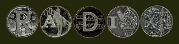
I have decided to produce a panel of three prints entitled "Money Talks" to enter into competition at my Photographic Club. The first of which is "Radix Malorum est Cupiditas" - the root of evil is greed.
I have not managed to get the spacing correct yet and will work on it more. But, what do you think of the concept?
Although only about 200k of each coin have been issued I have managed to collect a full A-Z with a large number of duplicates.
I have decided to produce a panel of three prints entitled "Money Talks" to enter into competition at my Photographic Club. The first of which is "Radix Malorum est Cupiditas" - the root of evil is greed.
I have not managed to get the spacing correct yet and will work on it more. But, what do you think of the concept?
Jun 10, 2019 15:43:41 #

The concept is fine, but if you want to go with "Money Talks", maybe you should actually spell out some appropriate words instead of random letters.
Jun 10, 2019 15:47:46 #

To bring out your idea more clearly, you might make the background color less overpowering, add quotation marks, and slightly emphasize the letter on each coin.
Jun 10, 2019 15:58:32 #
KTJohnson wrote:
The concept is fine, but if you want to go with "Money Talks", maybe you should actually spell out some appropriate words instead of random letters.
They are not random letters it is a Latin phrase which means (in English) "Greed is the root of evil".
Jun 10, 2019 16:09:45 #
artBob wrote:
To bring out your idea more clearly, you might make the background color less overpowering, add quotation marks, and slightly emphasize the letter on each coin.
Agree about the background. Not too sure why adding quotations marks would add to it. What is your thinking there? I'll work on the letter M but not too sure which other letters need t be emphasized.
Jun 10, 2019 16:33:51 #
KTJohnson wrote:
The concept is fine, but if you want to go with "Money Talks", maybe you should actually spell out some appropriate words instead of random letters.
Not random - Latin!
Jun 10, 2019 16:46:00 #
amersfoort wrote:
They are not random letters it is a Latin phrase which means (in English) "Greed is the root of evil".
Please pardon my ignorance. I am a product of the U.S. public school system.
Jun 10, 2019 16:47:52 #
amersfoort wrote:
Agree about the background. Not too sure why adding quotations marks would add to it. What is your thinking there? I'll work on the letter M but not too sure which other letters need t be emphasized.
The quotation marks tell the viewer to look for words. As it is, that is not clear.
Most of the letters are too hard to see. I would check all coins for clarity equal to the "a" in "Radix," and avoid the visual confusion of the "x". Yes, that's not exactly what the eye would see, but artists and photographers exaggerate to guide the mind of the viewer.
Jun 10, 2019 17:09:26 #
artBob wrote:
The quotation marks tell the viewer to look for words. As it is, that is not clear.
Most of the letters are too hard to see. I would check all coins for clarity equal to the "a" in "Radix," and avoid the visual confusion of the "x". Yes, that's not exactly what the eye would see, but artists and photographers exaggerate to guide the mind of the viewer.
Most of the letters are too hard to see. I would check all coins for clarity equal to the "a" in "Radix," and avoid the visual confusion of the "x". Yes, that's not exactly what the eye would see, but artists and photographers exaggerate to guide the mind of the viewer.
Thanks very much for that. I now think I understand what you are saying and will work on that element of the shot. I'm away for most of the rest of the week but will publish my rework on Saturday/Sunday.
Jun 11, 2019 09:22:52 #

The concept is fine, but a Judge not understanding of Latin might not see what you are portraying. And some judges skew heavily in favour of a good title.
Jun 14, 2019 16:03:45 #

KTJohnson wrote:
Please pardon my ignorance. I am a product of the U.S. public school system.
Careful...so am I.
De gustibus non est disputandum.
There are a great many of us whose first exposure to and taste of Latin was in eighth grade.
Dave
Jul 23, 2019 15:06:00 #
Interesting idea. Do you mind if I post an altered version of your image?
Mike
Mike
Jul 23, 2019 15:10:26 #
Jul 23, 2019 15:46:43 #
I moved the coins closer together, used a less distracting background, and selectively lightened the letters on the coins.
Mike
Mike
If you want to reply, then register here. Registration is free and your account is created instantly, so you can post right away.