Young lady portrait
May 20, 2019 00:31:44 #
Steve DeMott
Loc: St. Louis, Missouri (Oakville area)
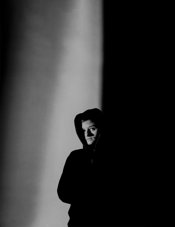
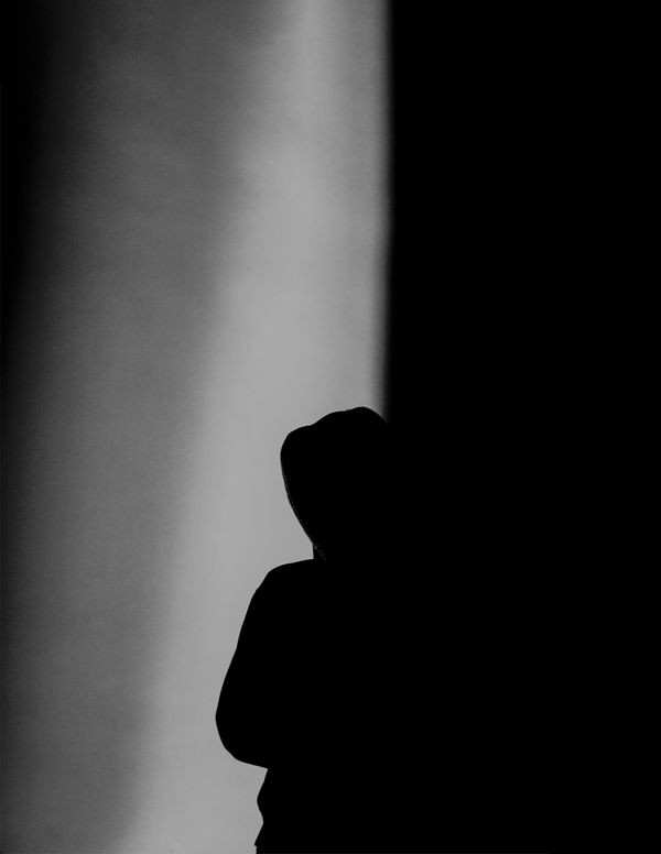
This is a photo from a college photography class. Can you imagine 20 people trying to shot at the same time while one person strikes a pose. Challenging at best. Had about 10 sec for this shot. Tried to position so that the shadow line was a little more to the left. This was originally shot in color and didn't really trip my trigger until I tried B&W.
Shot with a 60mm macro, f/2.8, 1/60. PP added more contrast and reduced the exposure by 1/2 stop.
Thanks for stopping by for a peek. As always comments/critiques are encouraged and welcome.
Steve
Shot with a 60mm macro, f/2.8, 1/60. PP added more contrast and reduced the exposure by 1/2 stop.
Thanks for stopping by for a peek. As always comments/critiques are encouraged and welcome.
Steve
May 20, 2019 06:12:39 #

I see the left-right being well balanced, the gradient shadow excellent. You are right, this is a B/W photo and color would only diminish its excellence.
IMO, way too much upper, bring down to a 8x10 landscape would focus my eyes and I would stop looking for some story in the vast upper. In cropping do not lose any of the left or right side they are el'perfectO.
IMO, way too much upper, bring down to a 8x10 landscape would focus my eyes and I would stop looking for some story in the vast upper. In cropping do not lose any of the left or right side they are el'perfectO.
May 20, 2019 06:26:39 #

steve DeMott wrote:
This is a photo from a college photography class. ... (show quote)
dpullum said it all!!!
May 20, 2019 08:29:53 #
Steve DeMott
Loc: St. Louis, Missouri (Oakville area)
dpullum wrote:
I see the left-right being well balanced, the gradient shadow excellent. You are right, this is a B/W photo and color would only diminish its excellence.
IMO, way too much upper, bring down to a 8x10 landscape would focus my eyes and I would stop looking for some story in the vast upper. In cropping do not lose any of the left or right side they are el'perfectO.
IMO, way too much upper, bring down to a 8x10 landscape would focus my eyes and I would stop looking for some story in the vast upper. In cropping do not lose any of the left or right side they are el'perfectO.
Thanks for your comment dpullum
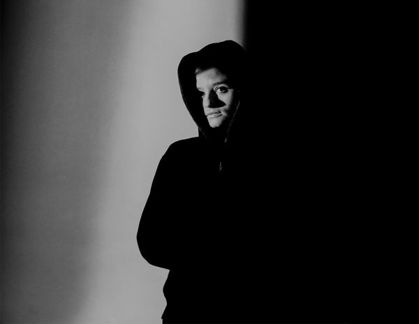
I went back and forth whether to leave all the upper. In the end I felt that it gave the image a little more mystical mood.
Here's the same photo with the upper cropped.
May 20, 2019 08:39:09 #
steve DeMott wrote:
Thanks for your comment dpullum
I went back and forth whether to leave all the upper. In the end I felt that it gave the image a little more mystical mood.
Here's the same photo with the upper cropped.
I went back and forth whether to leave all the upper. In the end I felt that it gave the image a little more mystical mood.
Here's the same photo with the upper cropped.

May 20, 2019 08:40:24 #

Cropping makes it too common IMO. I love the space above the figure! It makes the person appear more vulnerable and adds a bit of wonder as to the light's source. Yep Steve, mystical mood!
May 20, 2019 08:56:23 #
Steve DeMott
Loc: St. Louis, Missouri (Oakville area)
Linda From Maine wrote:
Cropping makes it too common IMO. I love the space above the figure! It makes the person appear more vulnerable and adds a bit of wonder as to the light's source. Yep Steve, mystical mood!
Thanks Linda
I still like the full image. Single Light was low and in front a little.
May 20, 2019 09:17:34 #

I like it with the space at the top. It is somewhat reminiscent of the work of Fan Ho, discussed in the Monthly Masters' Critique from last November.
Nice shot. Black and white is definitely the way to go.
Nice shot. Black and white is definitely the way to go.
May 20, 2019 09:44:33 #
Steve DeMott
Loc: St. Louis, Missouri (Oakville area)
MattPhox wrote:
I like it with the space at the top. It is somewhat reminiscent of the work of Fan Ho, discussed in the Monthly Masters' Critique from last November.
Nice shot. Black and white is definitely the way to go.
Nice shot. Black and white is definitely the way to go.
Thanks Matt. I'll have to look at Fan Ho work.
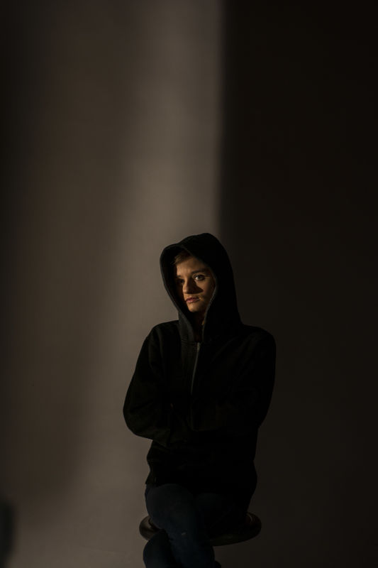
Here's the color version and you'll see why this almost found the delete button. Clare was sitting on a stool.
May 20, 2019 10:48:57 #
May 20, 2019 12:19:26 #
steve DeMott wrote:
This is a photo from a college photography class. ... (show quote)
I don't know if I would have liked it in color. In black and white it is really striking. I'm interested....do you remember what your professor said (if anything) about the space above the subjects head? It seems to me that this is almost 50% of your image. Do you think the photo would have the same impact without that much space above the subject? I think so.
It is very mysterious and so full of contrast. I really like that look.
Erich
May 20, 2019 12:51:00 #

An unpleasant photograph, wonderfully beautiful in its esthetics. Pose, pushed composition and cropping, tonality--all contribute to the effect. Congratulations.
May 20, 2019 13:09:23 #
Steve DeMott
Loc: St. Louis, Missouri (Oakville area)
ebrunner wrote:
I don't know if I would have liked it in color. In black and white it is really striking. I'm interested....do you remember what your professor said (if anything) about the space above the subjects head? It seems to me that this is almost 50% of your image. Do you think the photo would have the same impact without that much space above the subject? I think so.
It is very mysterious and so full of contrast. I really like that look.
Erich
It is very mysterious and so full of contrast. I really like that look.
Erich
Thanks Erich
Glad you agree with me on the color option. The class & professor gave high marks for this, but no one really mentioned if the space above contributed to the photo or not. The concentration was on the young lady.
Question: What is the real subject of this photo?
Everyone looks at this and sees a young lady against a high contrast background. If you took away the face, would the silhouette & black area be the subject or the graduated background to the black area.
Would the photo still be as interesting?
Steve
May 20, 2019 13:17:30 #
Steve DeMott
Loc: St. Louis, Missouri (Oakville area)
artBob wrote:
An unpleasant photograph, wonderfully beautiful in its esthetics. Pose, pushed composition and cropping, tonality--all contribute to the effect. Congratulations.
OK Bob. You kinda threw me on this until I looked up unpleasant Photograph.
Thanks for the enlightenment & wonderful comment.
Steve
May 20, 2019 13:19:24 #
Steve DeMott
Loc: St. Louis, Missouri (Oakville area)
kenievans wrote:
Beautiful b & w. Great balance between light and dark.
Thanks Keni. We still have a lot to learn about this hobby.
Steve
If you want to reply, then register here. Registration is free and your account is created instantly, so you can post right away.