Varied Color results
Apr 14, 2019 09:59:37 #

Color Management
You mentioned that you used the exact light source that you used to photograph the painting as a comparison source for color correction on your monitor. You, however, did not mention what that source was. There are light sources that are especially dedicated to examining and assessing colors. For exact control, the lamps have to of the require color the correct rendering index and spectral power distribution. If you viewing lamps are not correct, you are starting off with an incorrect model.
Then, of course, your computer, the software, and the monitor has to be calibrated.
Assuming you have done these procedures to perfection, it is unlikely that your clients have taken these steps on their home systems or even that graphic arts professionals, printers, publishers, etc., have their systems exactly in step with your own.
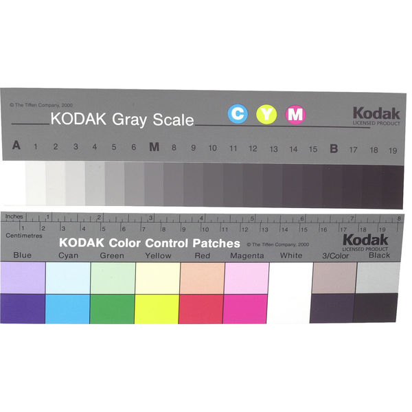
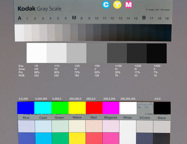
I shoot commercial work for the food service industry and have several clients at distant locations. I know that my in-studio and portable tethering systems are all calibrated and in one case, my client's system is perfect in step with my own. I know that my files are perfectly color balanced and that the exposure is correct. So, I always include a color control chart which is standardized- I have this chart and so do all my customers as do the pre-press folks and the lithographic printers or signage producers. Once they balance and correct for the chart, everything else falls into place. There are certain colors, paints, dyes, and pigments that have adverse effects on photographic reproduction because of the chemical, physical or spectral makeup and may need local correction. As long as the color on the chart is reasonably reproduced at least you know you are in calibration and you have done everything correctly that you can control.
As I alluded to, these are procedures practiced by graphic arts professionals, publishers, etc. and are not likely to be employed in consumer's home systems
Folks that are a computer, photography and graphic arts savvy can coordinate with this measure- most folks with their home system can not. As othere have mentioned here there are vast difference in all kinds of TV screens, monitors and, tablet and tablet screens.
I spent decades in my color lab correcting images for printing. I can see very minute color shifts so when I visit friends and relatives, I realize that folks are watching TV screens and computer monitors that are far off the mark and they don't know it! It drives me nuts. If they allow me to, at least, adjust the color, brightness, and contrast- they are amazed and react, "Oh... is that the way it supposed to look...so much better'!
So...you knock yourself out trying to get perfect color and the customer is viewing your hard work on God knows what- sometimes an old CRT monitor with a half-dead picture tube or a very inexpensive monitor with poor quality, or a good set up that is poorly calibrated. You have to inform your clients about these discrepancies. If you shoot a color control chart, they may be able to adjust things if they have the know-how.
I will sometimes include a color control chart in the frame, where it can be cropped out. I have a few slimmer versions for that purpose. I can also just shoot the chart on exactly the same lighting and exposures and include it in the transmission or whatever kind of storage device I am using.
As for your artist friend; I somehow doubt that the jury that is assessing art for a contest or exhibition is going to be all that exacting about color, on an online transmission, unless it is horribly shifted. They just need to get an impression of the artist's competency and talent and go on from there. Surely, the final judgments will be made in person under some form of standardized lighting.
I am often asked to judge "print" competitions at local camer clubs and a few local professional photographer's gorups. Many have gone to files projected on a screen. It's a horror story! The seldom look as good as a well made print. There are glitches and variations in the system, the projector, the screen and ambient light issues.
You mentioned that you used the exact light source that you used to photograph the painting as a comparison source for color correction on your monitor. You, however, did not mention what that source was. There are light sources that are especially dedicated to examining and assessing colors. For exact control, the lamps have to of the require color the correct rendering index and spectral power distribution. If you viewing lamps are not correct, you are starting off with an incorrect model.
Then, of course, your computer, the software, and the monitor has to be calibrated.
Assuming you have done these procedures to perfection, it is unlikely that your clients have taken these steps on their home systems or even that graphic arts professionals, printers, publishers, etc., have their systems exactly in step with your own.
I shoot commercial work for the food service industry and have several clients at distant locations. I know that my in-studio and portable tethering systems are all calibrated and in one case, my client's system is perfect in step with my own. I know that my files are perfectly color balanced and that the exposure is correct. So, I always include a color control chart which is standardized- I have this chart and so do all my customers as do the pre-press folks and the lithographic printers or signage producers. Once they balance and correct for the chart, everything else falls into place. There are certain colors, paints, dyes, and pigments that have adverse effects on photographic reproduction because of the chemical, physical or spectral makeup and may need local correction. As long as the color on the chart is reasonably reproduced at least you know you are in calibration and you have done everything correctly that you can control.
As I alluded to, these are procedures practiced by graphic arts professionals, publishers, etc. and are not likely to be employed in consumer's home systems
Folks that are a computer, photography and graphic arts savvy can coordinate with this measure- most folks with their home system can not. As othere have mentioned here there are vast difference in all kinds of TV screens, monitors and, tablet and tablet screens.
I spent decades in my color lab correcting images for printing. I can see very minute color shifts so when I visit friends and relatives, I realize that folks are watching TV screens and computer monitors that are far off the mark and they don't know it! It drives me nuts. If they allow me to, at least, adjust the color, brightness, and contrast- they are amazed and react, "Oh... is that the way it supposed to look...so much better'!
So...you knock yourself out trying to get perfect color and the customer is viewing your hard work on God knows what- sometimes an old CRT monitor with a half-dead picture tube or a very inexpensive monitor with poor quality, or a good set up that is poorly calibrated. You have to inform your clients about these discrepancies. If you shoot a color control chart, they may be able to adjust things if they have the know-how.
I will sometimes include a color control chart in the frame, where it can be cropped out. I have a few slimmer versions for that purpose. I can also just shoot the chart on exactly the same lighting and exposures and include it in the transmission or whatever kind of storage device I am using.
As for your artist friend; I somehow doubt that the jury that is assessing art for a contest or exhibition is going to be all that exacting about color, on an online transmission, unless it is horribly shifted. They just need to get an impression of the artist's competency and talent and go on from there. Surely, the final judgments will be made in person under some form of standardized lighting.
I am often asked to judge "print" competitions at local camer clubs and a few local professional photographer's gorups. Many have gone to files projected on a screen. It's a horror story! The seldom look as good as a well made print. There are glitches and variations in the system, the projector, the screen and ambient light issues.
Apr 14, 2019 10:10:32 #

BigDJim wrote:
After photographing a color painting, the client l... (show quote)
How did you profile your Mac?
When was the last time you performed a profiling operation?
Do you do a camera profile?
Did you instruct the artist to turn down the brightness on her display, and show the images to the judges in subdued light?
These four steps will get you darn close to the neutral ideal.
It will never be exactly the same, but it may be better than the results you are getting now.
Apr 14, 2019 10:10:40 #
gvarner
Loc: Central Oregon Coast
Use a written disclaimer and explain it to the client. That’s all you can do.
Apr 14, 2019 10:19:58 #

You have no control once they approve the product. You might also explain to people that, assuming the user on the other end for the product, i.e., a graphic designer or exhibition judge, most likely will have better equipment and will see the product the way it was on your computer. These days many galleries and exhibitions are requesting digital work to be viewed for entry into shows and exhibits so I don't see this problem going away. It's a matter of learning for all of us these days with digital files.
Apr 14, 2019 10:50:15 #

Could you have given your client a print that matched what she saw on your computer screen. With that in hand she would be able to compare the print (that she liked) to the image on her screen and see that the problem is her computer calibration and not the image file. We humans are predictable beings, our stuff can never be wrong. If it don't look or work right it's someone else's fault.
Apr 14, 2019 11:02:19 #
nadelewitz
Loc: Ithaca NY
Forgettting about photography....the only place color is "true" is the original moment of the scene as it existed then. And what is "true" will vary person-to-person. You have no way of knowing how someone else's eye/brain is perceiving colors, or even shades of gray.
Then when something is recorded, it WILL change from what the original scene "looked" like. And every time an image is copied or moved to a different medium it will change some more. And you can never know how someone else "sees" the image.
This is the nature of things. While the human eye/brain are highly capable of COMPARING colors together, humans are NOT good at REMEMBERING color. You cannot even say that a color you see today is the same as what you see tomorrow or five miinutes from now.
Research has demonstrated this for many years.
There is no such thing as a "perfect" color reproduction. Only what we think "looks" good.
Apr 14, 2019 11:03:56 #


Apr 14, 2019 11:12:39 #
nadelewitz wrote:
Forgettting about photography....the only place co... (show quote)
In this case that is not germane. The image was taken of a painting. The client approved how it appeared on the OP's monitor but don't like how it looks on hers.
Philosophizing won't do anything to correct her monitor calibration or her feeling that the photographer is at fault.
Apr 14, 2019 11:25:50 #
nadelewitz
Loc: Ithaca NY
Rich1939 wrote:
In this case that is not germane. The image was taken of a painting. The client approved how it appeared on the OP's monitor but don't like how it looks on hers.
Philosophizing won't do anything to correct her monitor calibration or her feeling that the photographer is at fault.
Philosophizing won't do anything to correct her monitor calibration or her feeling that the photographer is at fault.
You cannot even give an absolute guarantee that different "calibrated" monitors on different computers under different viewing conditions will "match" each other. Unless you have them all side-by-side, you can't know that what you see in one place is the same as somewhere else.
That's not "philosophizing". That is "color perception" by the human eye in all it's glory and lack of precision.
Apr 14, 2019 11:43:00 #
nadelewitz wrote:
You cannot even give an absolute guarantee that different "calibrated" monitors on different computers under different viewing conditions will "match" each other. Unless you have them all side-by-side, you can't know that what you see in one place is the same as somewhere else.
That's not "philosophizing". That is "color perception" by the human eye in all it's glory and lack of precision.
That's not "philosophizing". That is "color perception" by the human eye in all it's glory and lack of precision.
Trying to teach an unhappy client about the facts of light/color/monitors after you have presented your finished product to them will only sound to them like you are trying to get away with something. Even if they seem to accept your explanation, there will always be an element of doubt in their mind and they will seek out another photographer for future work. As I suggested, the way to solve this type of problem is with concrete proof. In this case a hard copy print that she can compare with her monitor's image.
Apr 14, 2019 11:55:42 #

BigDJim wrote:
After photographing a color painting, the client l... (show quote)
HOW are you calibrating your MacBook Pro? As good as they are, I would never use even a hardware calibrated, software profiled MBP, *unless I had to.*
That aside, there are some standards (for calibration of a desktop monitor) that I trust, ever since I used them to set up the color correction department of a major portrait lab.
> Black Point 0.5 candelas per square meter
> White Point 80 to 120 cd/m^2 (I use 105)
> Monitor color temperature 5800K
> Gamma 2.2
> Print viewing color temperature 5000K
> Print viewing intensity 9.5 to 10 EV at ISO 100 at the Print surface as metered from a gray card or with an incident meter
As for your client, it’s a good idea to have a conversation before providing files. Be sure the client understands the danger of viewing and/or adjusting images on an uncalibrated device! Color management is complex. Any artist who wants digital files of his/her work should learn a lot about it.
Apr 14, 2019 12:19:42 #
BigDJim wrote:
I would love hearing from anyone having experienced this same problem who might have a solution. In fact, I'd love hearing from anyone who has an idea, a system or procedure that might work. Thanks.
I would love hearing from anyone having experienced this same problem who might have a solution. In fact, I'd love hearing from anyone who has an idea, a system or procedure that might work. Thanks.
You received a lot of very good ideas on the physical side of the problem and Burke photo suggested a way to 'fix' the human side of the problem.
Your clients expectations are set too high. While you can't educate them so they understand and accept all the information from this thread, you can 'warn' them of possible problems. If you are going to do more of this type of work you might prepare a short document on color perception and reproduction with references to lend credibility. It will be work but a lot of the information is here on UHH. If they read the document and then work with you as described they may be more understanding of the problem and acceptive to the result.
Apr 14, 2019 12:21:44 #

BigDJim wrote:
After photographing a color painting, the client l... (show quote)
You can't control how your "perfect" image is displayed. Moreover, your display may be lying to you! If it is printed, no monitor can change it!
Apr 14, 2019 13:10:39 #
CatMarley wrote:
You can't control how your "perfect" image is displayed. Moreover, your display may be lying to you! If it is printed, no monitor can change it!
Good point! This is precisely why better service bureaus serving the artist community handle the ENTIRE process, end to end.
> Copy Photography
> Color management and adjustment
> Limited edition pigmented "giclee" inkjet printing and export file creation
> Working with framers to ensure archival print preservation methods are observed
> Working with lithographers or engravers to ensure accurate reproduction
Printing is typically done from a direct raw conversion through Lightroom to a 16-bit printer driver, with the appropriate ICC profile for the paper/ink/printer used. This, and soft proofing, maximizes the use of available colors in the file, and achieves the most honest color conversion the printer is capable of achieving.
Image and print evaluation is in direct comparison with the original artwork under standardized lighting conditions. Alternate "gallery" lighting comparisons and soft proofing for that are also available. A small, color-corrected proof print is supplied for each piece of art, printed on the same stock that the artist wants for larger prints.
Files are supplied as 16-bit TIFFs in a wide gamut color space (at least Adobe RGB) and sRGB JPEGs.
Client approval of proofs is generally required before any large prints are made.
Clients are encouraged to examine the process to see the care and concern taken.
Image files in different formats are compared on a calibrated monitor, so clients can see the limitations of each file type, and compare it with a print. (This is particularly important with sRGB JPEGs for web viewing and home printing!)
Most importantly, the color management concept and limitations are explained simply, up front, so clients have an appreciation that the work is taken very seriously and know what they can expect.
All images are photographed with at least one color target (usually several), placed just out of the way of the art, so there is a visible reference. Clients are encouraged to purchase a target of their own for comparison on their devices.
That's a simplified version of how the pros do it! It is a disciplined process, with lots of finesse.
Apr 14, 2019 15:02:03 #
nadelewitz
Loc: Ithaca NY
Rich1939 wrote:
Trying to teach an unhappy client about the facts ... (show quote)
A client like this will hop from one photographer to another endlessly, never being satisfied. Good riddance.
If you want to reply, then register here. Registration is free and your account is created instantly, so you can post right away.