Hay Wagons
Apr 1, 2019 19:40:48 #

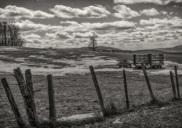
I have been tinkering with this one for far too long and i just really need some reactions/comments. I'm just too far into this forest to see the trees; it's starting to feel like an itch i can't quite get to. I have several renditions, but (at least for this moment) this is my favorite. So please - any and all comments welcome.
I worked on this first in LR, then in Silver Efex Pro with lots of tweaks, then back to LR for some final touches. Thanks for looking!
Marylea
I worked on this first in LR, then in Silver Efex Pro with lots of tweaks, then back to LR for some final touches. Thanks for looking!
Marylea
Apr 1, 2019 20:43:43 #

On UHH (and my Chromebook) it is coming across as very "middle gray." Even the snow in the field is gray. Have you tried more contrast and/or working with tonal values prior to conversion? What do you feel are the image's strengths; what do you like best about this version?
Apr 1, 2019 21:40:14 #

I think Linda is correct. The foreground snows are too gray (too dark). Cloud highlights are lacking and the contrast between those and the sky is not enough. My view fwiw. There’s great tonality stored in your image I think. I’d boost the contrast. Nice composition. I think you’re on the right track.
Not the best here but no real difficult effort. Just a boost in contrast. Keep after it. You have a keeper I believe. Hopefully food for thought for you, nothing more. No intent to offend. You may not like this rendition and if so no problem. Just my quick impression by adding some contrast on nothing more than an iPad. Have fun.
Not the best here but no real difficult effort. Just a boost in contrast. Keep after it. You have a keeper I believe. Hopefully food for thought for you, nothing more. No intent to offend. You may not like this rendition and if so no problem. Just my quick impression by adding some contrast on nothing more than an iPad. Have fun.
Apr 1, 2019 22:29:03 #
Step back and take a deep breath, I think you are there. If I was to comment on anything at all it is when I look at anything my eyes track left to right and the first thing I see is the three fence posts but maybe that is your intention. What would happen if you just horizontally flipped the photo in PS and the first focus would be the wagons. I am a sucker for B&W and it is certainly the right medium for this subject.
Apr 2, 2019 00:41:51 #
mwsilvers
Loc: Central New Jersey
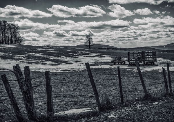
I agree with the others. It's a very nice image but needs a small bit of work besides the color of the snow I think the image was a bit warm looking and cooled it down a bit to make it more appropriate to the season. Here is my cut.
Apr 2, 2019 05:07:51 #
Linda From Maine wrote:
On UHH (and my Chromebook) it is coming across as very "middle gray." Even the snow in the field is gray. Have you tried more contrast and/or working with tonal values prior to conversion? What do you feel are the image's strengths; what do you like best about this version?
Thanks Linda. Yes - the snow is tough to nail in this one . . . my guess is that one of my other renditions probably hits the mark better, but i study them too long and start meandering! Trust me - contrast, structure, tonal values have all been tweaked ad nauseum . . . my eye is just getting jaded. I may post those later today once i have more time.
Apr 2, 2019 05:13:28 #
pesfls wrote:
I think Linda is correct. The foreground snows ar... (show quote)
Thanks pesfls - i appreciate your ideas and will probably post a couple of my other renditions later when i have more time.
Apr 2, 2019 05:14:34 #
Curmudgeon wrote:
Step back and take a deep breath, I think you are there. If I was to comment on anything at all it is when I look at anything my eyes track left to right and the first thing I see is the three fence posts but maybe that is your intention. What would happen if you just horizontally flipped the photo in PS and the first focus would be the wagons. I am a sucker for B&W and it is certainly the right medium for this subject.
Thank you Curmudgeon - interesting idea on the flip. There's one permutation i have not tried yet - but might!
Apr 2, 2019 05:15:55 #
mwsilvers wrote:
I agree with the others. Its a very nice image but needs a small bit of work besides the color of the snow I think the image was a bit warm looking and cooled it down a bit to make it more appropriate to the season. Here is my cut.
Mwslivers - i think you're right about the warmth factor. I will post another later. Thank you for your comments and observations!
Apr 2, 2019 07:36:55 #

It's important to have a vision of where you want to end up, before you dive in. Have a look at some of Graham Smith's black and white work. He knows what he what he is working towards, before he takes the first step in processing.
Apr 2, 2019 10:42:21 #

And to add to Fergmark's comment, try looking at some of Bob Malarz' B&W's. Both of these fellows have a real mastery of B&W.
Apr 2, 2019 10:48:59 #

It is fine as it is. The suggestions from others also "work," but convey a different expression. Yours is a fine balance between real and surreal, giving off a kind of soft melancholy for me. Objectively and formally, yours is a low-key creation, likely to create moodiness.
Apr 2, 2019 17:56:49 #
fergmark wrote:
It's important to have a vision of where you want to end up, before you dive in. Have a look at some of Graham Smith's black and white work. He knows what he what he is working towards, before he takes the first step in processing.
Thanks fergmark - i'm getting there. I absolutely have and do check out other works, and love Graham's . . . you have some great stuff too. I think i overthought this one. My previous renditions are probably more in keeping with what might be considered more in line with the suggestions here, but i'm not sure i'm ready to let those go yet! My take is that really good B&W is a huge challenge to pull off. The thought process is starting to come to me before i even take the shot, but i really need to be more consistent with that process.
ML
Apr 2, 2019 17:57:42 #
AzPicLady wrote:
And to add to Fergmark's comment, try looking at some of Bob Malarz' B&W's. Both of these fellows have a real mastery of B&W.
Yep - love his stuff too. He's part of my B&W inspiratation! Thanks for looking and commenting.
ML
Apr 2, 2019 18:01:34 #
artBob wrote:
It is fine as it is. The suggestions from others also "work," but convey a different expression. Yours is a fine balance between real and surreal, giving off a kind of soft melancholy for me. Objectively and formally, yours is a low-key creation, likely to create moodiness.
Thanks artBob! I do think it needs a little tweaking here and there, especially with the temp, but i also think B&W is extremely subjective . . . maybe more than color. Thanks again for your kind words! I may put this one to bed for a while.
Marylea
If you want to reply, then register here. Registration is free and your account is created instantly, so you can post right away.